Wayfinding System Redesign of Chung Hsing Cultural & Creative Park
(2025)


中興文創園區營運至今,舊有指標已不符合實際需求。團隊實地造訪後,搜集民眾及業者意見、製作現況調查與動線分析,從而著手系統更新設計。
更新後的視覺焦點回歸「紙廠」的歷史脈絡,圖標融入紙張彎折、捲曲意象;色彩與字體也因應工業遺構景色進行搭配,並重新規劃建築名稱系統與資訊陳列層級。

WAYFINDING SYSTEM DESIGN

CLIENT/
Chung Hsing Cultural & Creative Park, Cultural Affairs Bureau Yilan County


*For the complete English introduction, visit THIS PAGE︎︎︎.
The redesigned wayfinding system for “CHCC Park” returns its focus to the site’s historical context of "former paper factory", while considering the present scenery of industrial relics.
By incorporating the imagery of paper being bent or folded, a unique visual vocabulary was established to present a distinct identity suited for navigation purposes and future expansions.


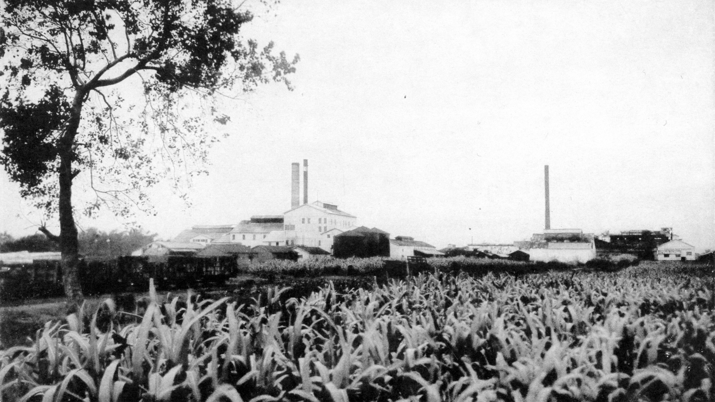
「中興文化創意園區」前身可回溯至昭和10年(西元1935年)成立的「臺灣興業株式會社」,後經歷國營事業接管改組為「中興紙廠」。2013年由宜蘭縣政府經手轉型,透過工業遺構的保存與活化,逐步發展成培育及經營地方文創應用的空間。


The predecessor of the Chung Hsing Cultural and Creative Park can be traced back to the Taiwan Industrial Corporation, which was established in 1935. It was later reorganized into a state-owned paper factory. In 2013, the Yilan County Government initiated the preservation and revitalization of industrial heritage within the park. Since then, it has gradually developed into a space for cultivating and operating local cultural and creative applications.


然而園區營運多年以來,並未建立完整的指標系統,在不同階段的建設當中參雜風格各異的設計;且隨著部分設施營運方針改變,一定比例的指標已不再符合實際需求。 為此,園區遂於2023年委託團隊進行指標系統的更新設計及施作,並隨之展開為期一年的工作計劃。


However, after years of operation, no complete wayfinding system was established among the park. Designs with mixed styles had been implemented between different stages of construction, and as operating policies of some facilities had changed, a certain proportion of signages no longer meet actual needs.
Thus in 2023, the park commissioned us to carry out a one-year work plan, aiming to update the overall wayfinding system.


工作計劃
System Update Planning

團隊從實地造訪開始,搜集了參觀民眾及進駐業者的意見,並製作指標現況調查、基礎設施統計、入園動線分析等前置準備。
在盤點完畢園區既有和未來階段的各類需求後,著手進入設計作業。

We started with a field visit, collected opinions from visitors, and organized meetings with businesses. Space studies were also conducted, laying out visitor flows and decision points, gathering all information needed for our design process.


指標更新前後佈局  Wayfinding Updates

鑑於園區腹地廣大、服務設施及開放空間分佈距離較遠,指標系統如何與民眾入園的習慣動線產生重疊、進而達到引導效果,是我們在規劃時的重要考量。

藉由導入「節點」與「指標層級」的系統,我們得以更清晰掌握設計時所需擺放的位置,以及承載的關鍵資訊。

Given that the park has a vast space and facilities are scattered over long distances, ensuring the wayfinding system overlaps with the habitual routes of visitors and thus achieves a guiding effect is an crucial point in our planning.
By introducing "decision points" and creating a variety of levels in our system, we are able to get a better grasp of where our design placements should be, and what key information they must carry.


主要節點 Main Decision Points

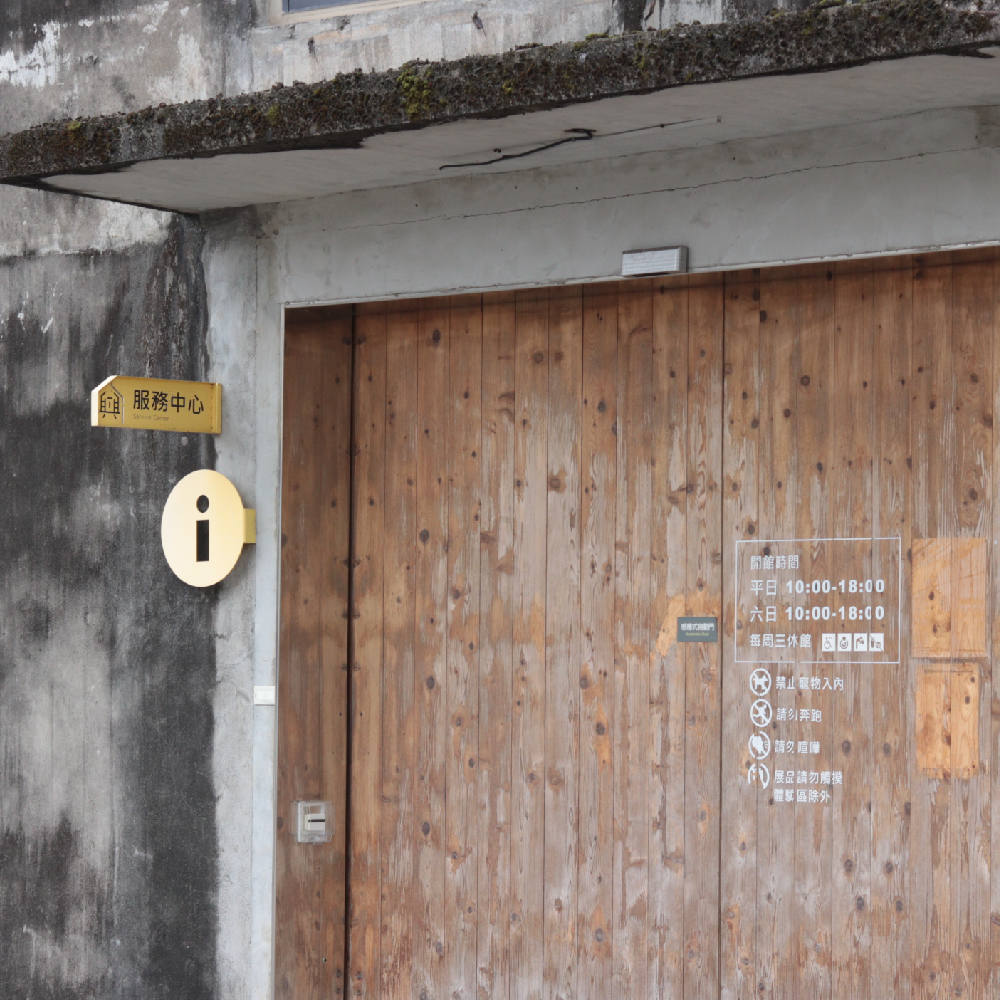
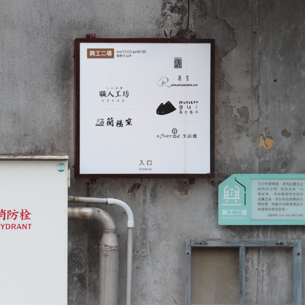
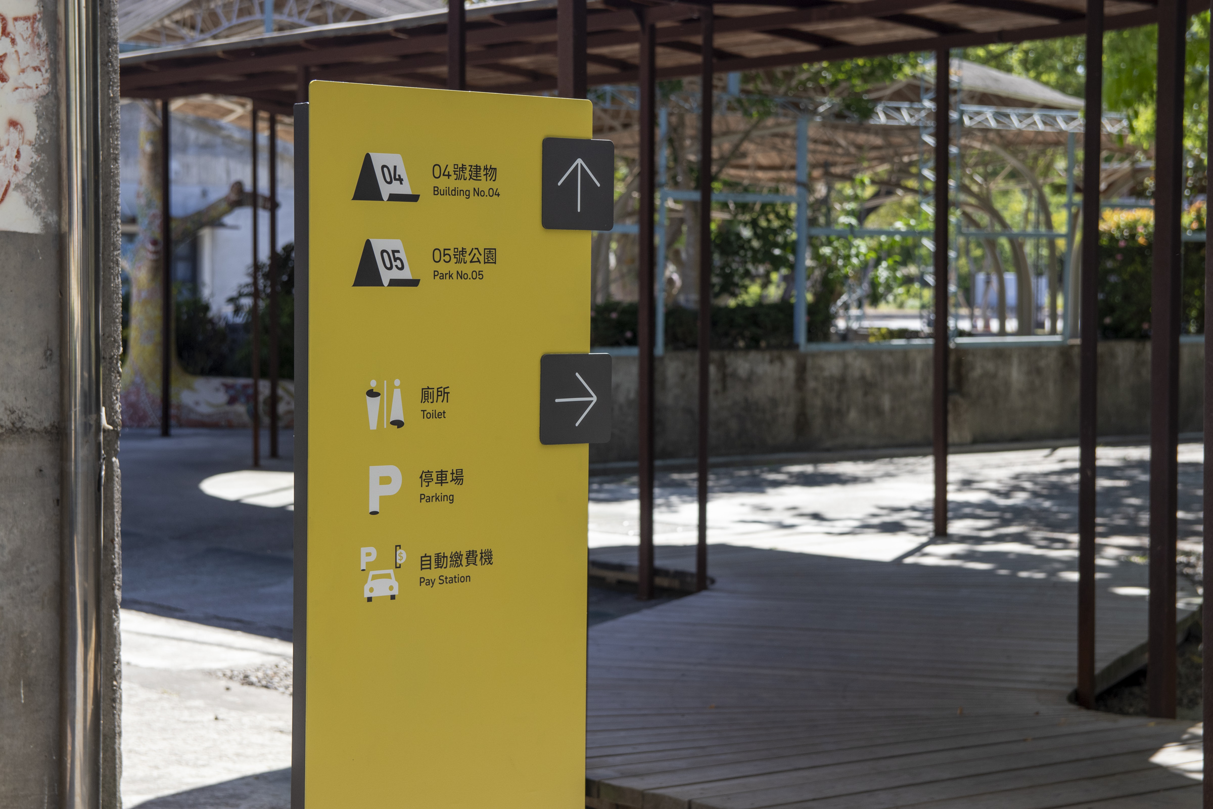
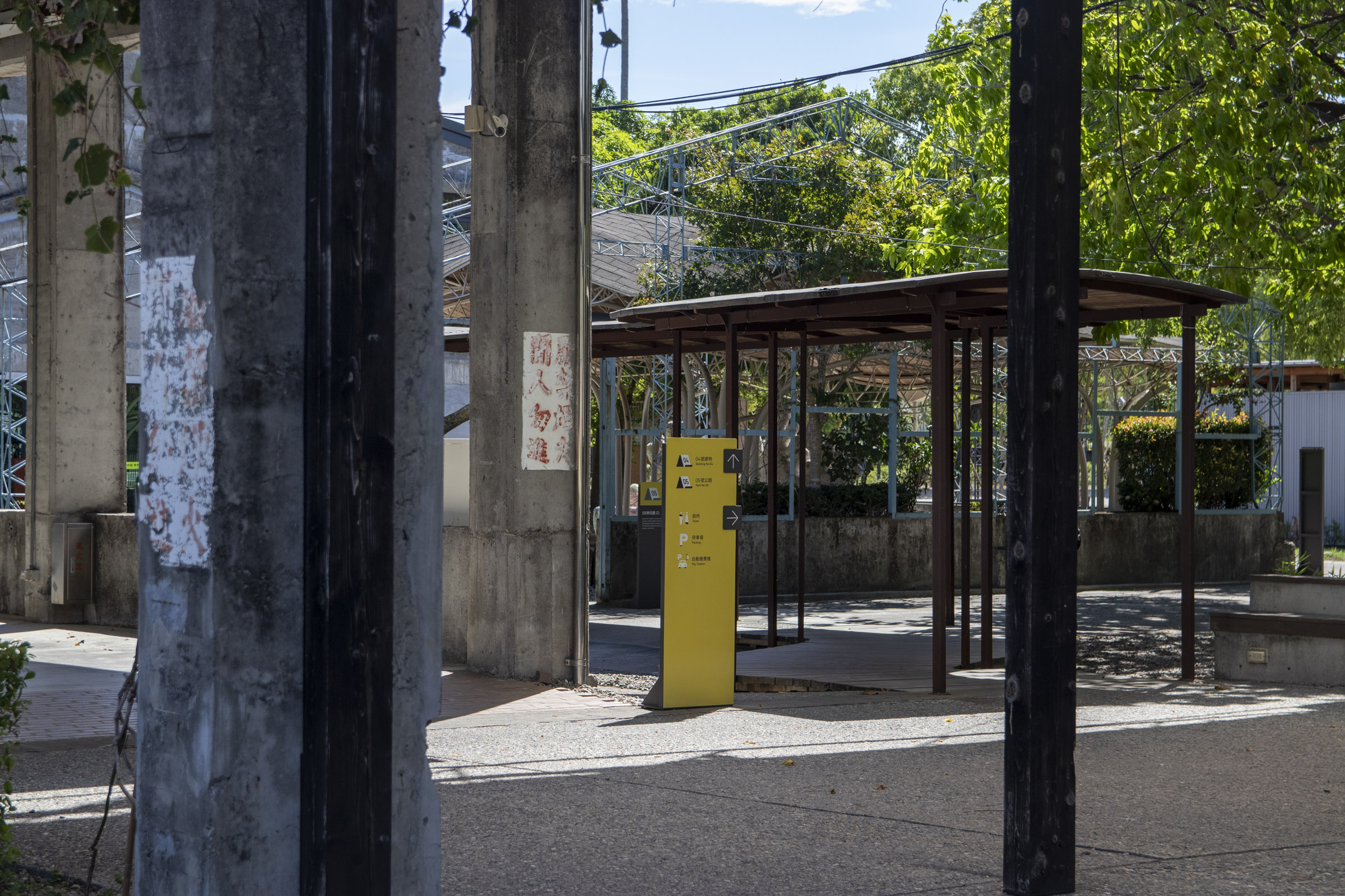
我們將民眾入園後最常有規劃動線需求的幾處地點作為主要節點,包含服務中心前入口處、廣場中心與停車場旁廁所等。指標設計以全區地圖呈現,形式依循環境轉換。

Locations where visitors most often need to plan their routes after entering are slected as main decision points, including the front entrance, the center of the square, and the toilets next to the parking lot. The signage is presented with an overall map, and the design changes according to the surrounding environment.


次要節點 Sub Decision Points

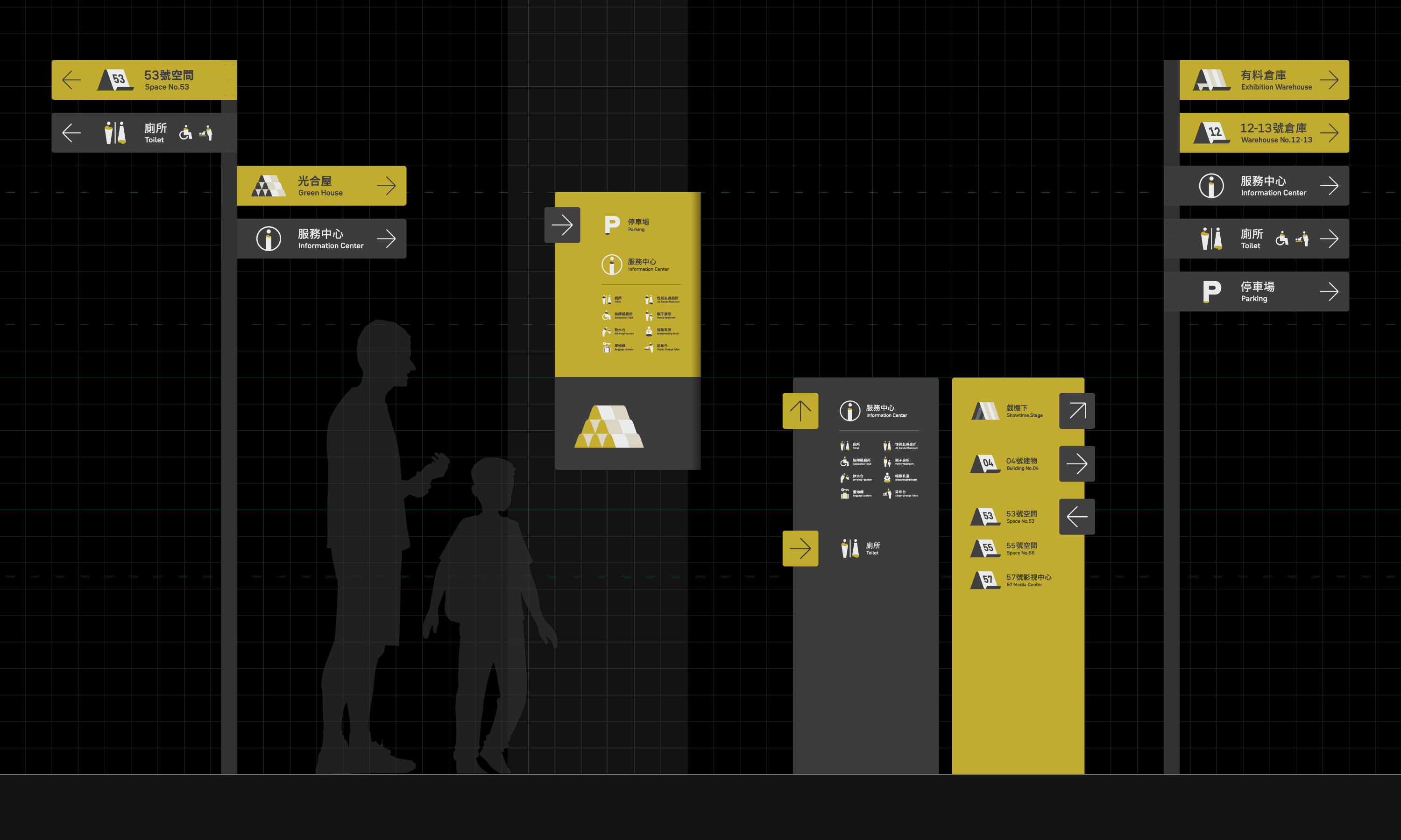
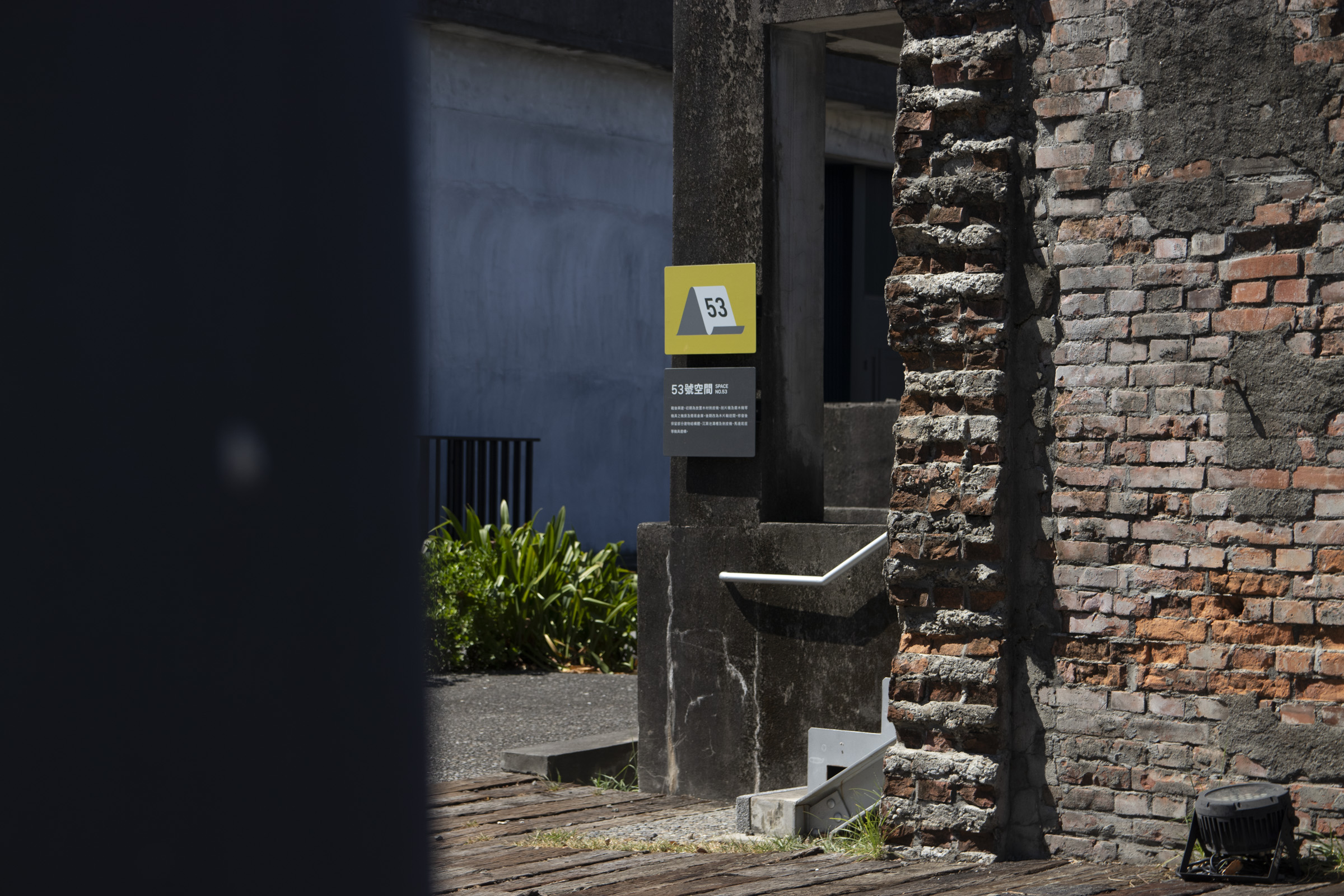
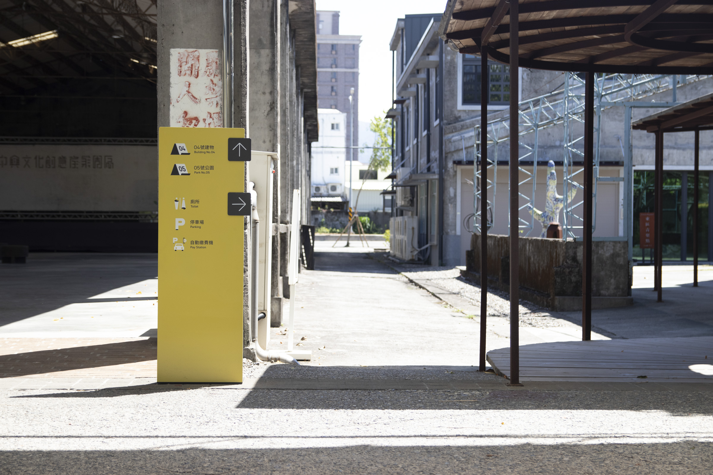
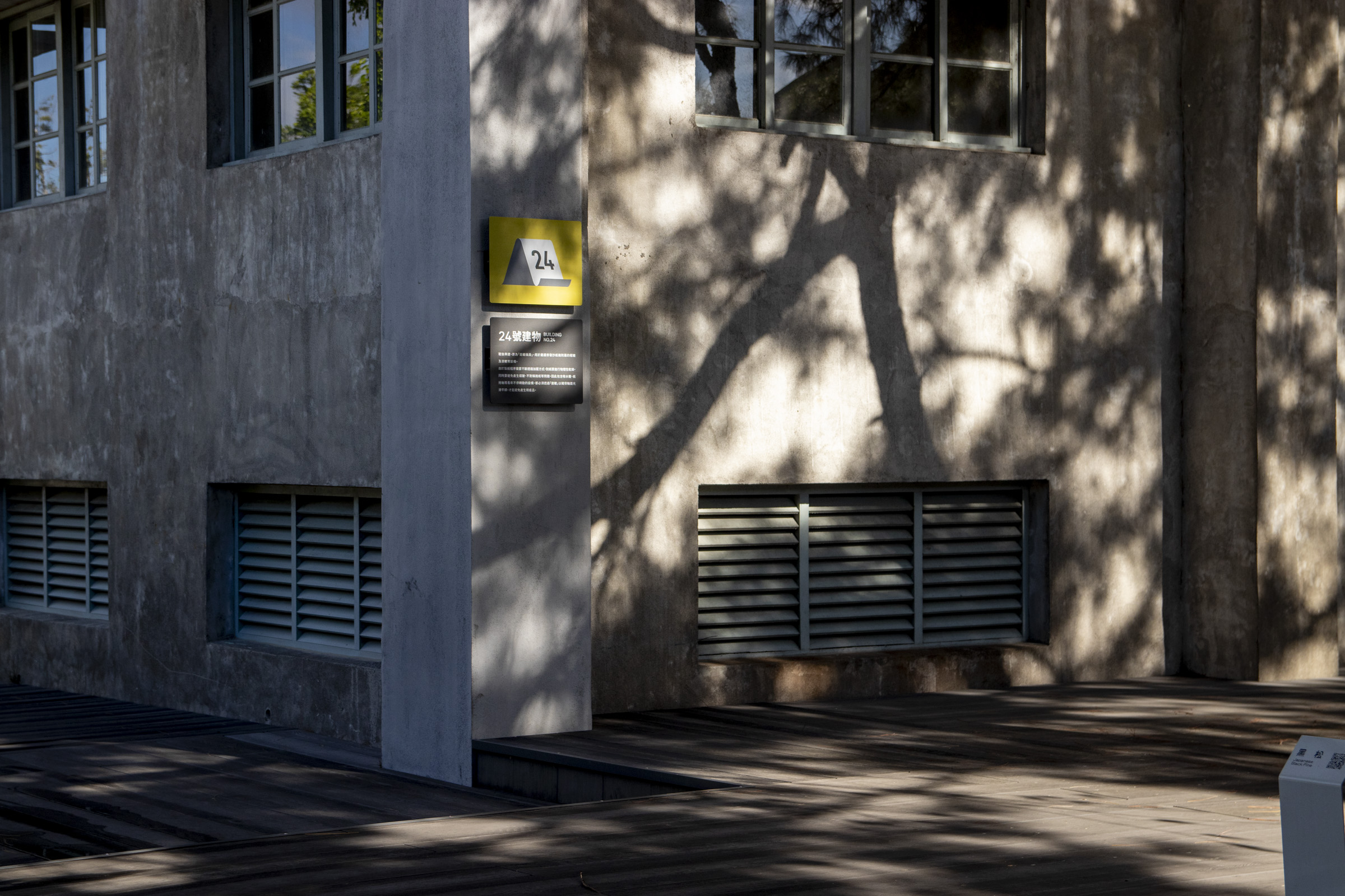
次要節點主要涵蓋特定設施或開放空間指引需求較高的熱區,以及人流引導上期待的參訪動線。指標以部分項目的識導為重心,主要呈現多為方向路牌或周遭設施指引,不時融入空間介紹牌面。

Sub decision points cover hot spots with high demand for guidance of specific facilities, as well as expected visitor routes for flow maintainence. The signages focus on the wayfinding toward specific locations, mainly presenting directional signs or guidance on surrounding facilities, and occasionally combined with space introductions.


增設及更新項目 Updated Functions & Designs

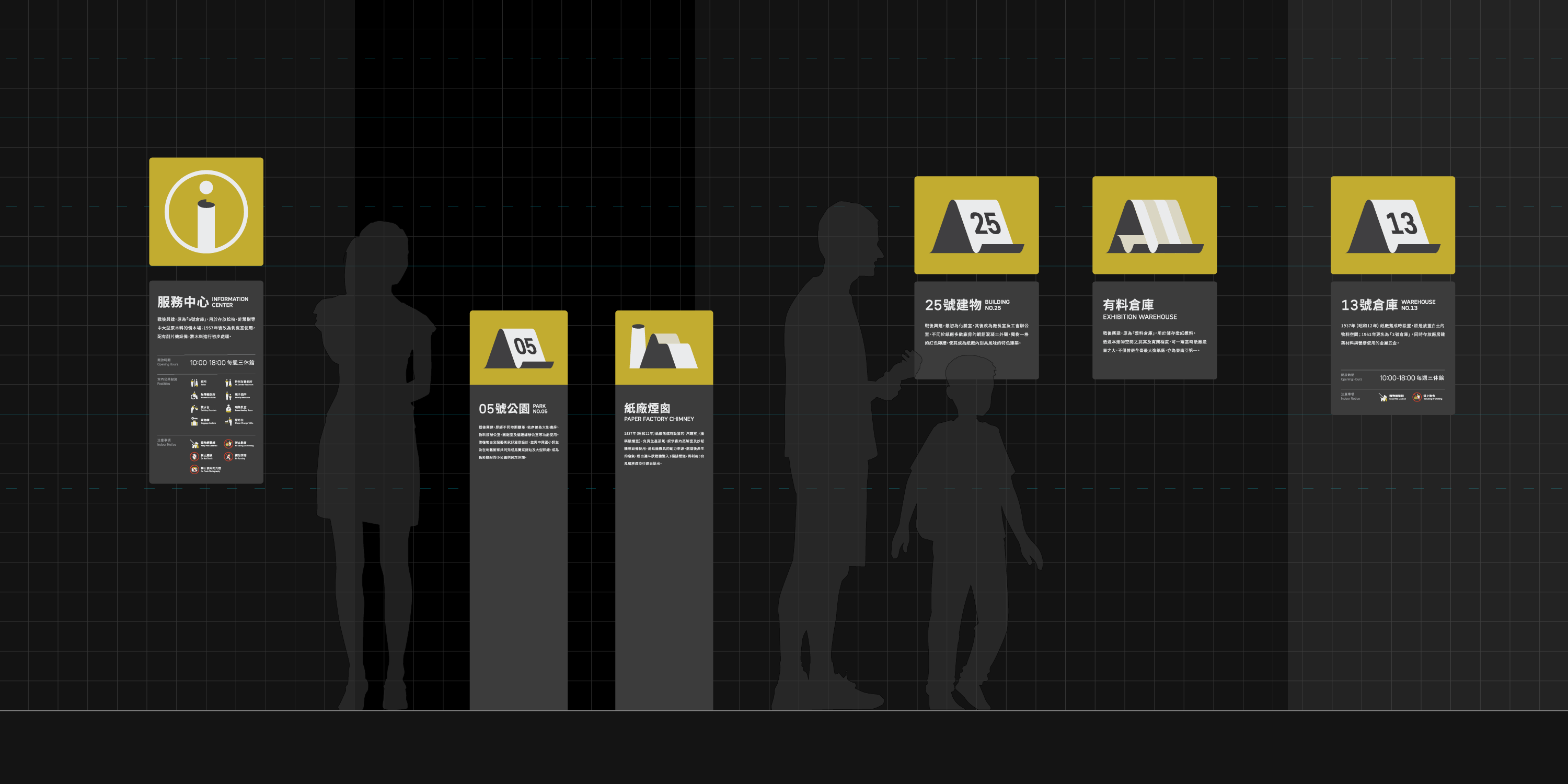
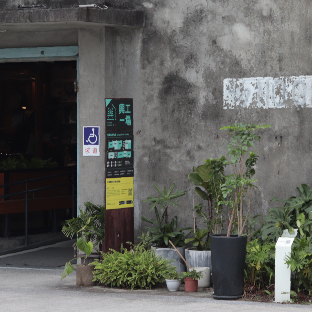
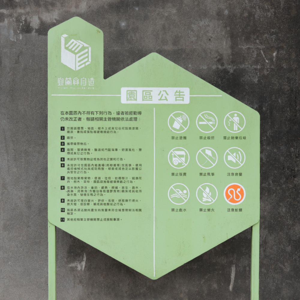
配合系統設置與園區發展規劃,主要設施與開放空間在計劃中皆設置了指引或介紹牌面,人流較高的特定建築也補足基礎設施概覽,提升園區整體識導上的完整性。

In line with the updated system and future developments, the main facilities and open spaces are all equipped with guidance or introduction signs in our project. Specific buildings with high traffic also supplement overviews to enhance the overall integrity of the park's wayfinding experience.


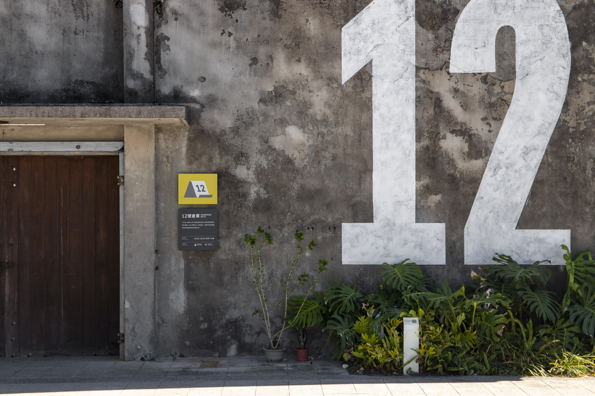
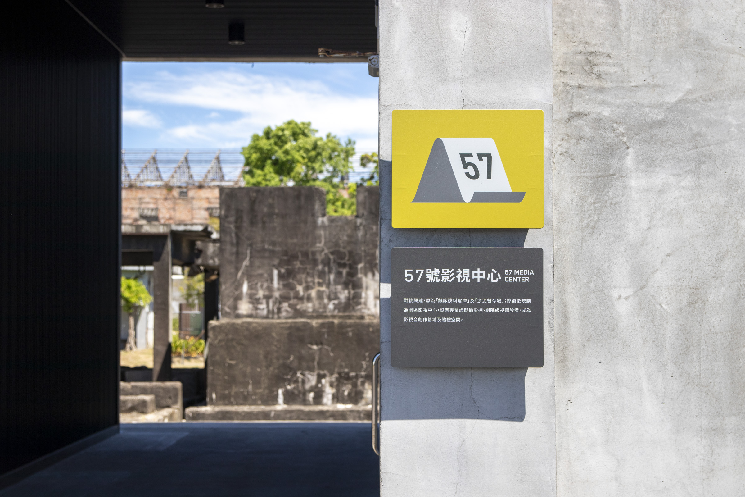
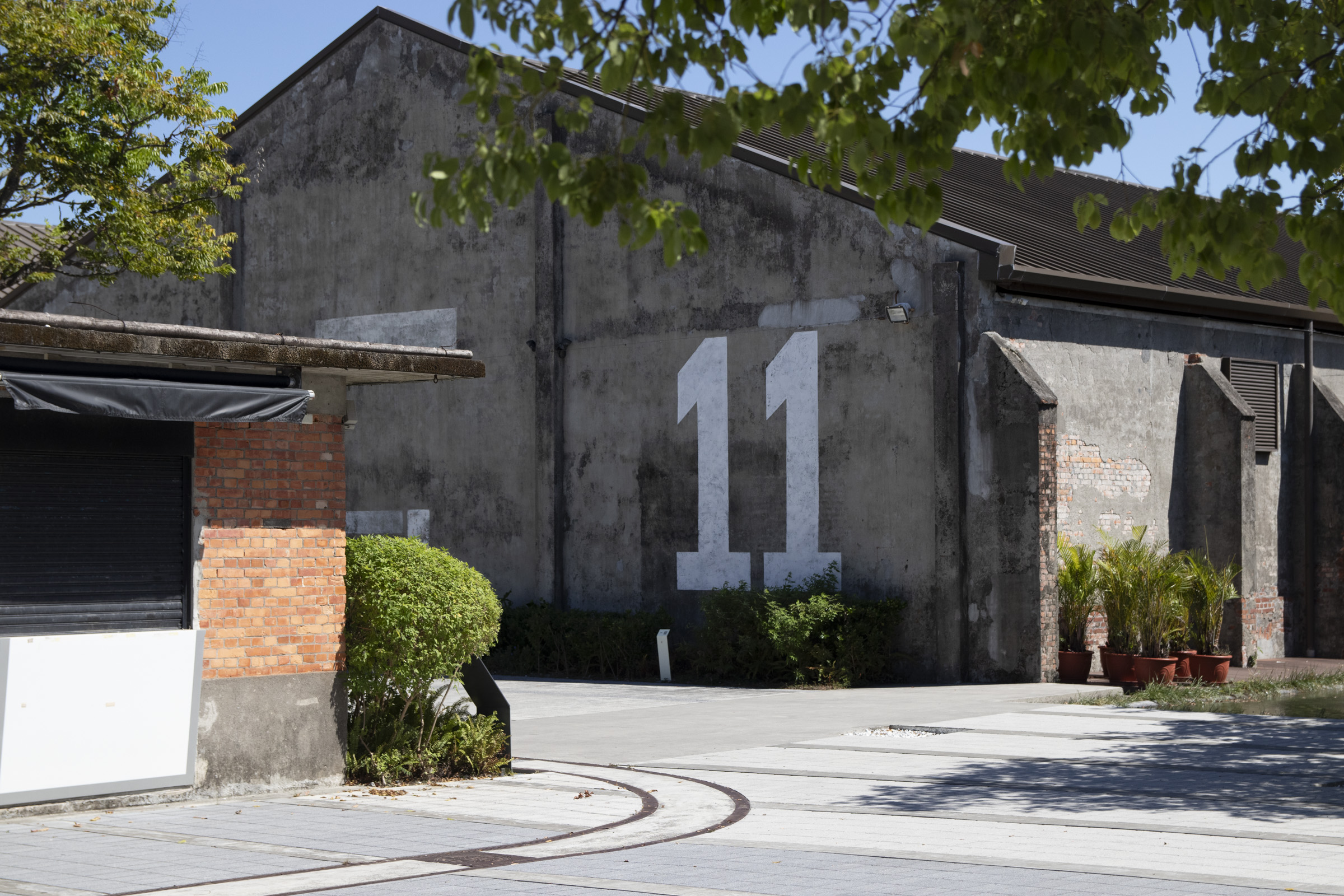
指標的層級呈現也是影響視導的重要因素之一。整體系統中,我們由大至小規劃出不同引導效果的形式;從建築牆面上的大型數字引導、圖標內的編號標示,到基礎的牌面排版中,如何配合大眾民眾閱讀習慣的同時,維持系統個性及清晰度,都需要經過精心安排。


Different levels presented among the layout of our design is also one of the crucial factors. We created various forms of wafinding elements from large to smaller scales, from numeric titles on the walls, numbered labels in pictograms, to basic signage layout. Efforts were made to maintaining the system's identity and clarity while coordinating with the general public's reading habits.


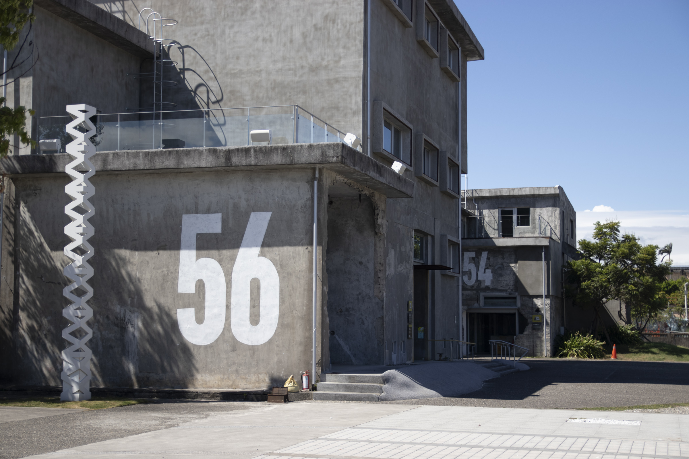
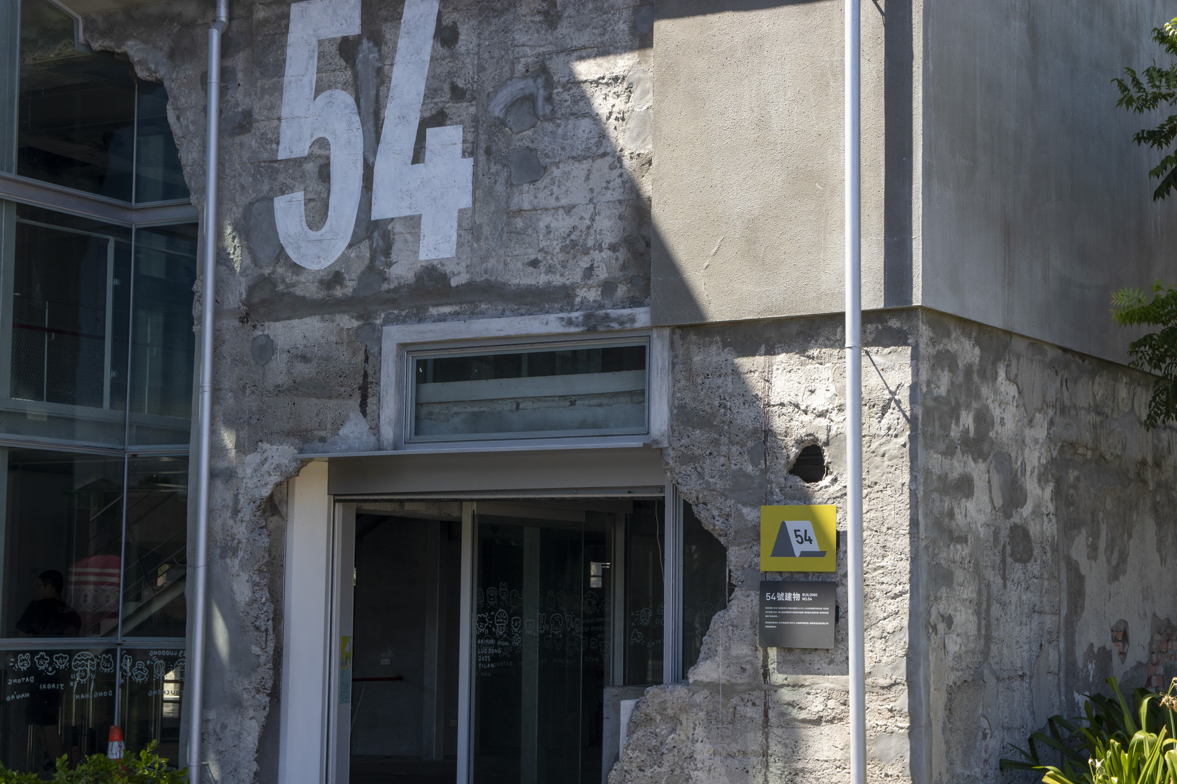
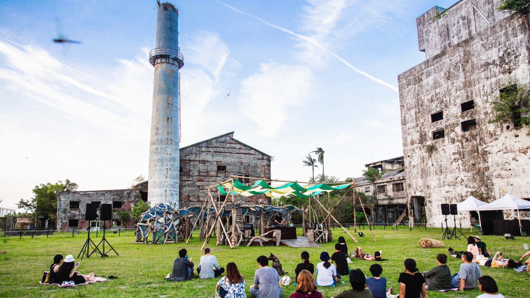
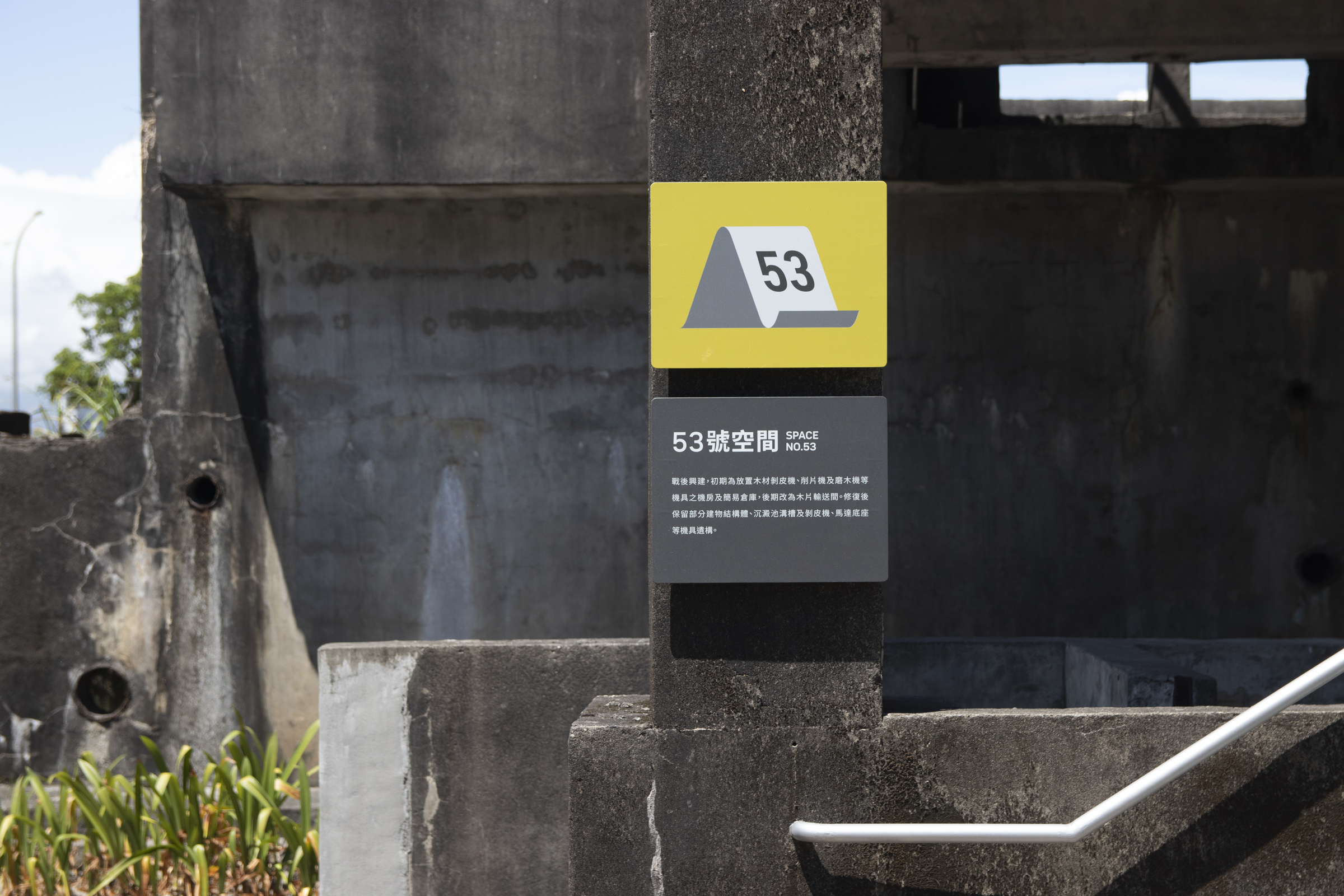
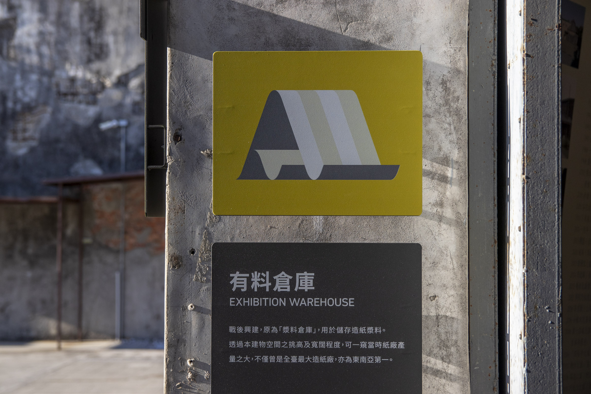
面對園區內結構相似、連貫配置的工業遺構建築群,一般指標尺寸與樣式難以清晰區辨。因此我們導入「牆面大型編號塗繪」的設計策略,提升遠距可辨識性,也強化場域中「紙廠歷史」的連結。


By painting large-scale numeric titles on certain buildings that share similar structures and coherent locations, we improved long-distance clarity and strengthened their past industrial context.


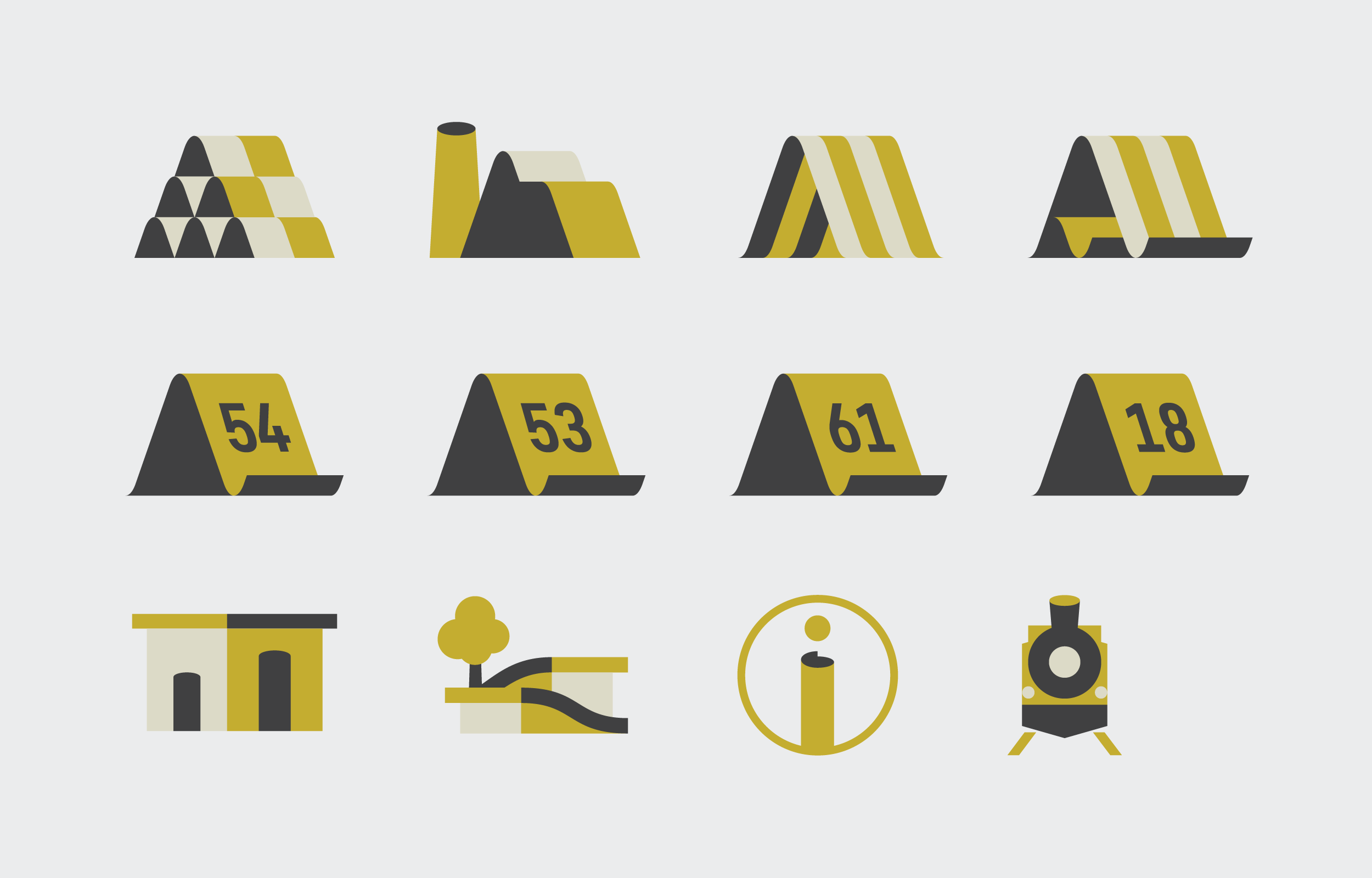
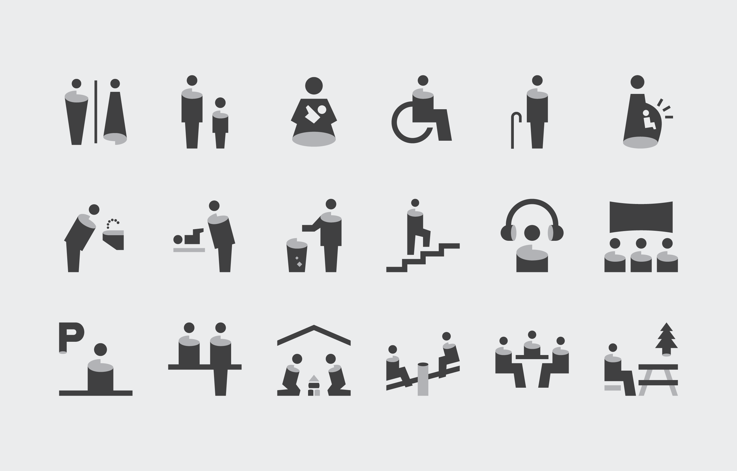
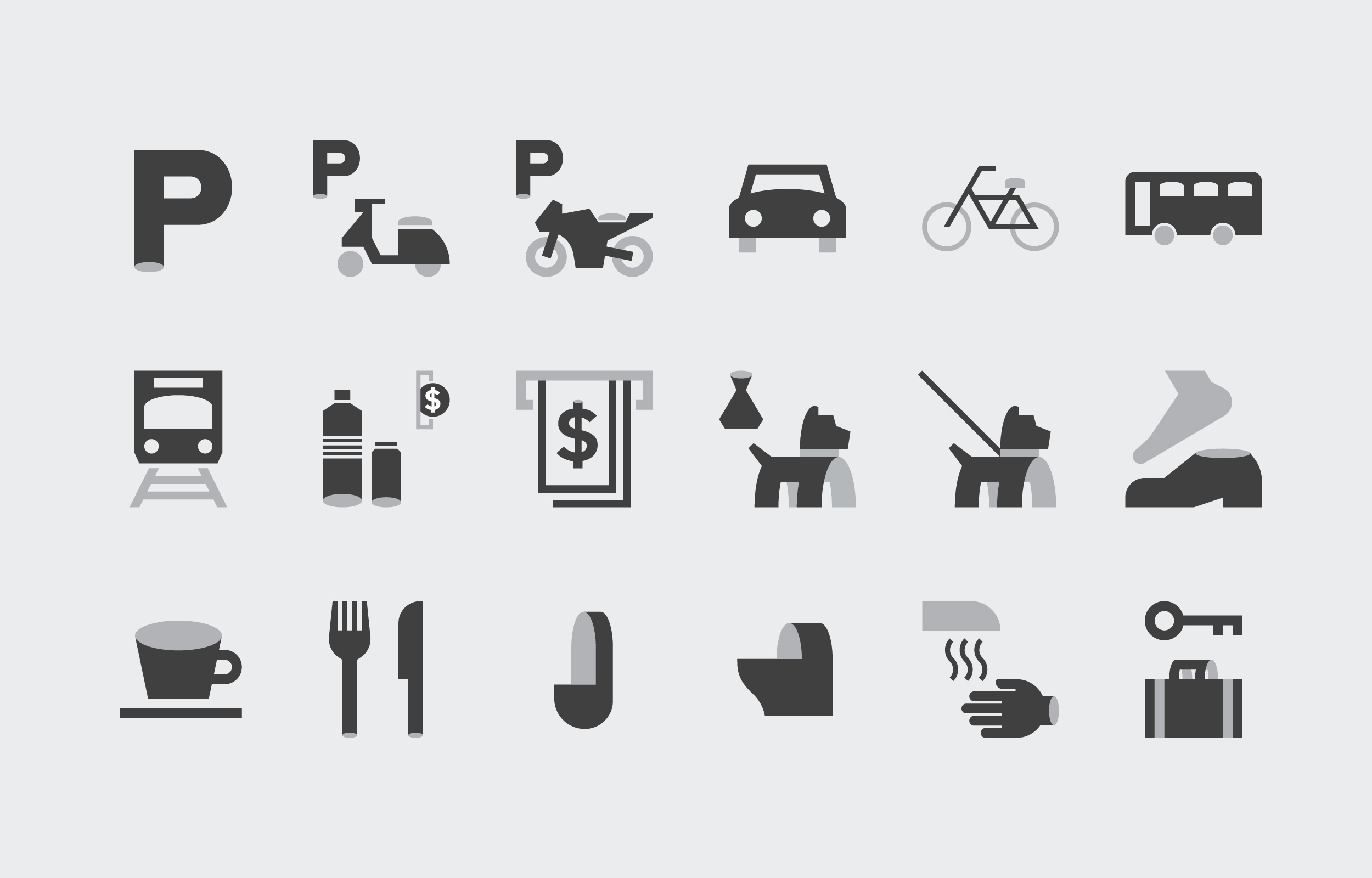
圖標設計  Pictogram Design

圖標設計是此次識導更新中,將焦點回歸園區「紙廠歷史」場域脈絡的關鍵元素。透過紙張彎折與捲曲的意象轉化為構成圖標的造形,一方面解決過往風格混雜的困境,也同時為園區帶來新的視覺語彙。

Pictogram is a key element in the update, returning the focus to the historical context of precedent "paper factory". By transforming the image of paper bending and curling into the shape of the icon, it brings in a new visual vocabulary, and reestablishes a more recognizable identity.


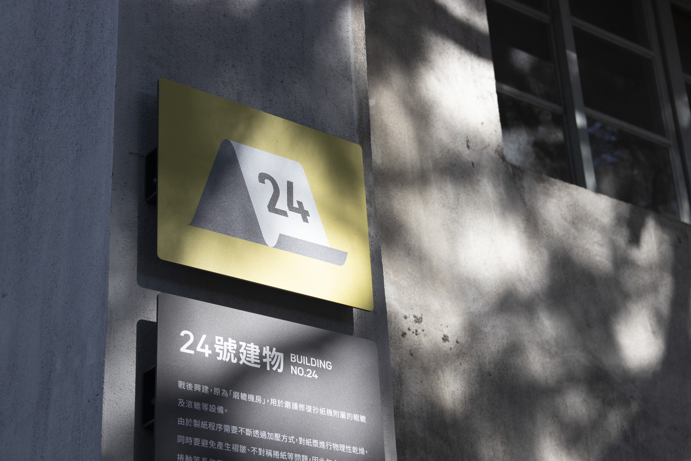
園區未來規劃將逐步開放更多空間,因此圖標設計如何保有擴展性也是一道課題。搭配前述排版中的文字層級,我們得以在圖標中設計編號加入的系統,確保後續指標上的空間圖標保有一致性。

As the park will gradually open up more space, keeping the scalability of pictograms is also a pivotal point. Combined with our layout, a numbering system intergrated in the icons were brought up. This ensurse the consistency of the space icons that will be presented on subsequent signages.


配合指標更新的視覺風格與系統規劃,園區識別標誌也同步進行了再設計。
調整後的圖像標誌簡化掉過往手感痕跡,標準字則趨近中性、呼應規範指定的歐文字體。


In line with the updated wayfinding system, the park's logomark was also redesigned. Over-detailed traces were simplified, and the logotype was adjusted to a much neutral style, matching with the typography inused of this update.

色彩計劃  Color Planning

此次更新中,色彩計劃是風格定奪的關鍵,也是指標功能分類的重要依據。因應戶外工業遺構與景觀植栽錯落的環境,指標設計多採用深灰色背景搭配黃綠主色來呈現。深灰色既呼應周圍偏淺灰的工業遺構與地景色彩,又能確保足夠的訊息承載辨識度;而作為主色的黃綠具備清晰識別性,同時維持整體色彩計畫的節奏與秩序。


The color scheme responds to the park’s scenery of relics and plantings with a slightly distinctive green combined with grayscale backgrounds. The former creates a recognizable order and a rhythmic scheme, while the latter accommodates the surrounding structures, ensuring sufficient clarity.


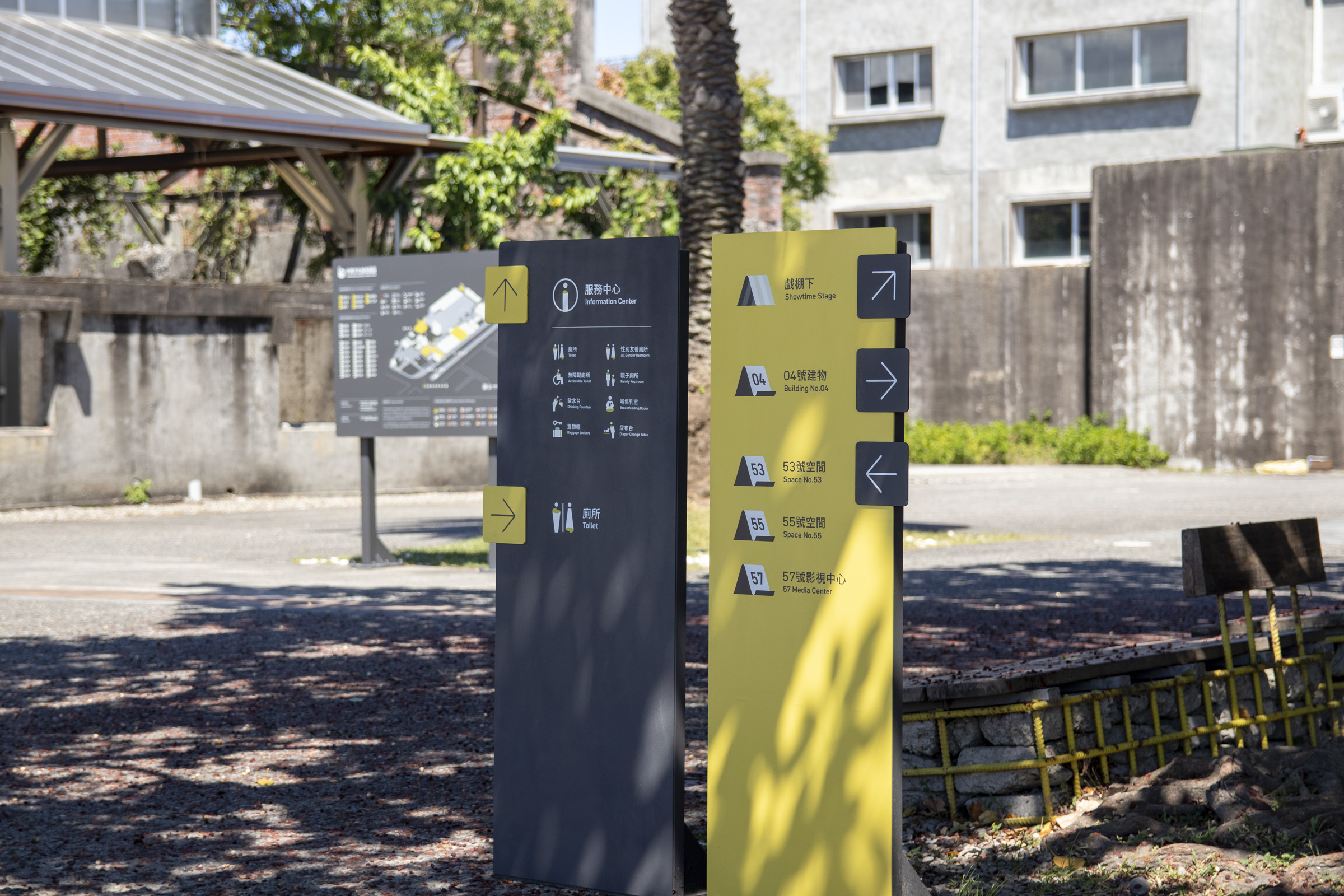
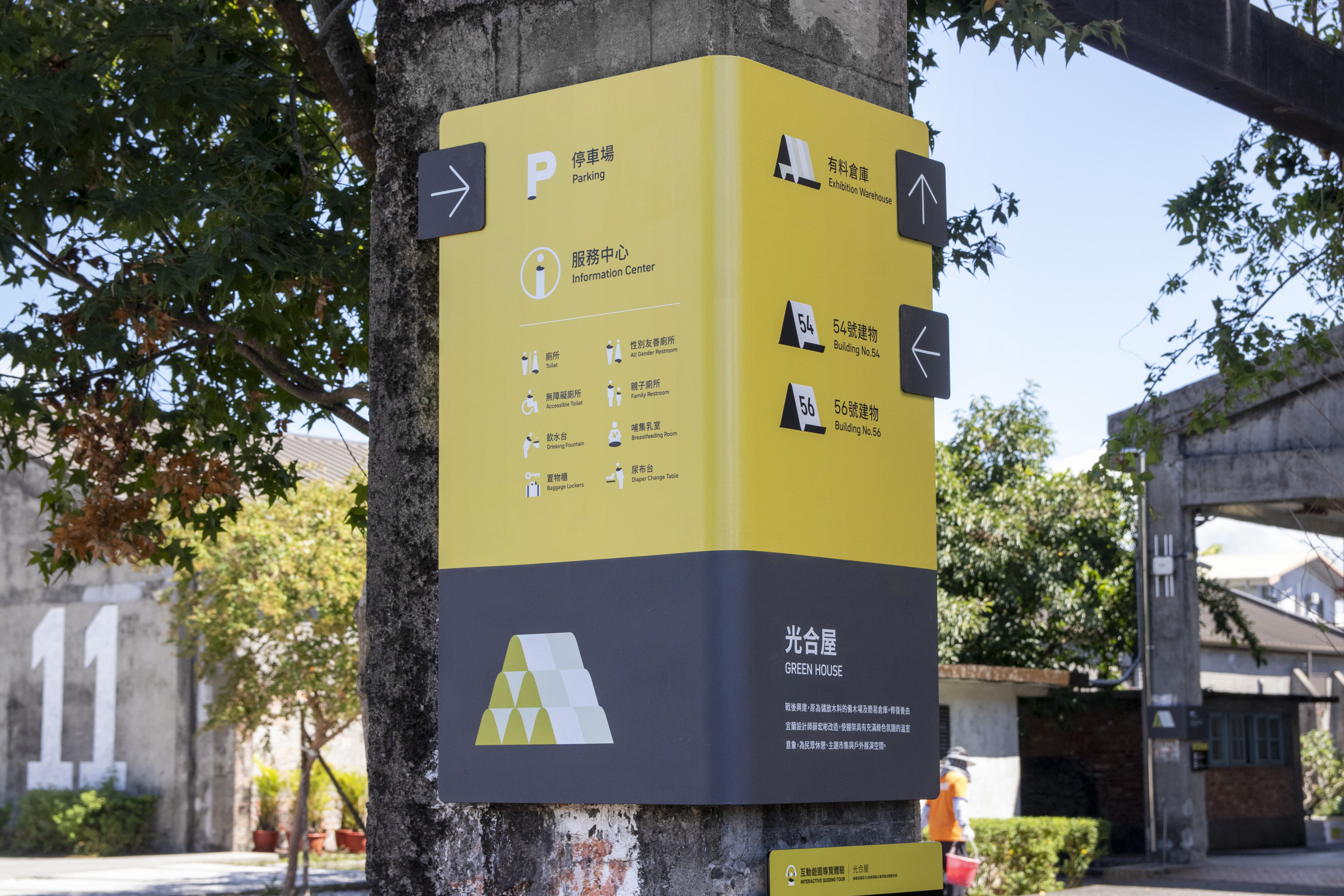
色彩分類上,開放空間與服務設施多使用主色綠作為背景呈現,在維持環境視覺協調的情況下最大化辨識度;透過一致的色彩重複出現,進而形成閱讀上的習慣,也營造出空間整體的個性。
而公共設施與相關資訊等,多使用暗色背景來提高易讀性,呼應工業遺構外觀的同時,也與空間類別做出區隔。


In terms of color sorting, open spaces and service facilities mostly use the primary color as the background. This maximizes recognizability while maintaining the visual harmony of the surroundings. Furthermore, reading habits are formed through repeating appearance, and the overall character of the space is brought out.
Public facilities and information mostly use dark backgrounds to improve clarity, responding to the appearance of industrial relics, while also distinguishing from the precious category.


指標設計 Signage Showcase

介紹完前期規劃與系統設計,以下為整體計劃中部分的指標設計說明:

With the preliminary plannings and system setup introduced, the following is some of the signage designs in the overall plan and their description.


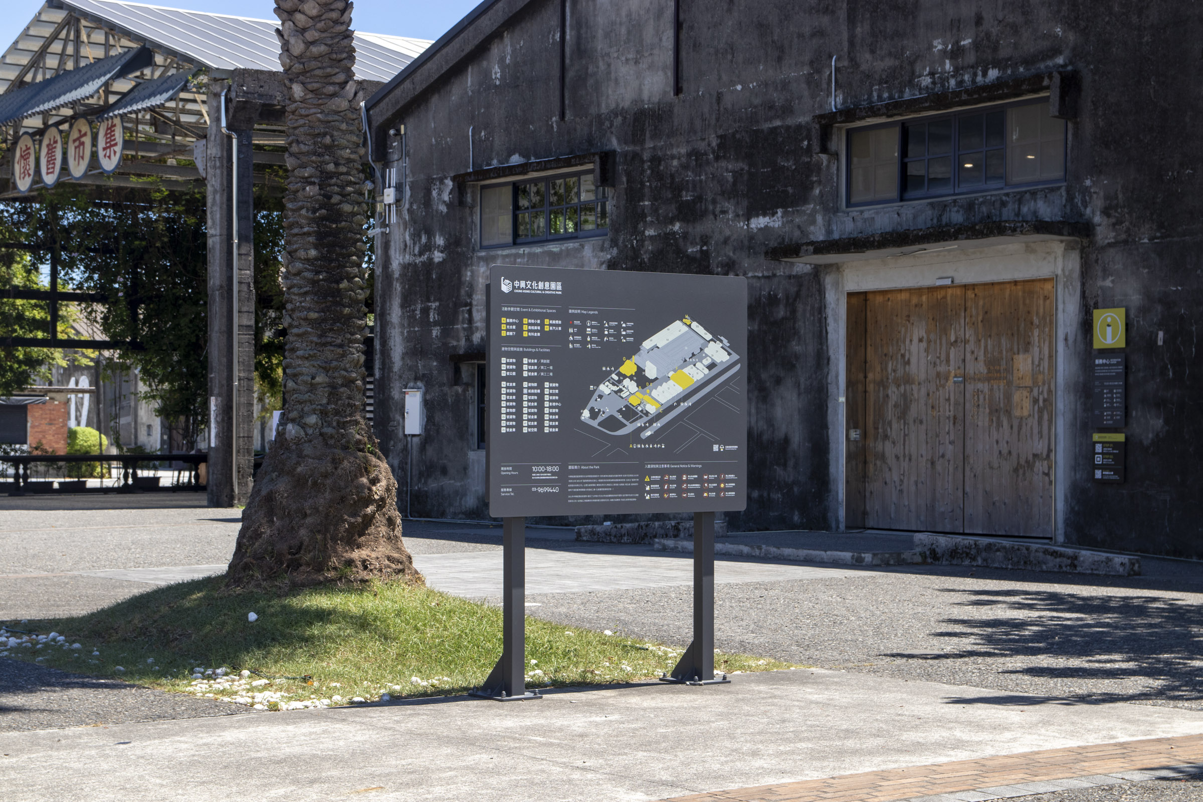
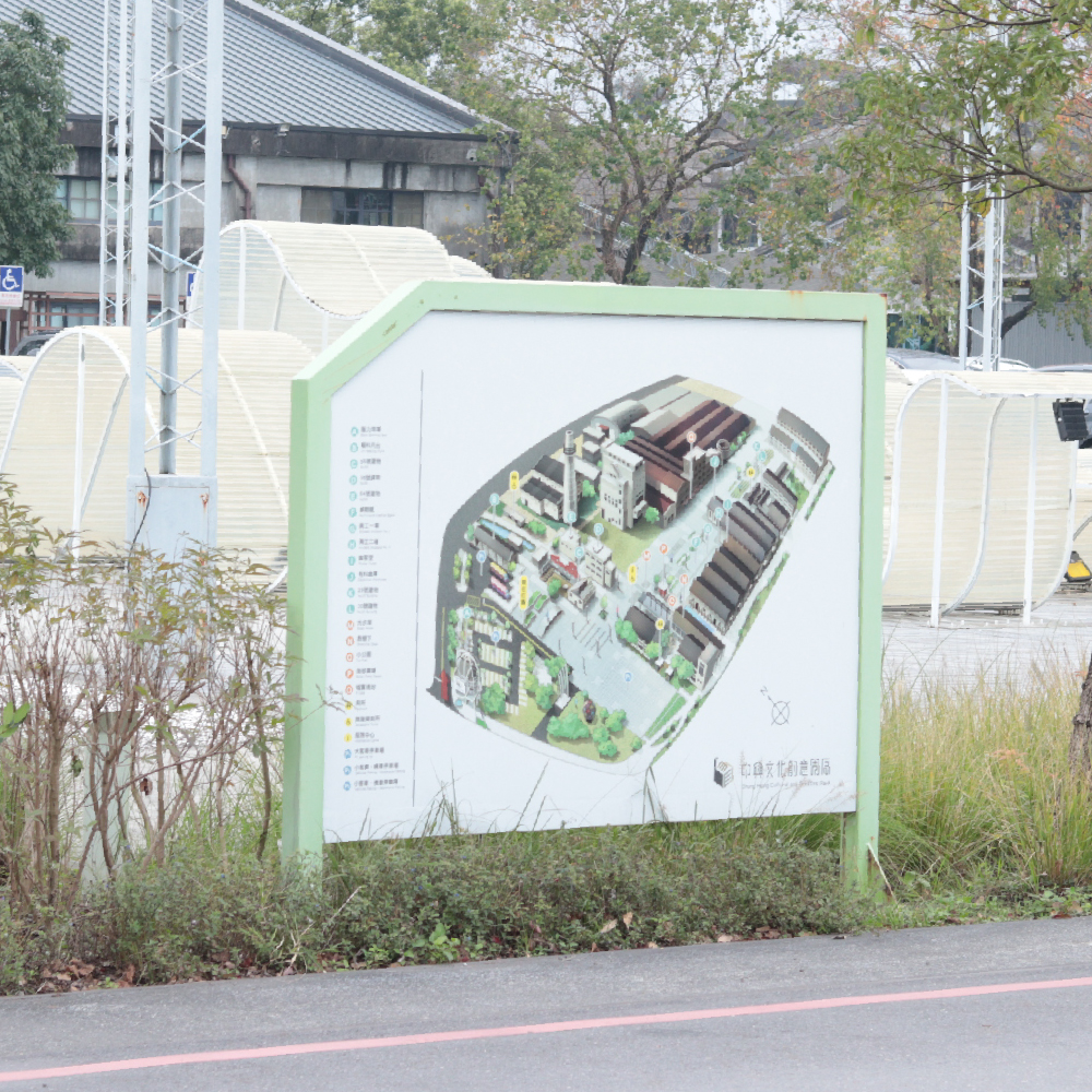
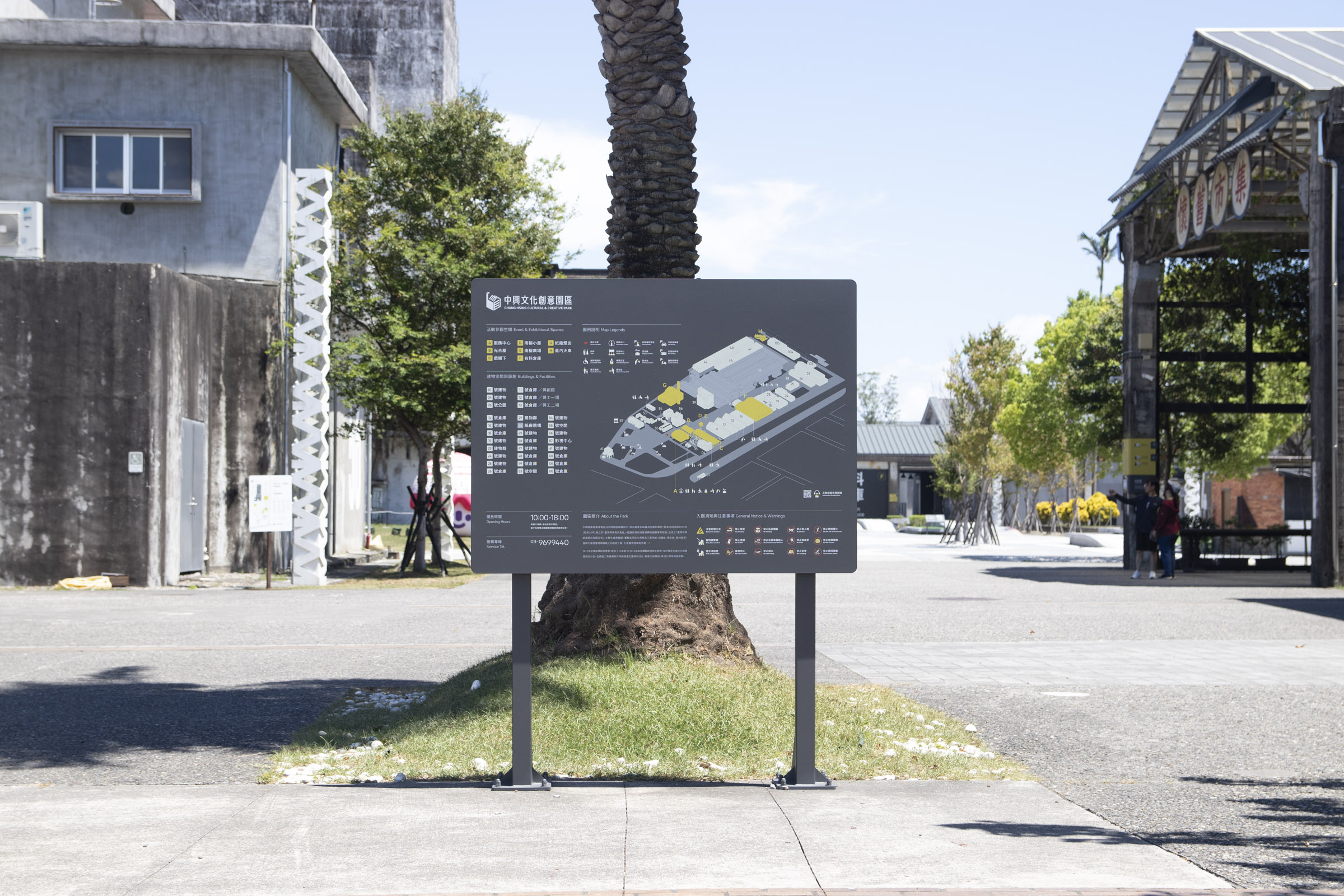
入園地圖 Entrance Map (Main Decision Point)

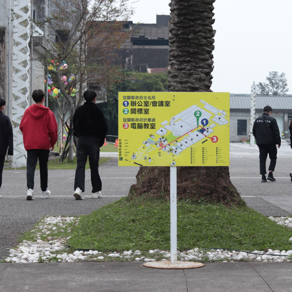
我們觀察到民眾入園的主要動線為停車場末端、服務中心前通道,故在此處設立乘載完整資訊的全區地圖,詳列各處地標與服務設施,以便民眾快速釐清位置並規劃動線。

We noticed that the main entering route is from the passage in front of the service center, connecting the end of the parking lot. Thus, we set up a map of the entire area with complete information, detailing various landmarks and service facilities, ensuring visitors could identify their location and plan their routes.


全區地圖 Central Map (Main Decision Point)

園區前後兩段皆有腹地較大的廣場區域,並且都坐落於參訪的主要動線上。鑑於廣場周圍錯落不少服務設施及參觀地標,我們在中央都有設置斜立型態的地圖指標;以便在此作短暫停留的民眾可以規劃下一步動線。

The front and back sections of the park have large plaza areas, both located along the main visiting routes. Considering many facilities and landmarks surround the squares, we set up tilted map signages in both centers. Thus, visitors staying at the square for a short time can plan their next route.


直立式地圖 Vertical Map (Main Decision Point)

實地觀察時我們注意到駕車抵達的民眾習慣先前往服務中心後方的友善廁所盥洗,隨後從周遭通道進入園區。
然而此區域較不容易匯流至主要動線,因此我們設置版面較小的直立型地圖,避免民眾通行時無法有效尋找指引。

During our survey, we noticed that visitors who arrived by car were accustomed to heading for the washroom behind the service center first, then entering the park through surrounding passages.
However, it is rather challenging to converge into the main visiting routes from here; therefore, a smaller vertical map is set up to prevent people from having a hard time finding directions when passing through.


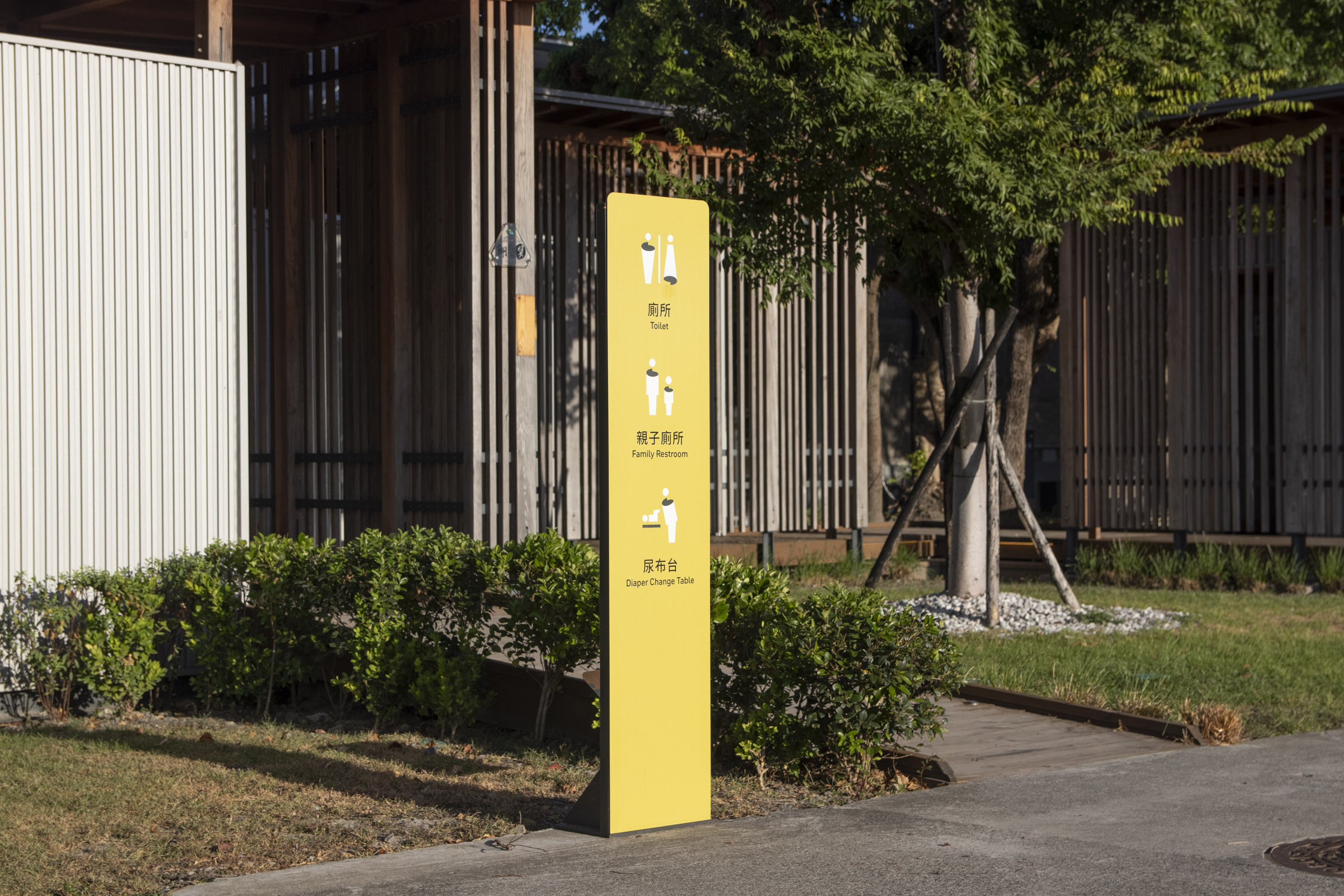
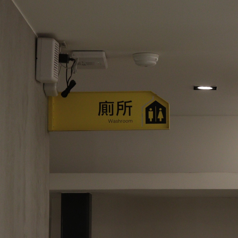
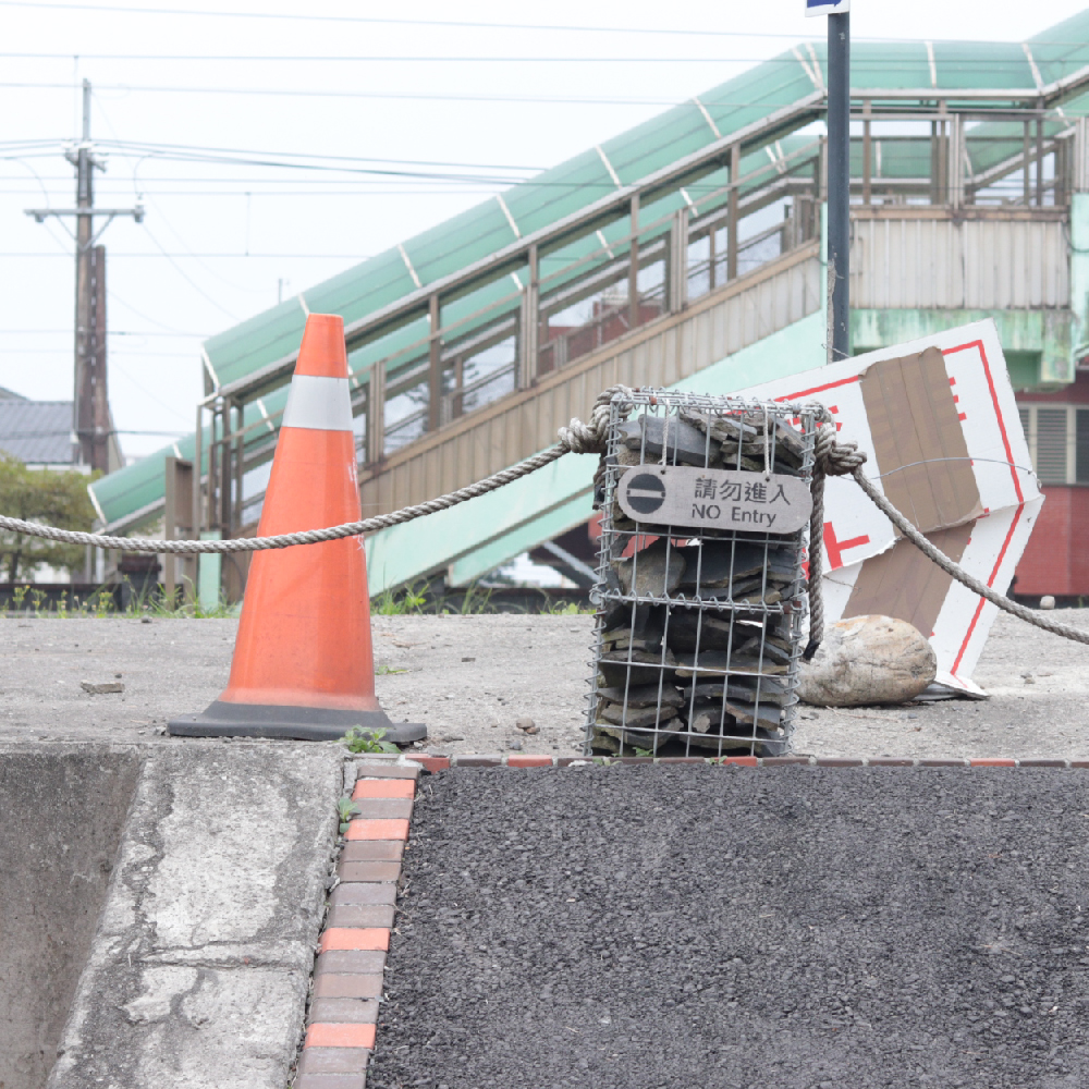
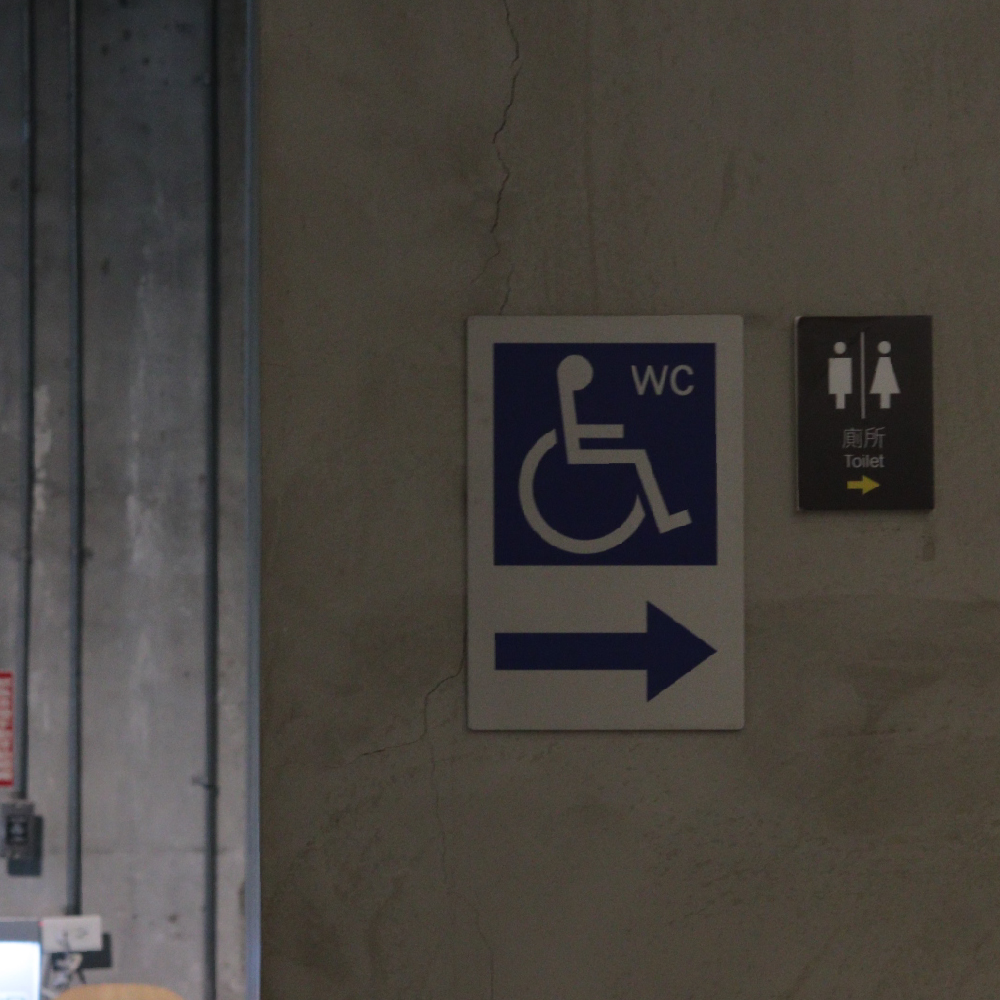
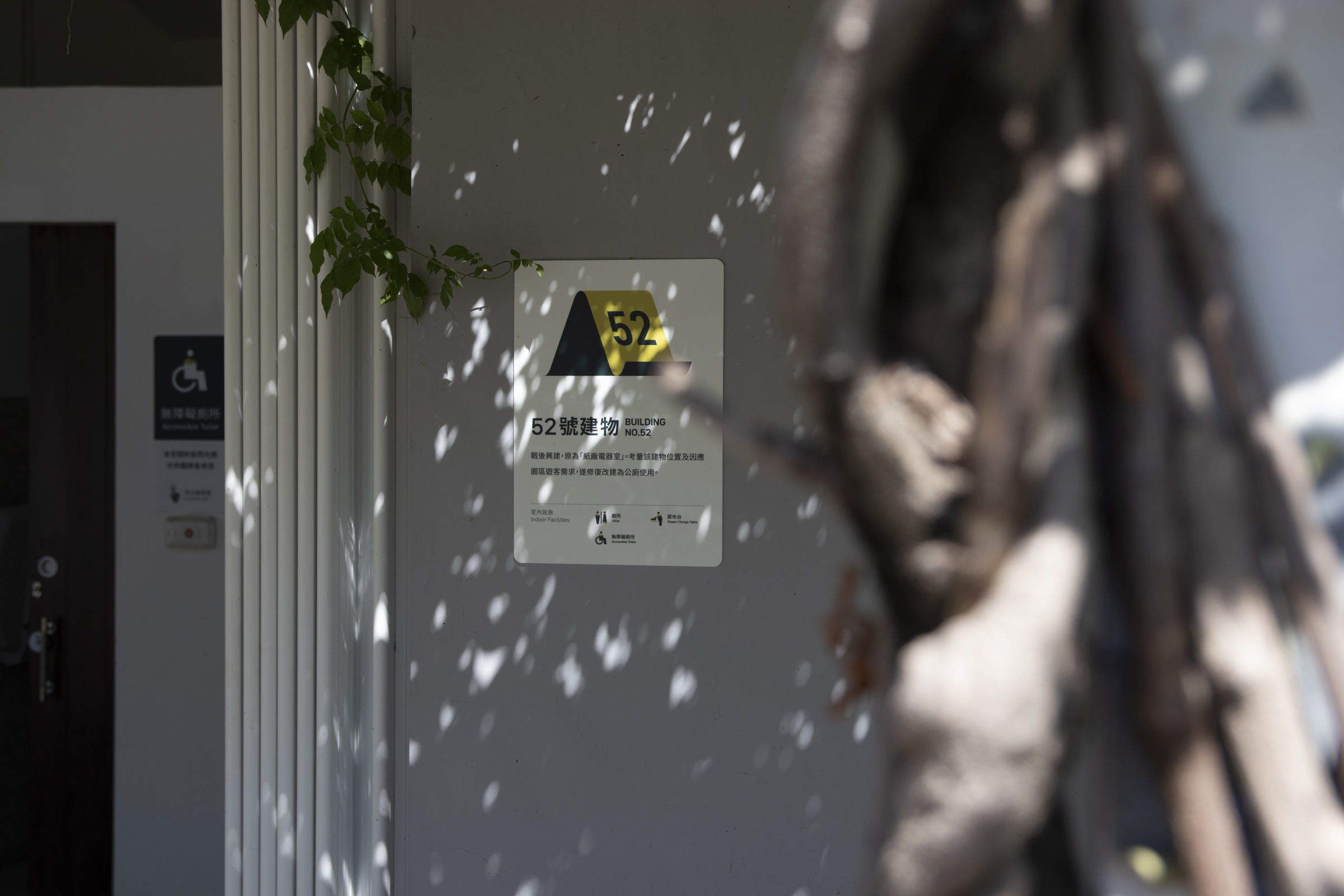
友善廁所標誌 All Gender Restrooms

延續前述觀察,我們注意到停車場末端以及園區中段後方的友善廁所使用人數較多,然而舊有指標辨識度不足、導致民眾詢問頻繁。
因此在廁所入口處接製作了較為顯著的牌面,也特例改用主色作為背景,增加環境中的識別性。

In addition, we noticed that the "All Gender Restrooms" at the end of the parking lot and the middle section of the park were frequently visited. However, the former signs were not recognizable enough. In response, more prominent signages were set up at the entrance of both restrooms, and the primary color was used as an exception to increase recognizability in the surroundings.


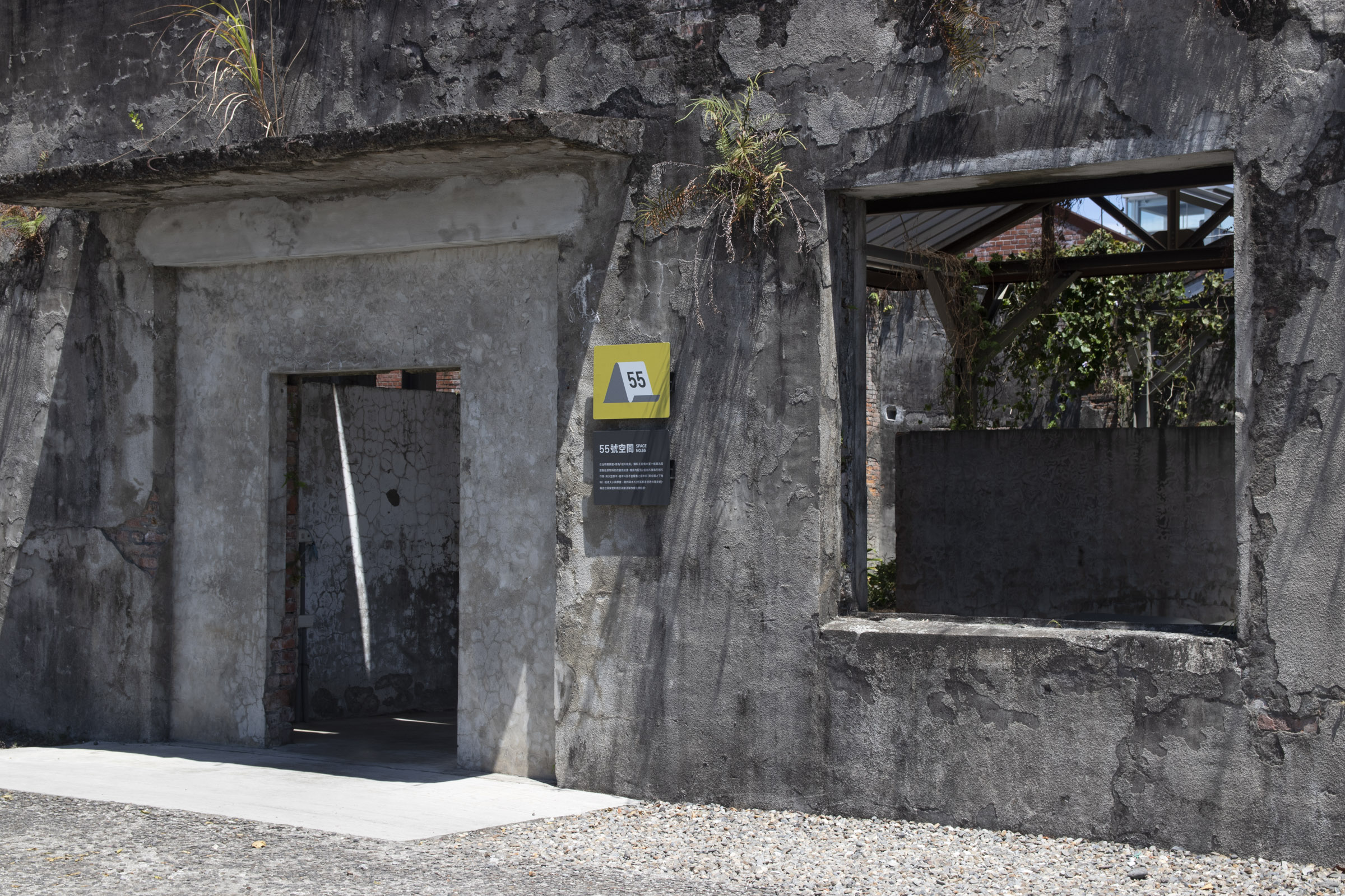
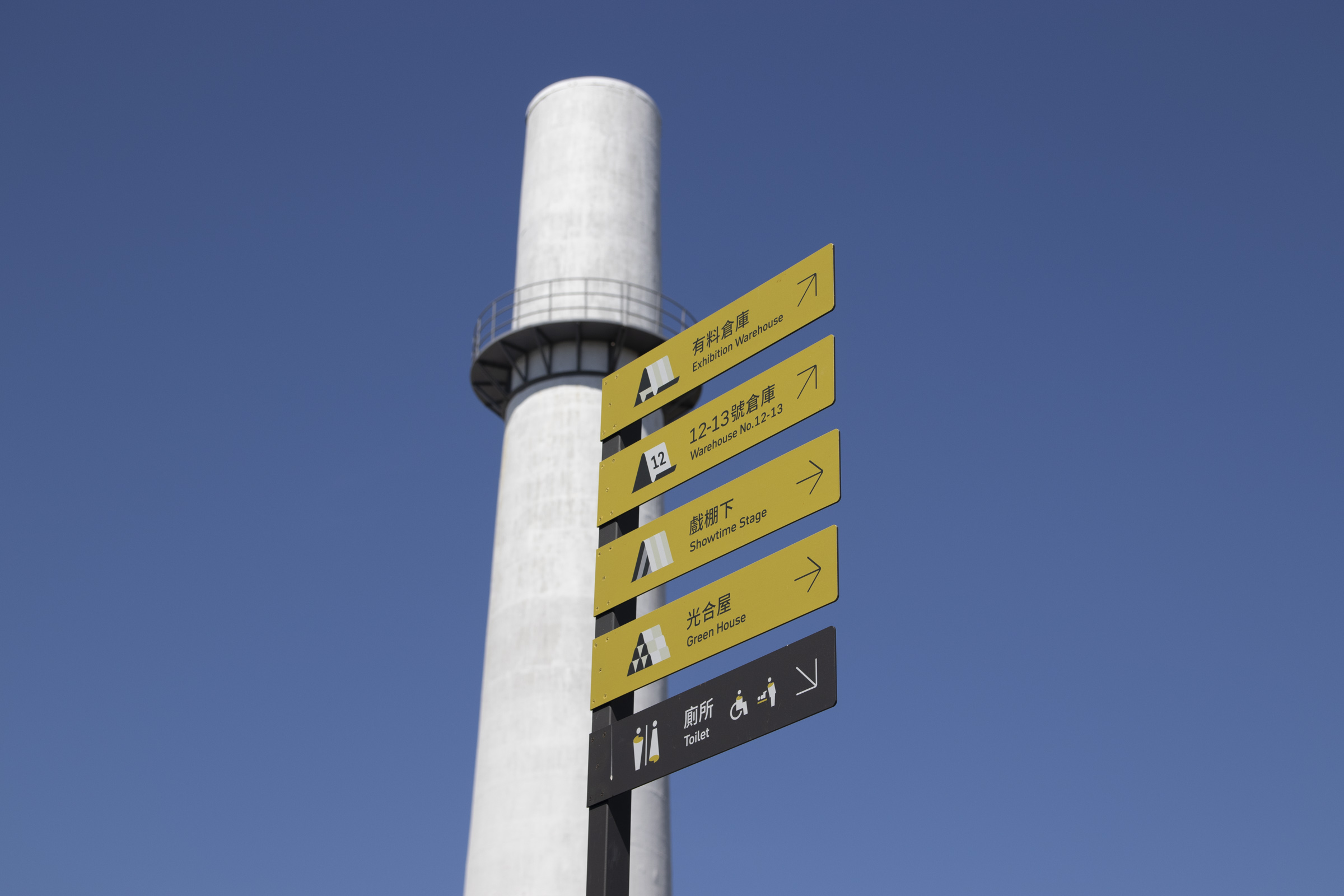
方向指標 Wayfinding (Sub Decision Point)

園區建築歷史悠久、經歷不同階段的變革,在建築周圍或空間交接處常有無法直接觀察到重要設施指標的情況。
故依照不同區域的常見需求,如地標或文化空間參觀、乃至基礎設施的導引,我們設立了承載不同方向指標的牌面,避免民眾在複雜的環境中對路線感到不確定。

The buildings in the park have undergone long history of changes at different stages. It is often difficult to directly observe important facility around corners or intersections of spaces. Thus, we set up signs with different direction indicators which lead to common needs amid various areas, such as landmark or cultural space visits, and infrastructure wayfinding. This aims to avoid visitors from feeling frustrated while on their route.


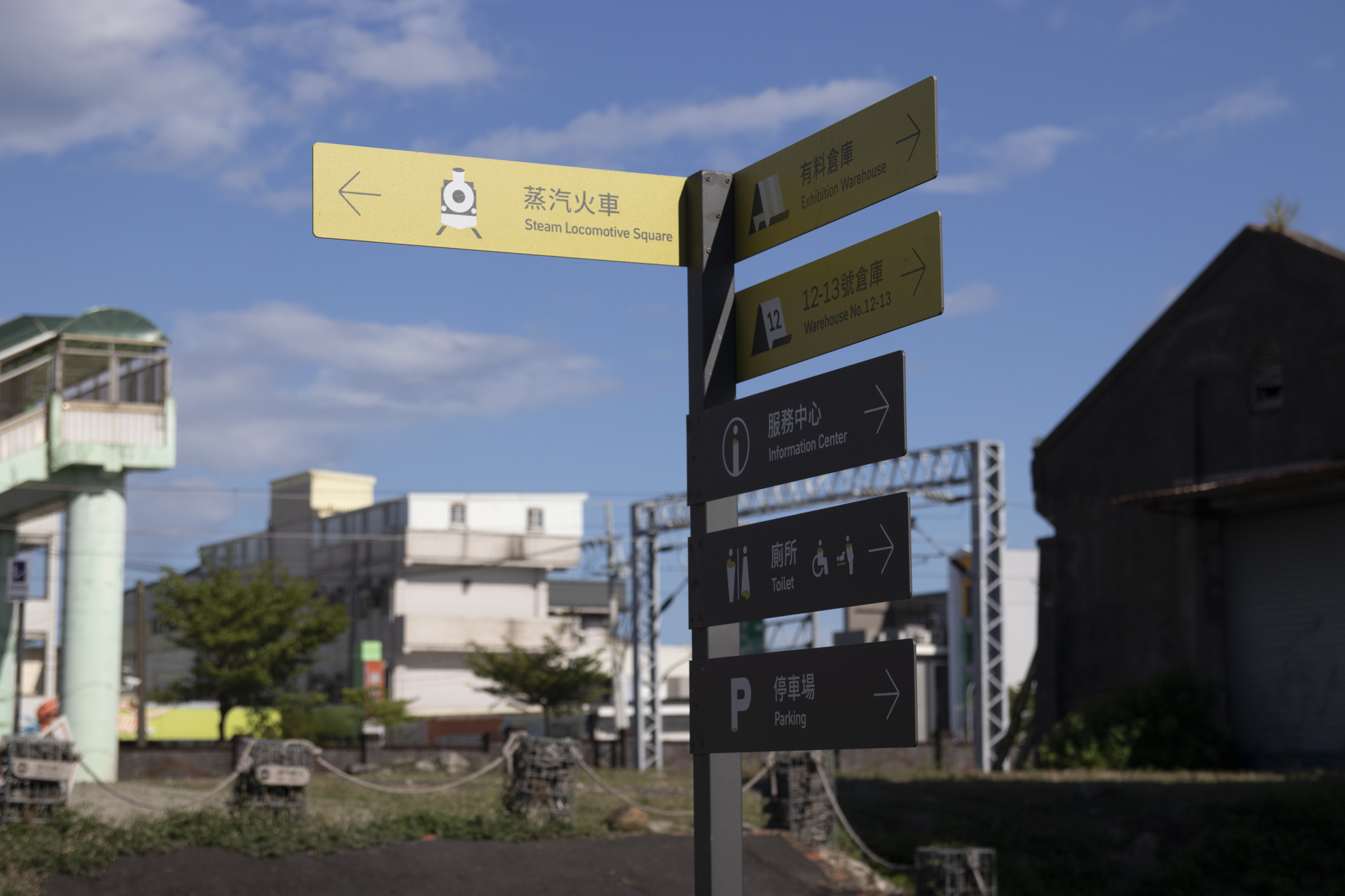
方向路牌 Wayfinding (Sub Decision Point)

園區多數通道較為狹長,在指引上也容易有前述狀況;加上園區戶外為開放空間,入園動線因人而異。
因此,我們在許多節點安裝較高的方向路牌,指引初步入園的民眾抵達一些重要地標,以接續其他指標的導引。

Most of the park's passages are long and narrow, which can easily lead to the problems above. Moreover, the park's outdoor areas are filled with open spaces, with entrance points varying from person to person. Hence, we installed directional signs at many segments, leading people entering for the first time toward major landmarks. The guidance of other wayfinding designs can be carried on in such way.


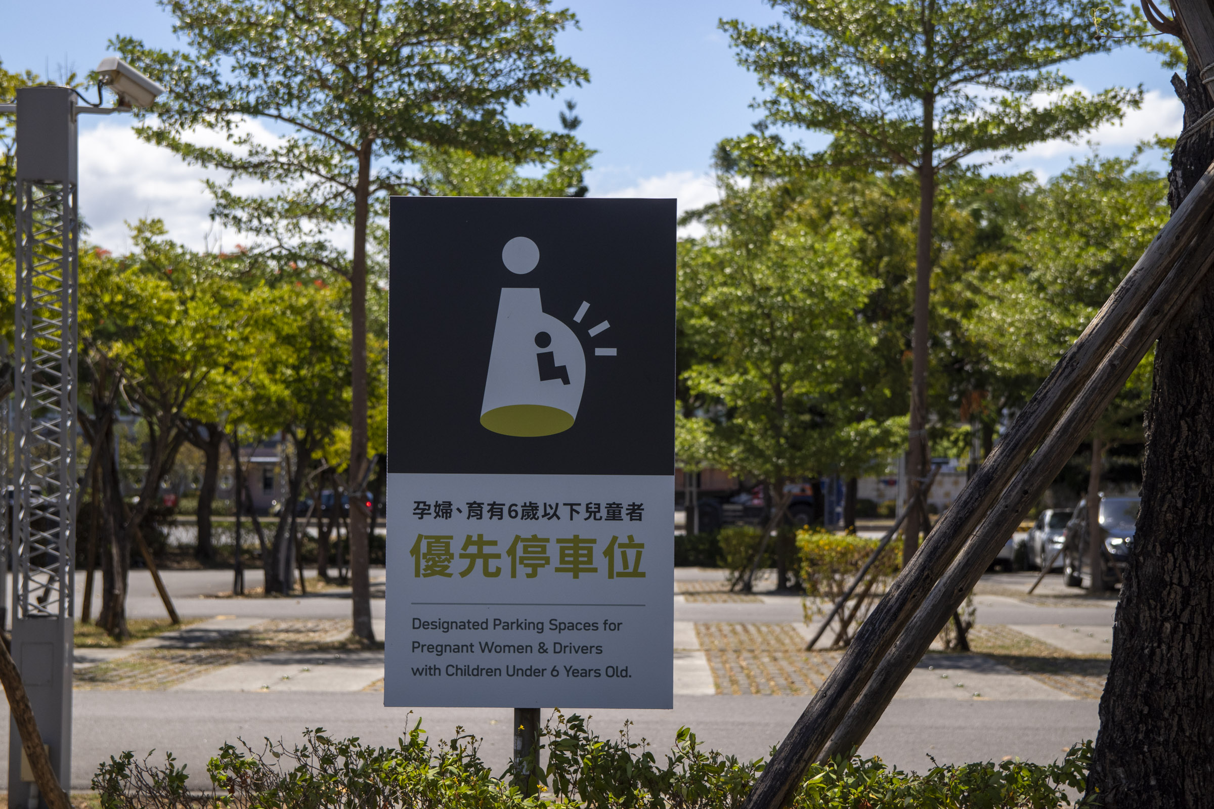
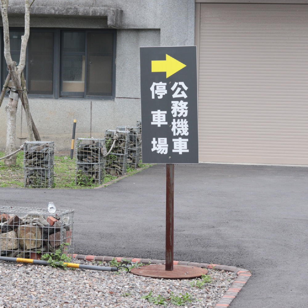
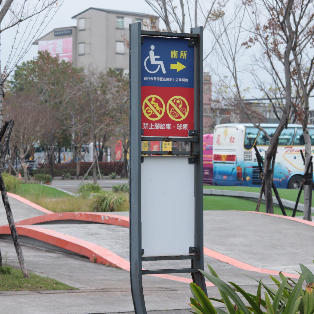
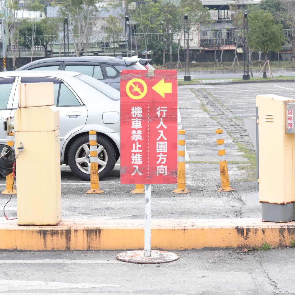
交通標示 Parking Signages

自駕為參訪民眾主要的交通方式,園區前段的停車場中依照車種、特殊群體需求等有種類繁多的規範,因此牌面的易讀性十分重要。

Driving is the main transportation for visitors. The parking lot in front of the park has a wide variety of regulations based on the types of vehicles and the needs of special groups, so the clarity among designs is critical.


CREDITS

中興⽂化創意園區 - 指標系統更新設計
Chung Hsing Cultural & Creative Park - Wayfinding System Redesign


客戶  宜蘭縣政府文化局  中興文化創意產業園區
承攬單位  遠傳電信股份有限公司系統整合分公司
設計單位  跡地有限公司

CL  Chung Hsing Cultural & Creative Park, Cultural Affairs Bureau Yilan County
AD  劉銘傑 Ming-Jie Liu  錢柏翰 Po-Han Chien
D  錢柏翰 Po-Han Chien  王祥宇 Xiang-Yu Wang  吳泓震 Hung-Jen Wu

動態設計  伍聖耀


本作品部分圖標設計參考自台灣設計研究院《公共圖標系統》,依據創用CC「姓名標示 4.0 國際(CC BY 4.0)」授權使用。
Pictograms in this work are partially adapted from the “Public Icon System” by the Taiwan Design Research Institute, licensed under CC BY 4.0.   Original Source︎︎︎