(2018)
04. Remains on the Track
(2021)
(2021)
(2021)
(2021)
(2022)
(2022)
(2022)
(2022)
(2022)
(2023)
(2023)
(2024)
(2025)
(2025)
Wayfinding System Redesign of Chung Hsing Cultural & Creative Park.

The redesigned wayfinding system for “CHCC Park” returns its focus to the site’s historical context of "former paper factory", while considering the present scenery of industrial relics.
By incorporating the imagery of paper being bent or folded, a unique visual vocabulary was established to present a distinct identity suited for navigation purposes and future expansions.
# WAYFINDING SYSTEM DESIGN
CLIENT/ Chung Hsing Cultural & Creative Park, Cultural Affairs Bureau Yilan County
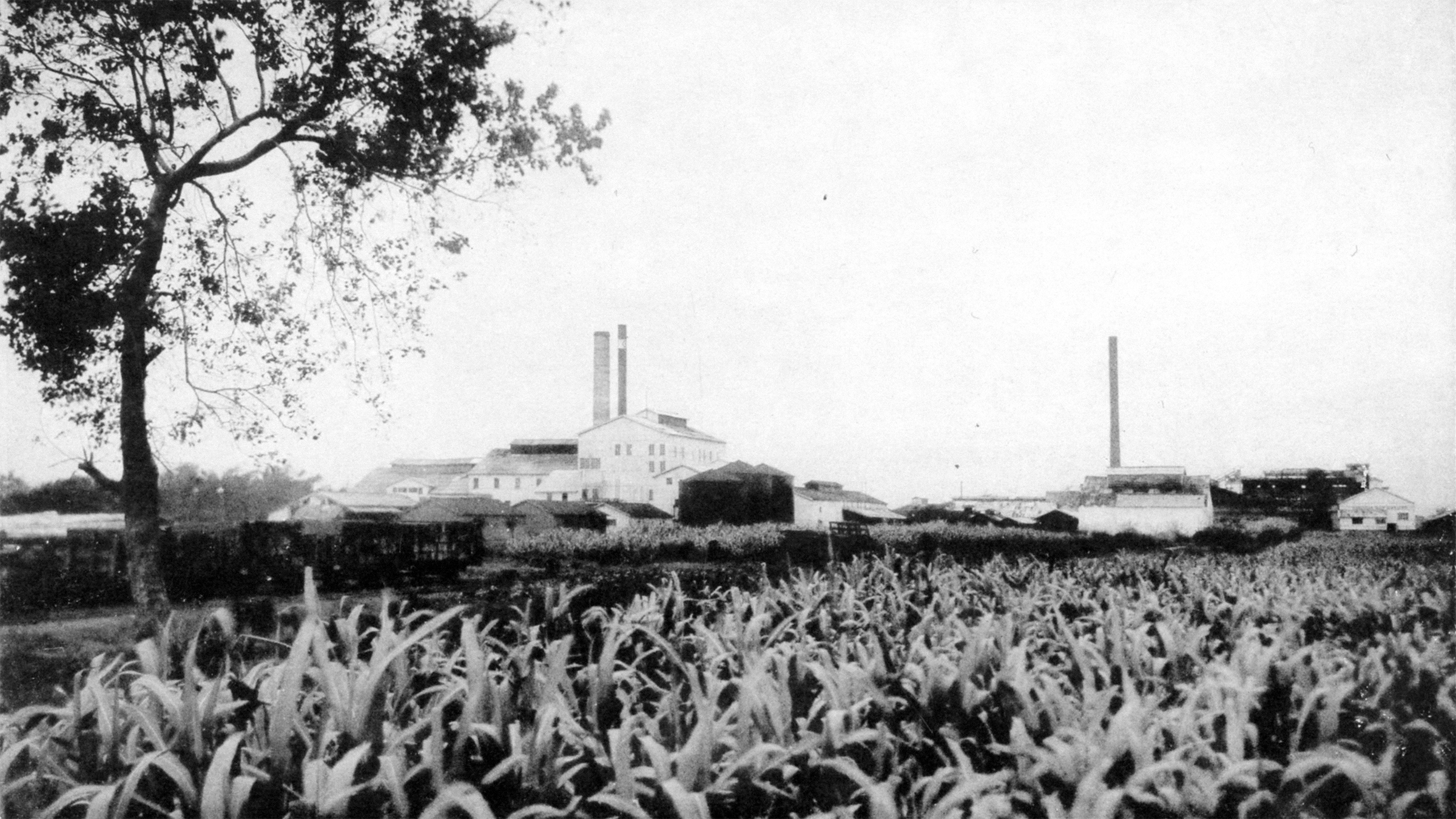
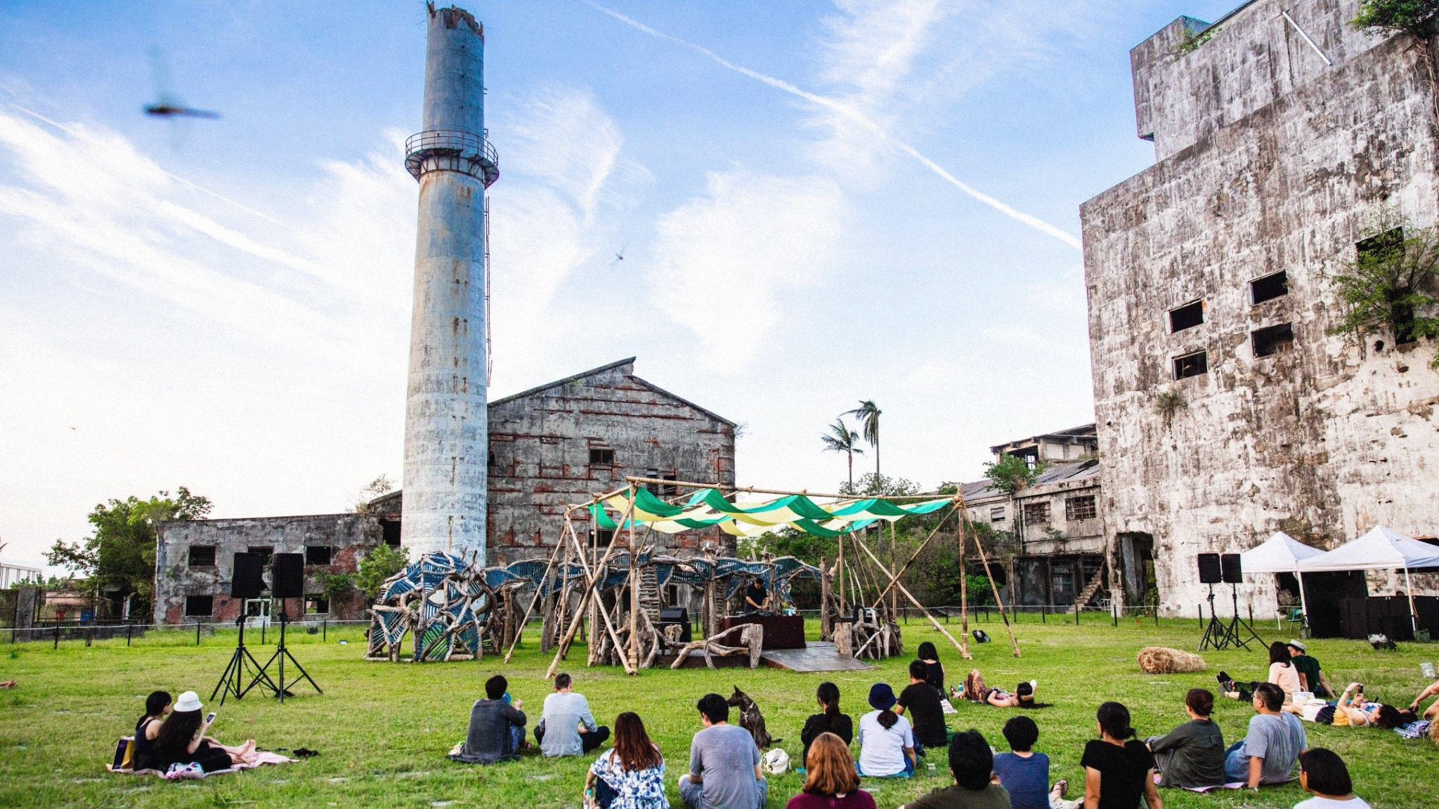
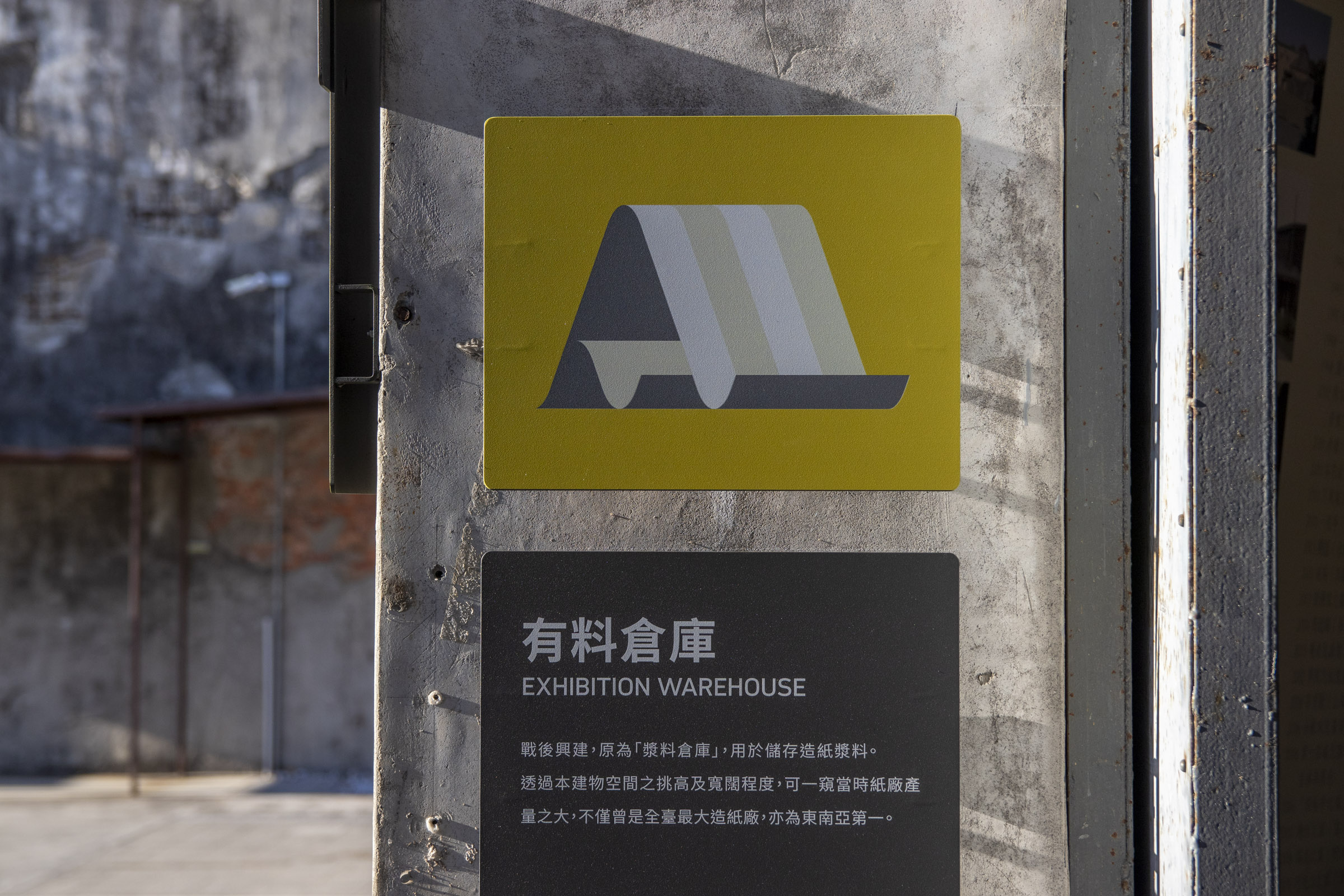
The predecessor of the Chung Hsing Cultural and Creative Park can be traced back to the Taiwan Industrial Corporation, which was established in 1935. It was later reorganized into a state-owned paper factory.
In 2013, the Yilan County Government initiated the preservation and revitalization of industrial heritage within the park. Since then, it has gradually developed into a space for cultivating and operating local cultural and creative applications.


However, after years of operation, no complete wayfinding system was established among the park. Designs with mixed styles had been implemented between different stages of construction, and as operating policies of some facilities had changed, a certain proportion of signages no longer meet actual needs.
Thus in 2023, the park commissioned us to carry out a one-year work plan, aiming to update the overall wayfinding system.
System Update Planning
We started with a field visit, collected opinions from visitors, and organized meetings with businesses.
Space studies were also conducted, laying out visitor flows and decision points, gathering all information needed for our design process.
Wayfinding Updates
Given that the park has a vast space and facilities are scattered over long distances, ensuring the wayfinding system overlaps with the habitual routes of visitors and thus achieves a guiding effect is an crucial point in our planning.


*Rotate your mobile device to have a better grasp of the slider's map.
By introducing "decision points" and creating a variety of levels in our system, we are able to get a better grasp of where our design placements should be, and what key information they must carry.

Locations where visitors most often need to plan their routes after entering are slected as main decision points, including the front entrance, the center of the square, and the toilets next to the parking lot.
The signage is presented with an overall map, and the design changes according to the surrounding environment.
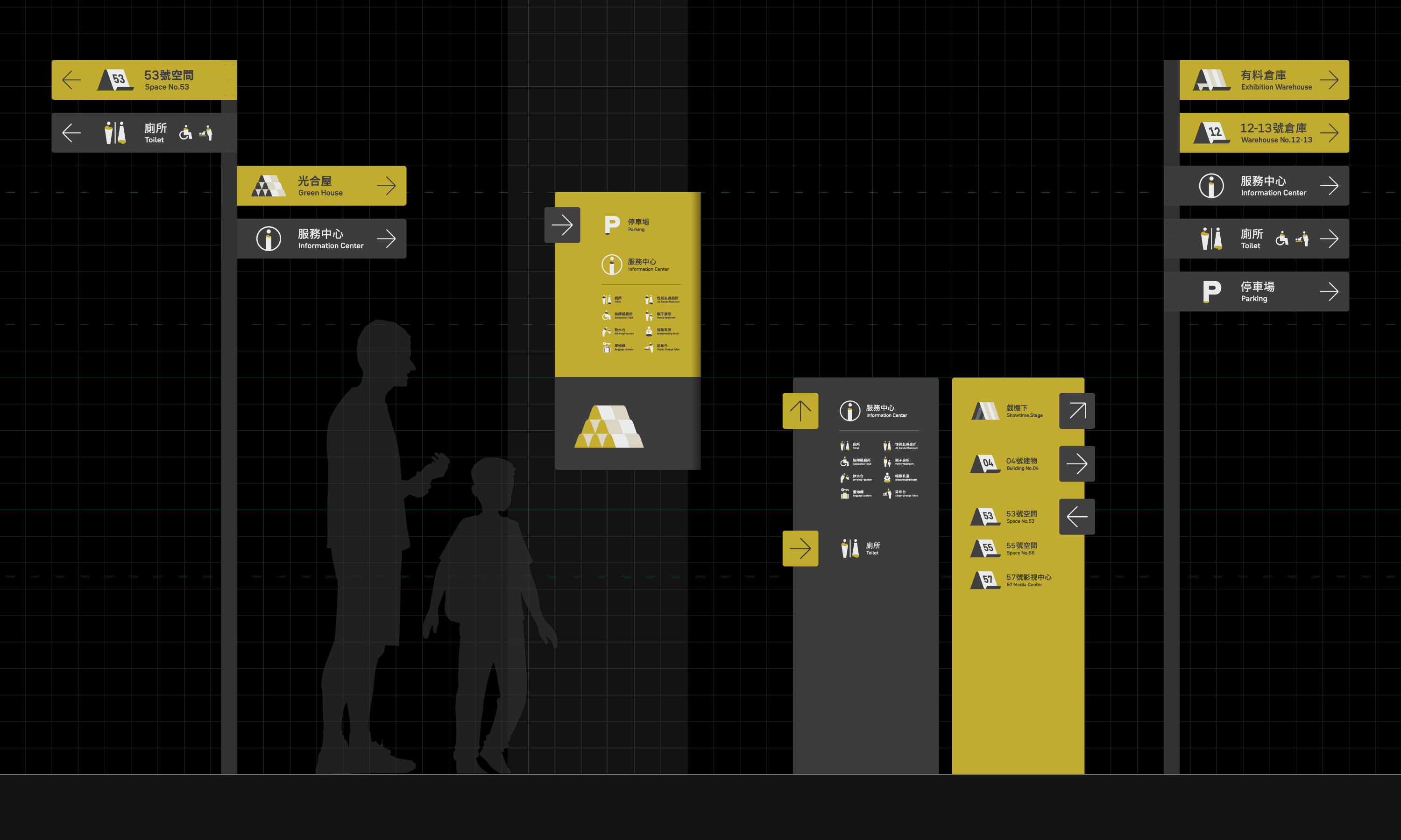
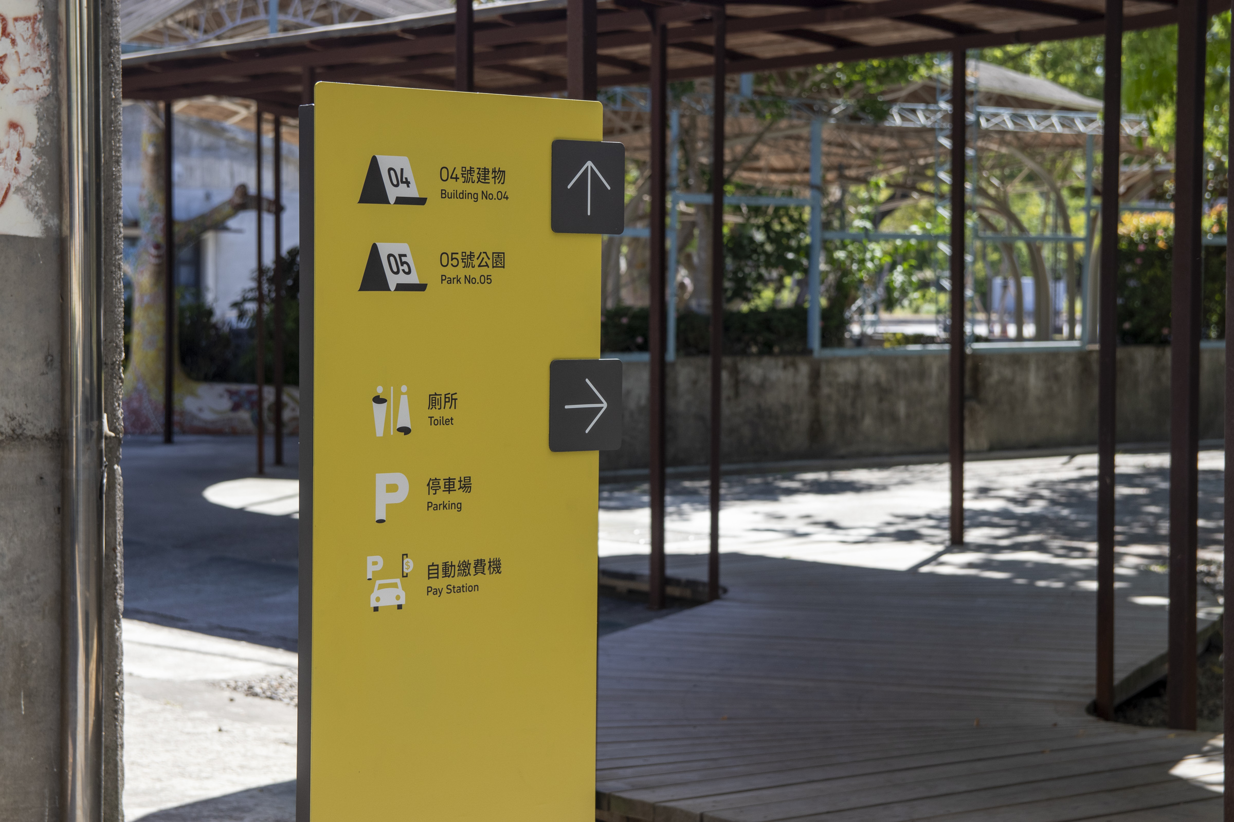
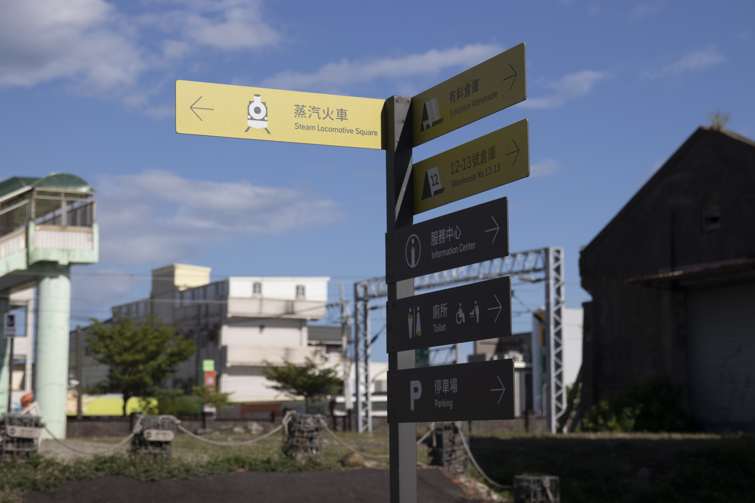
Sub decision points cover hot spots with high demand for guidance of specific facilities, as well as expected visitor routes for flow maintainence.
The signages focus on the wayfinding toward specific locations, mainly presenting directional signs or guidance on surrounding facilities, and occasionally combined with space introductions.
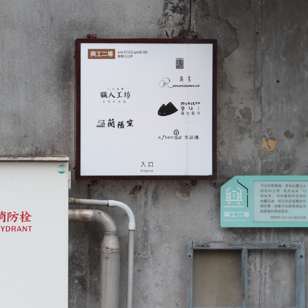
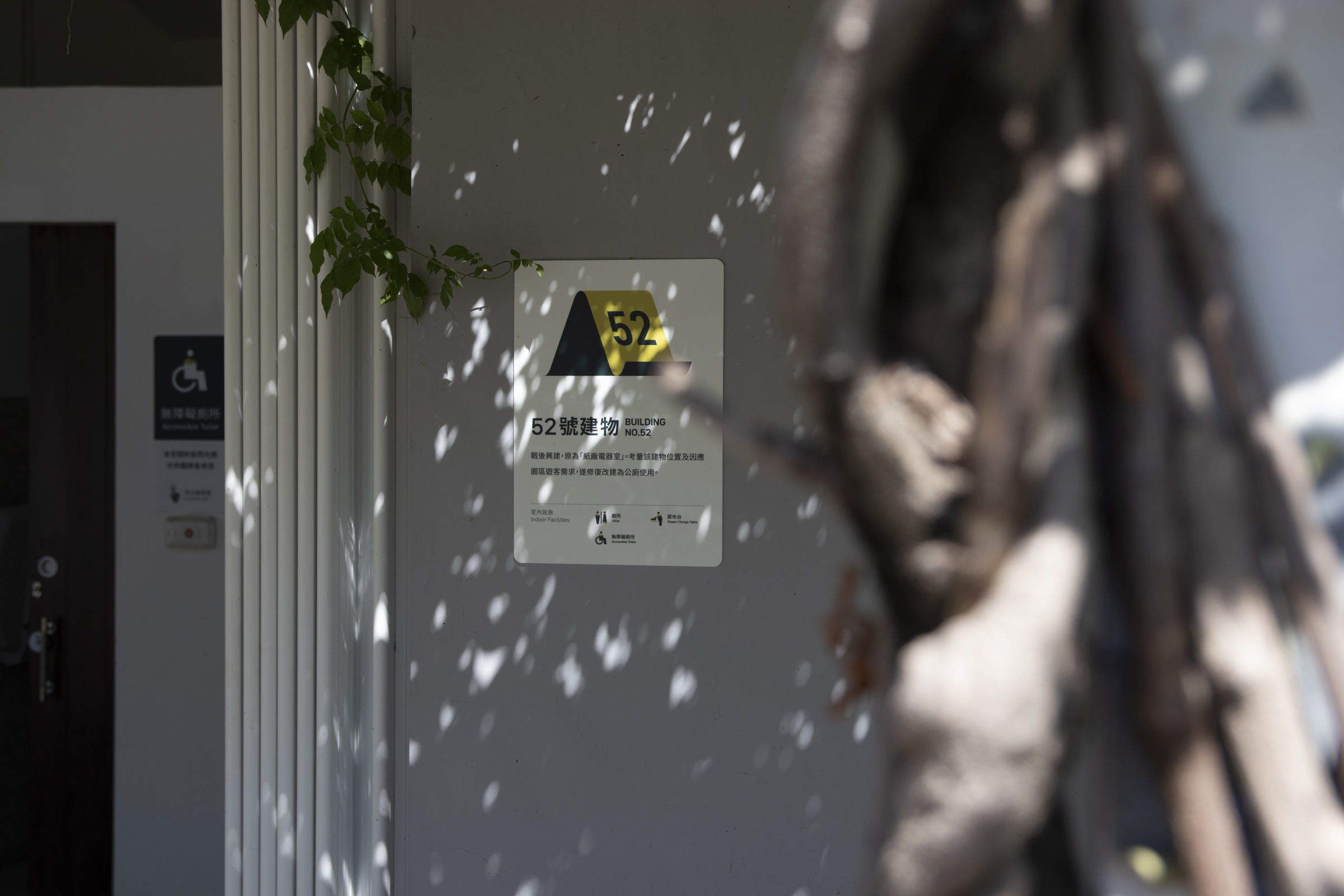
In line with the updated system and future developments, the main facilities and open spaces are all equipped with guidance or introduction signs in our project.
Specific buildings with high traffic also supplement overviews to enhance the overall integrity of the park's wayfinding experience.
Layout Settings
Different levels presented among the layout of our design is also one of the crucial factors.
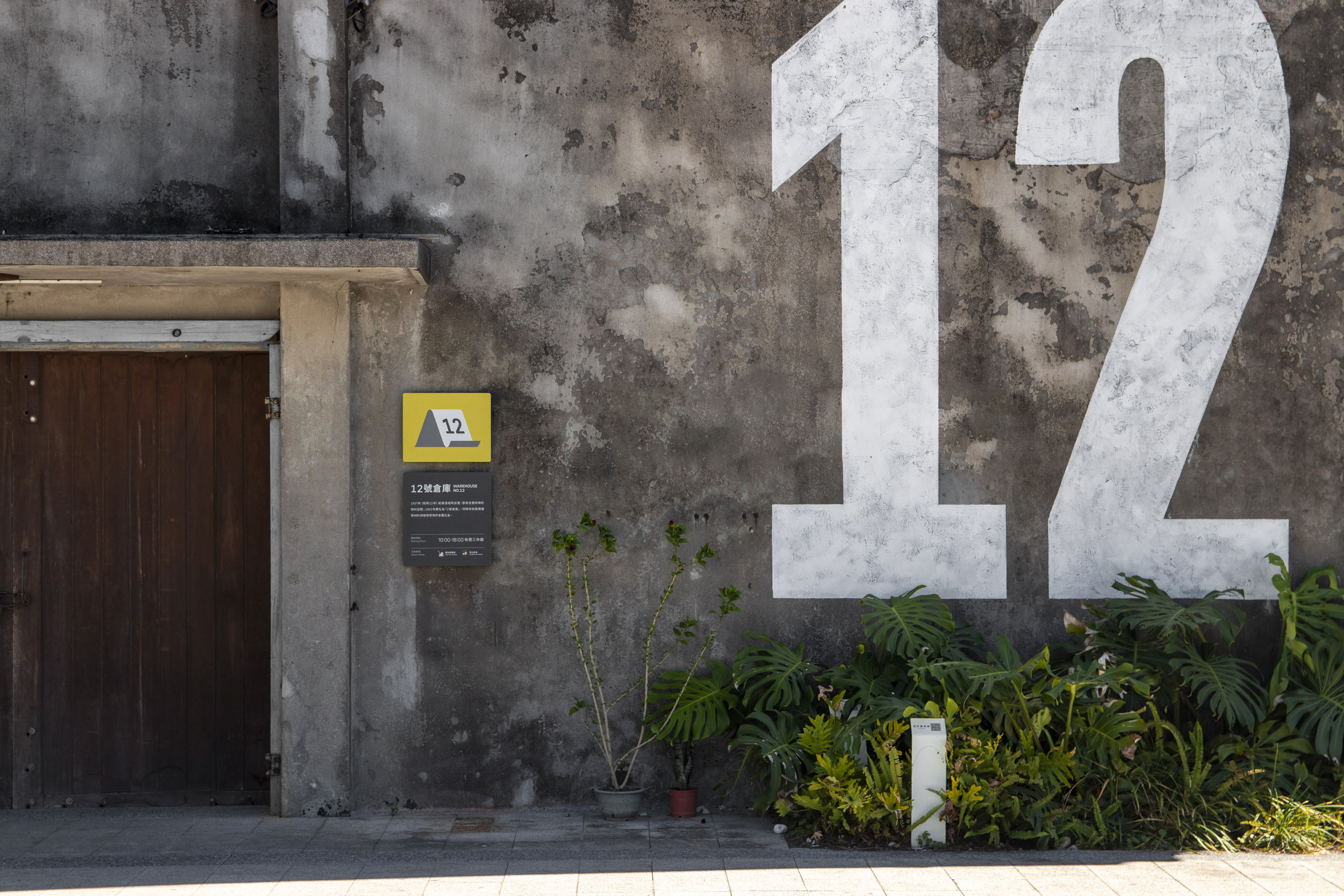
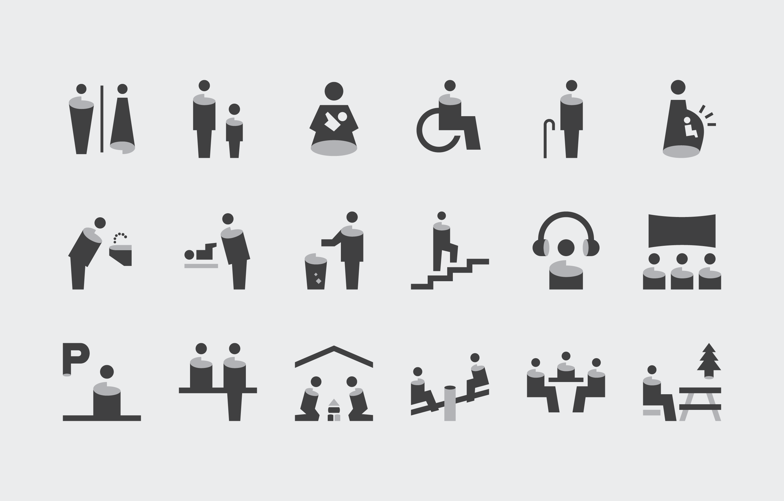
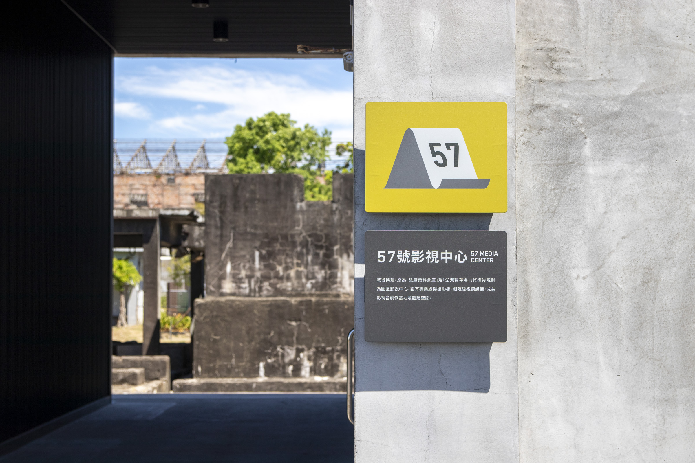
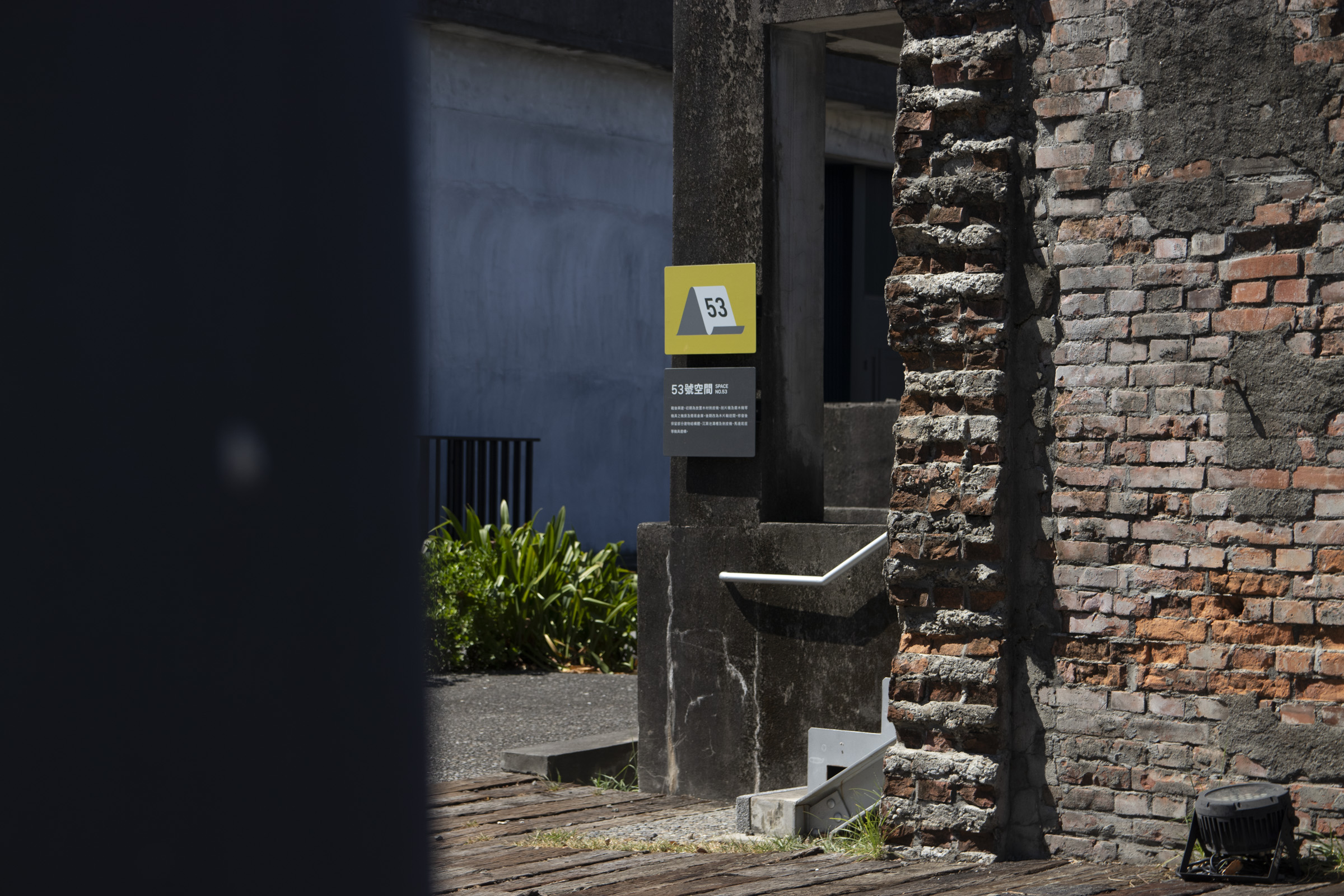
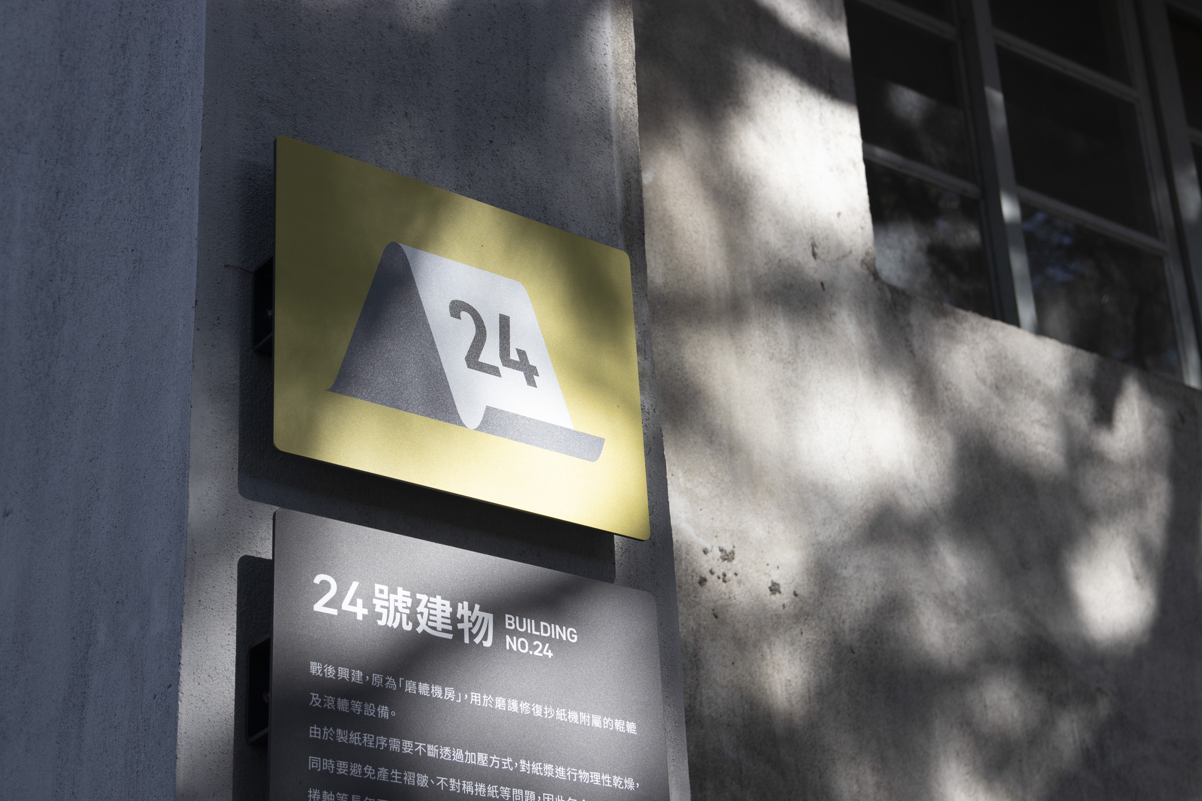
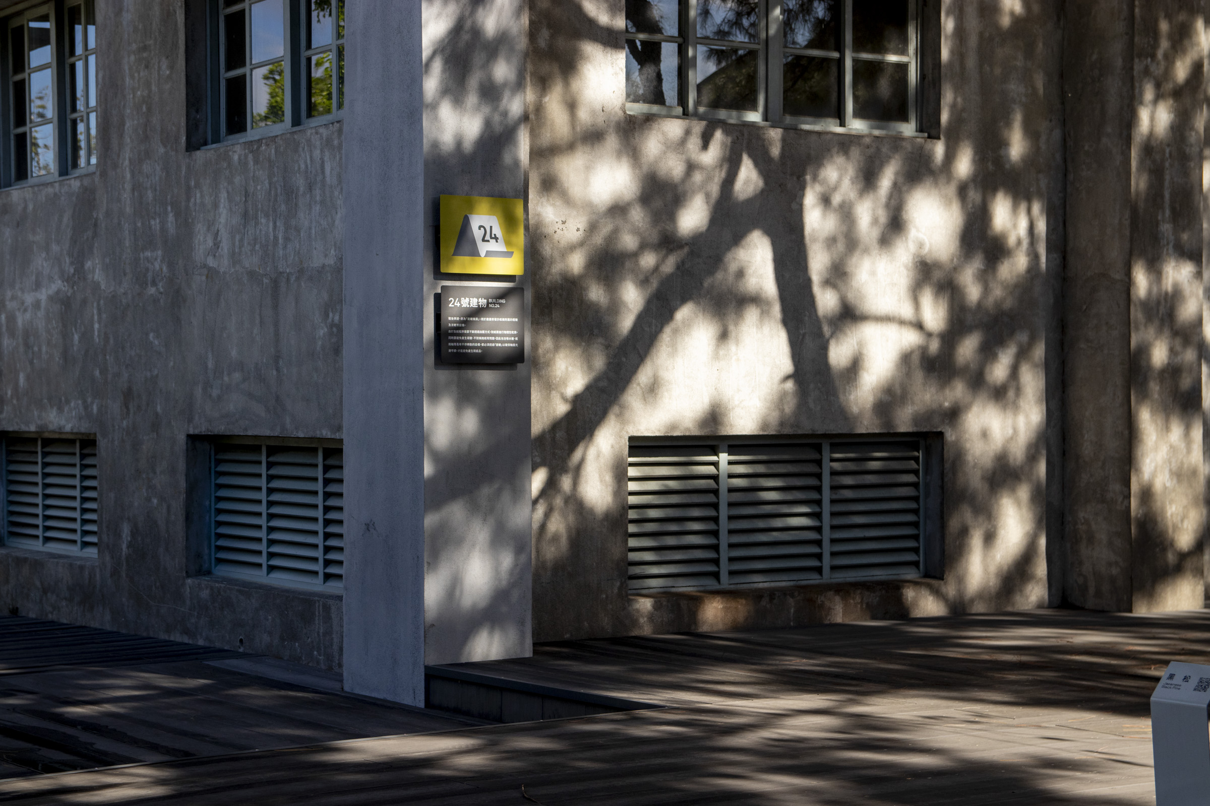
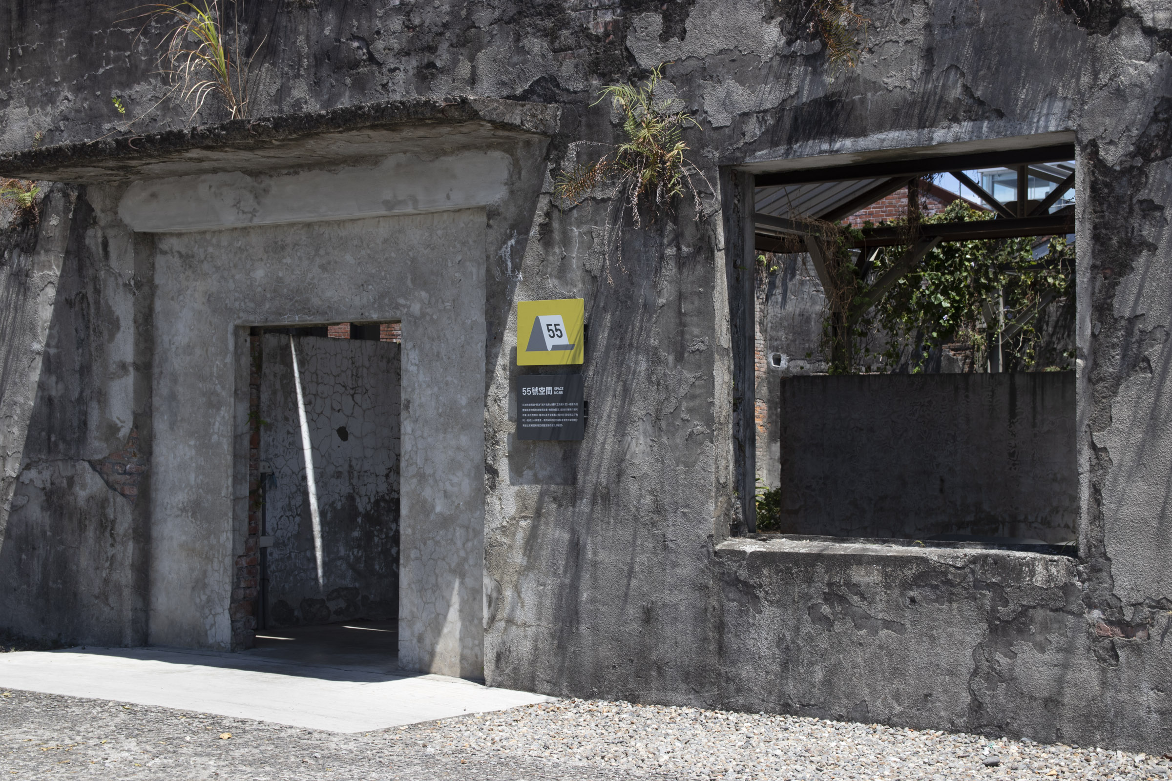
We created various forms of wafinding elements from large to smaller scales, from numeric titles on the walls, numbered labels in pictograms, to basic signage layout.
Efforts were made to maintaining the system's identity and clarity while coordinating with the general public's reading habits.
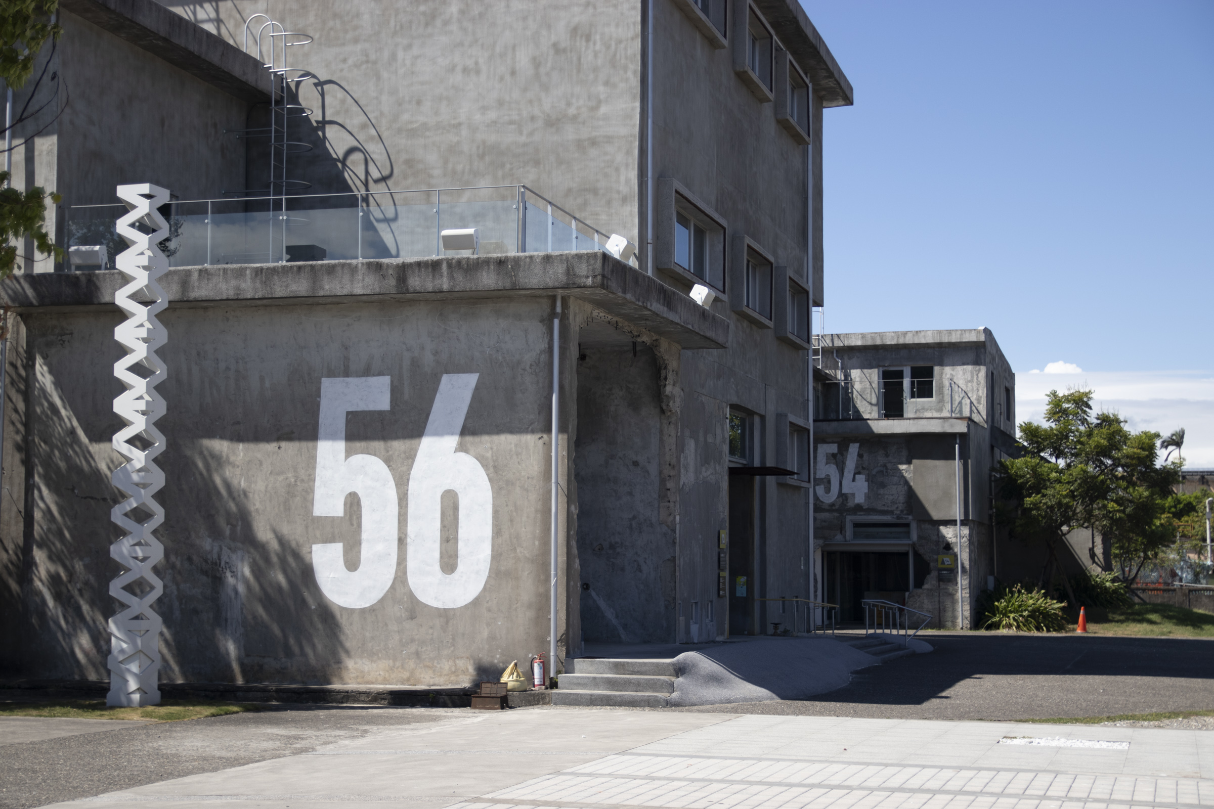

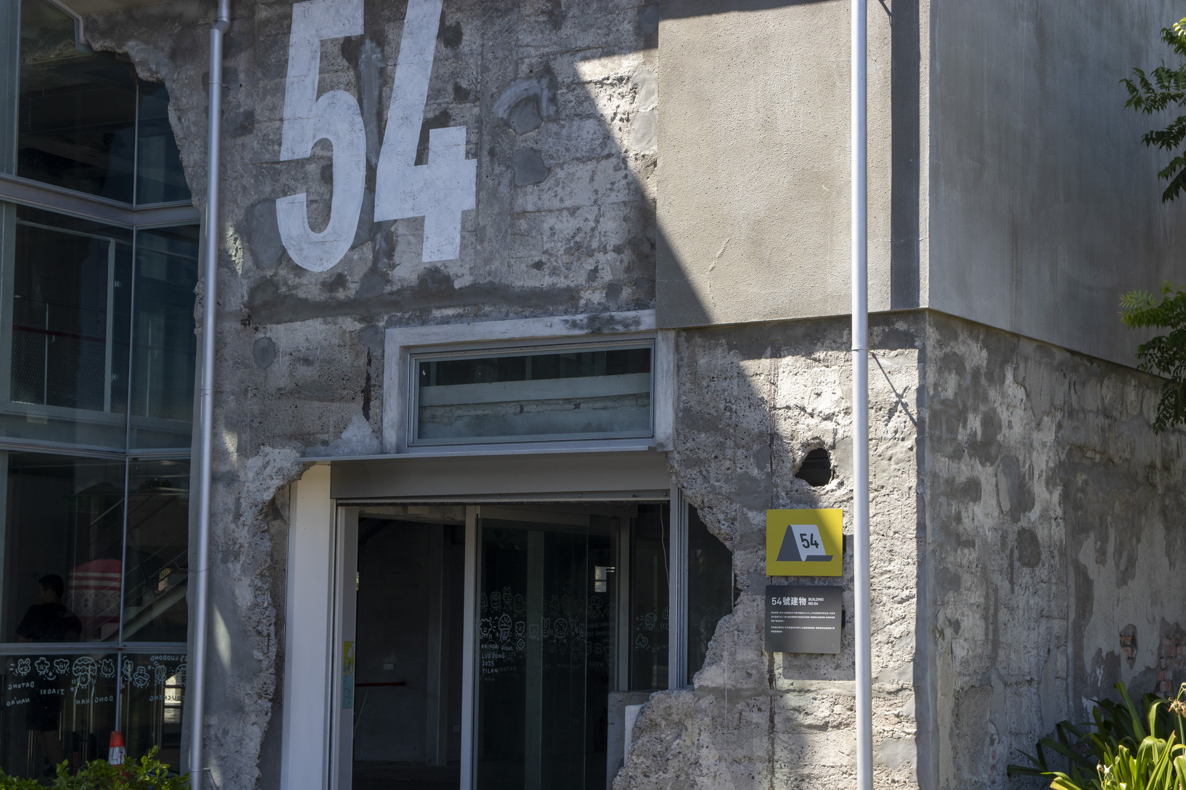
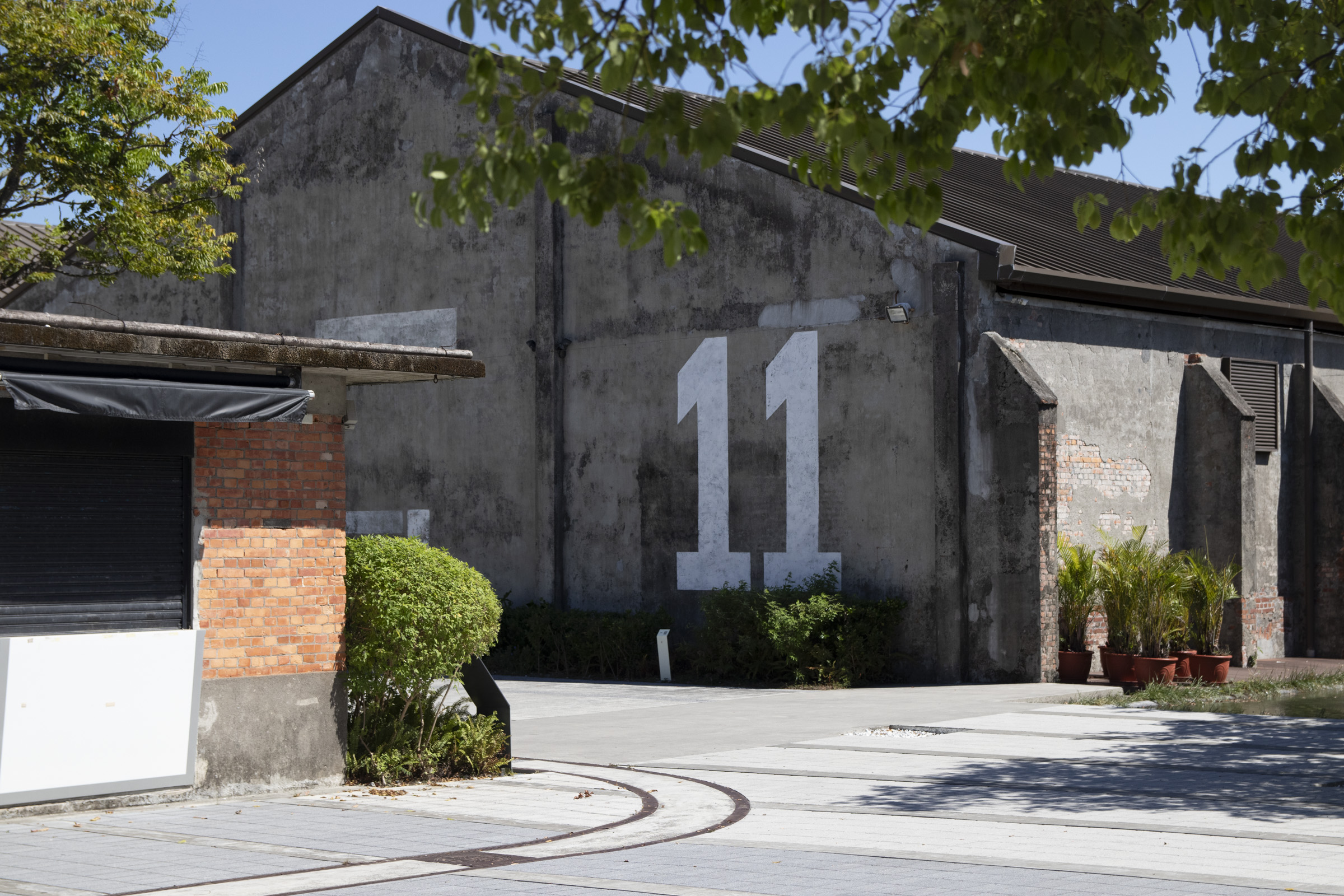
By painting large-scale numeric titles on certain buildings that share similar structures and coherent locations, we improved long-distance clarity and strengthened their past industrial context.
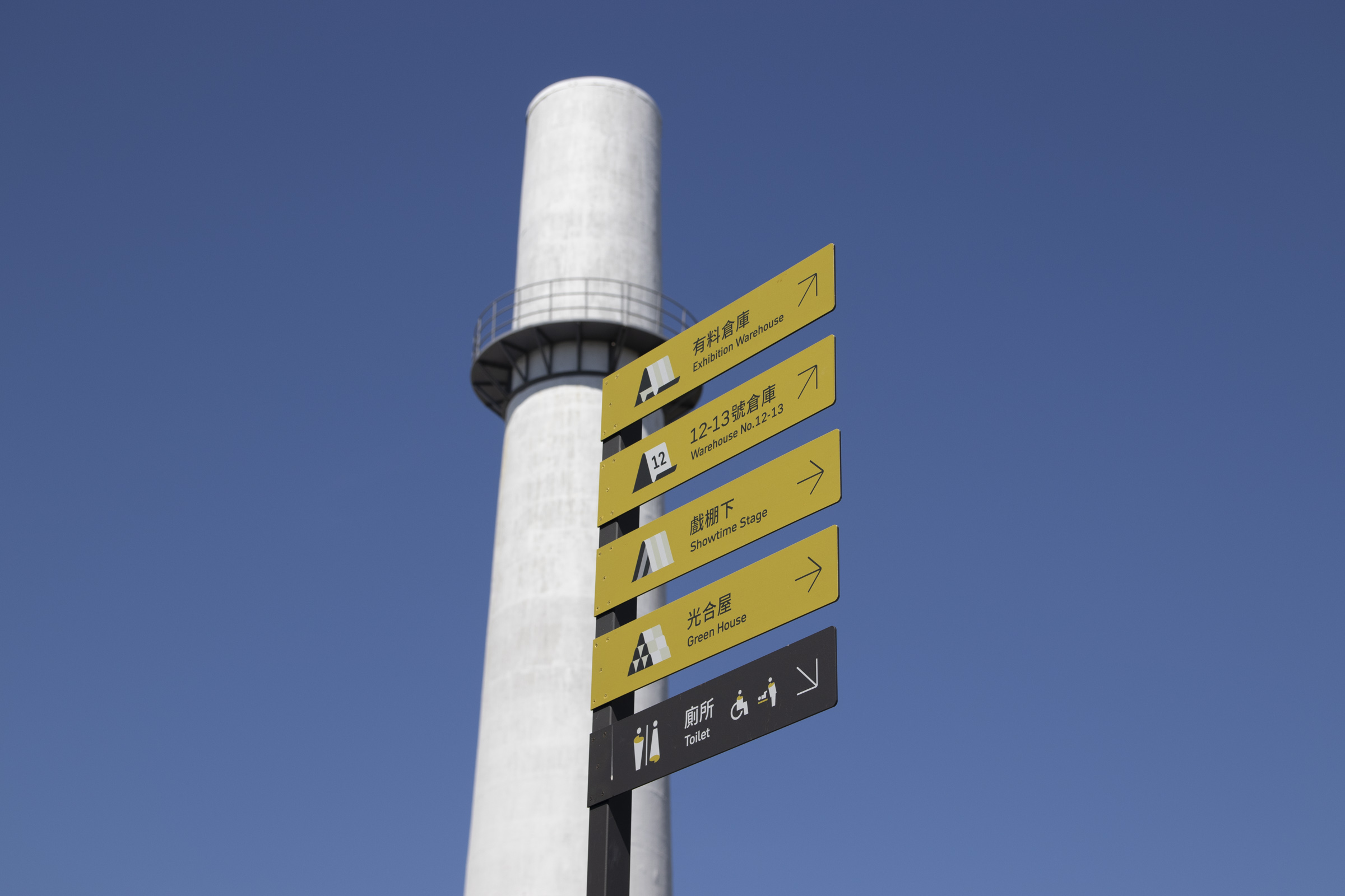
Pictogram is a key element in the update, returning the focus to the historical context of precedent "paper factory".
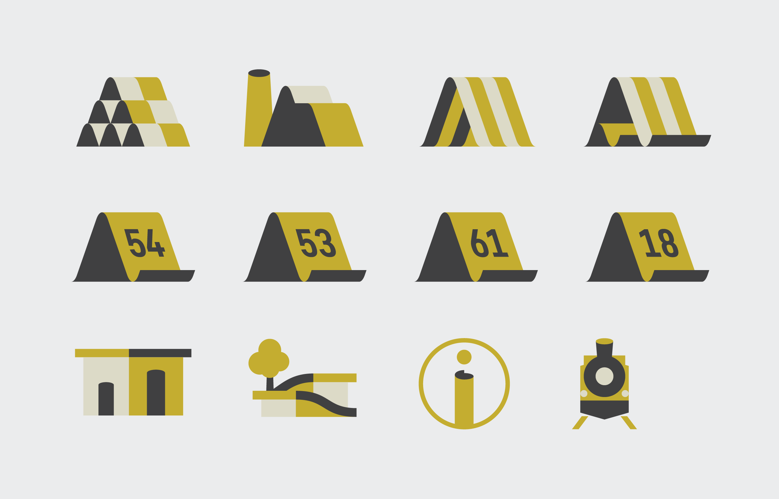
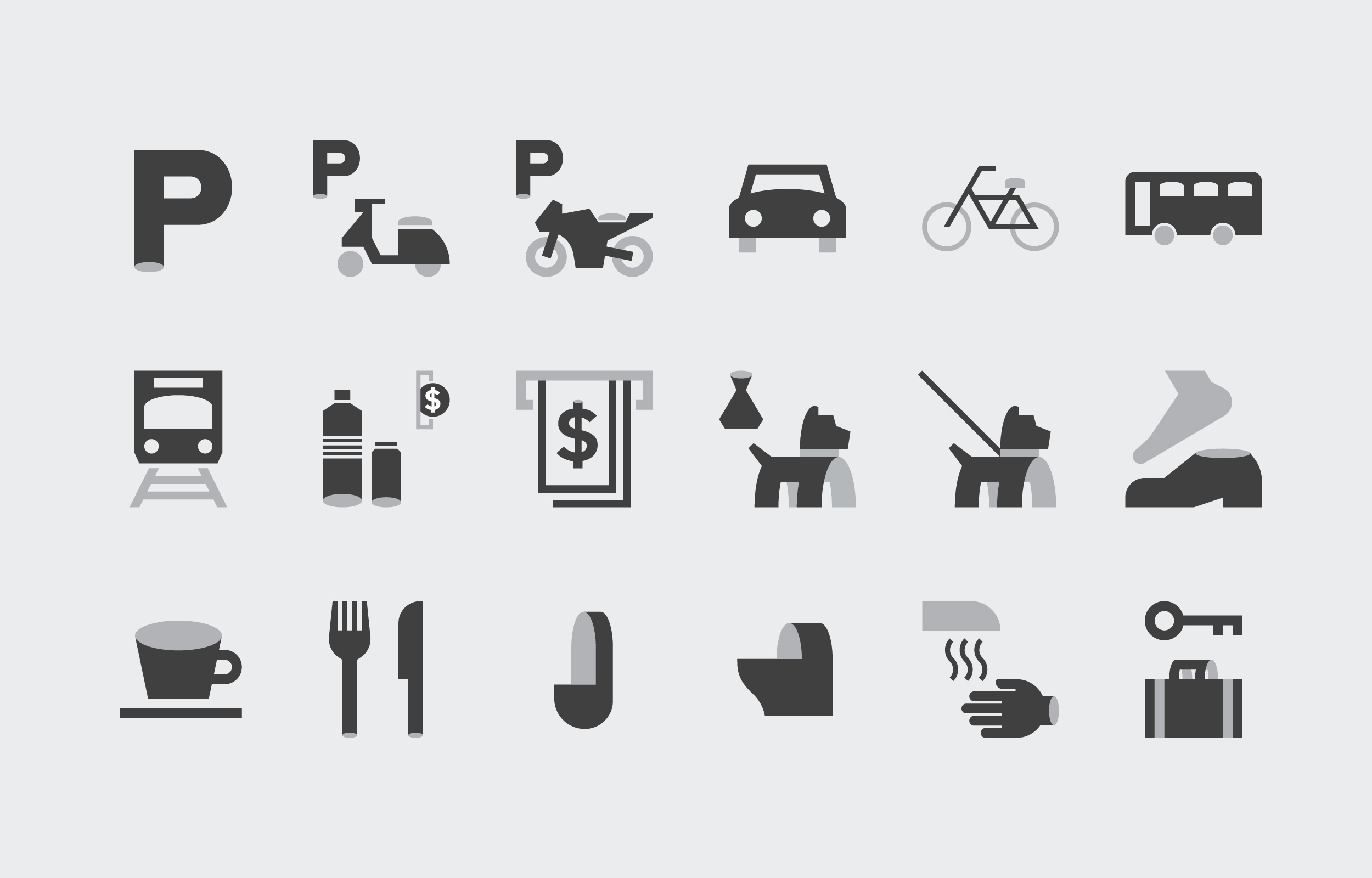
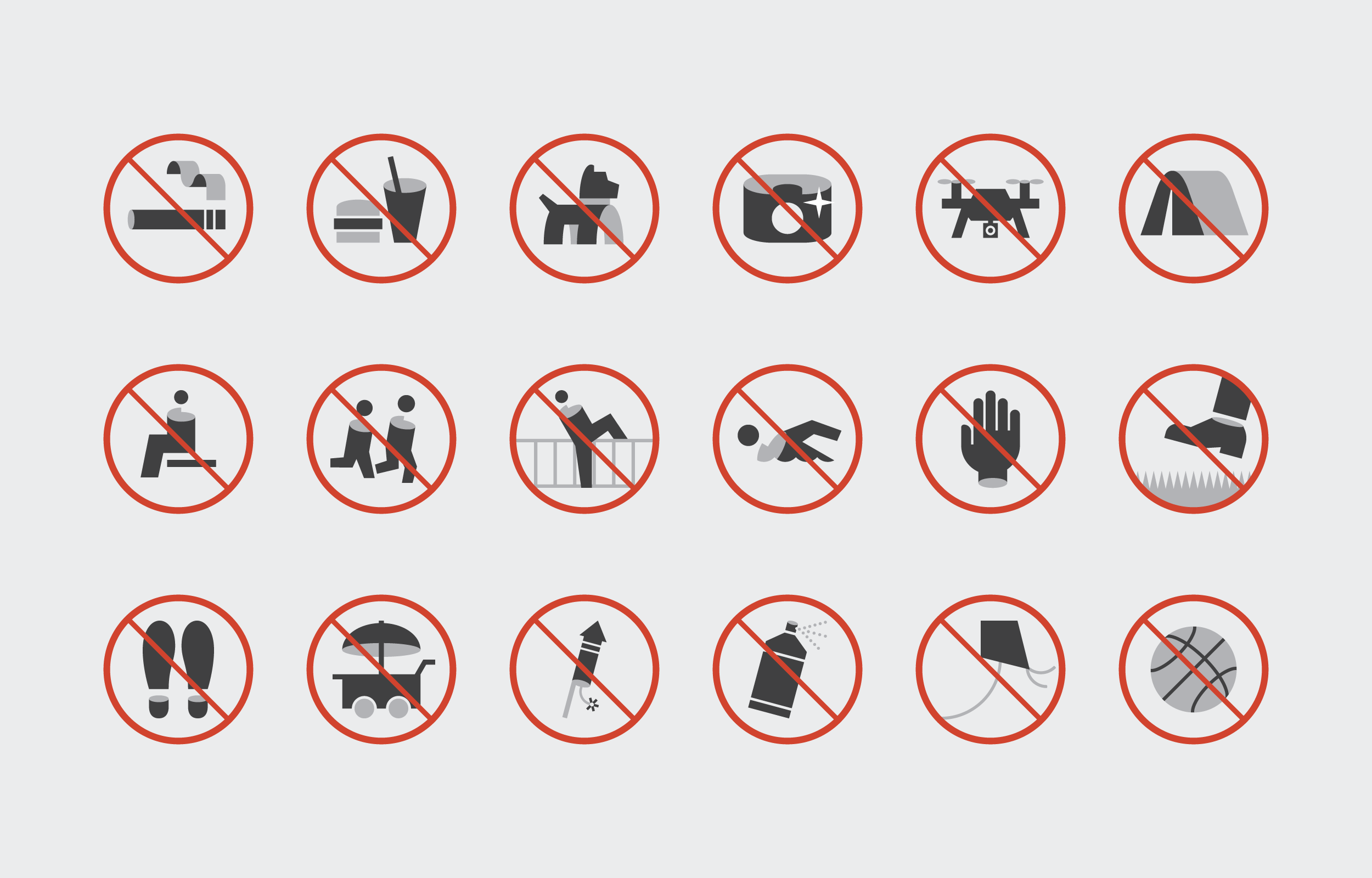
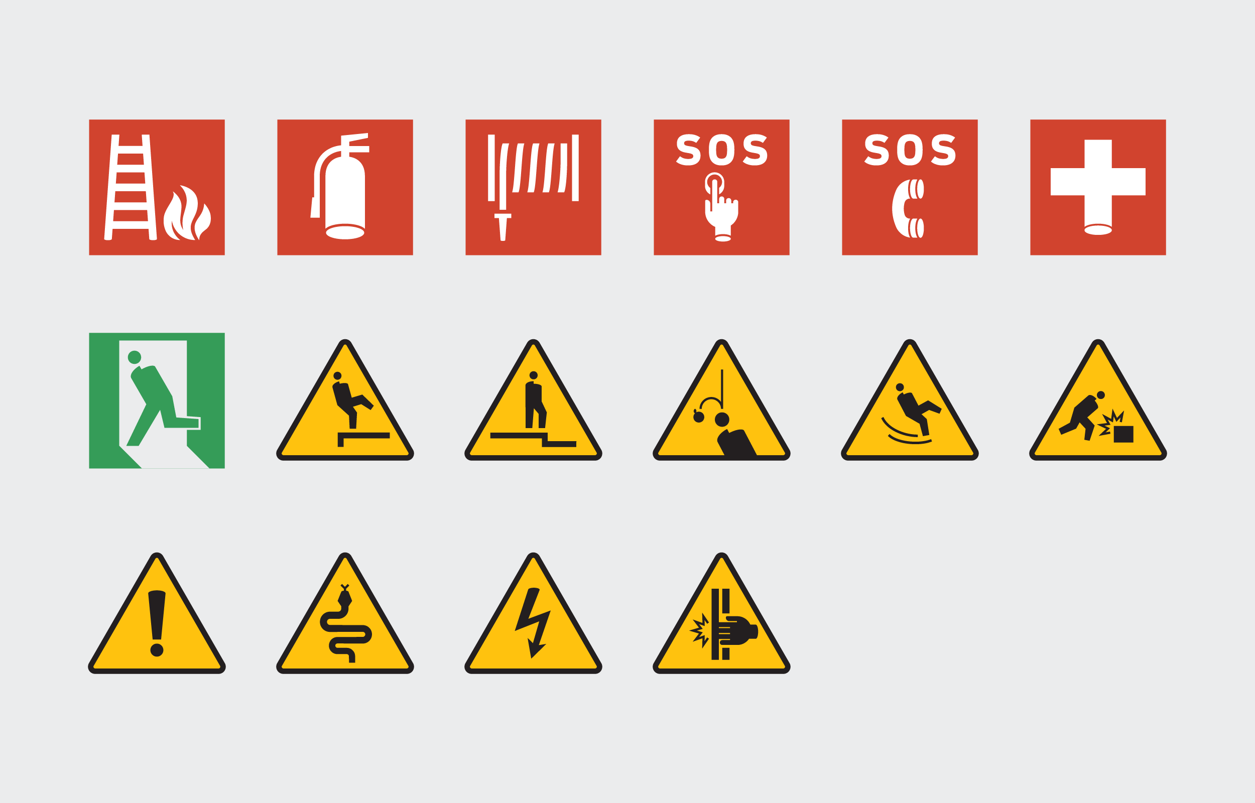
By transforming the image of paper bending and curling into the shape of the icon, it brings in a new visual vocabulary, and reestablishes a more recognizable identity.
As the park will gradually open up more space, keeping the scalability of pictograms is also a pivotal point.
Combined with our layout, a numbering system intergrated in the icons were brought up. This ensurse the consistency of the space icons that will be presented on subsequent signages.
Logomark Redesign
In line with the updated wayfinding system, the park's logomark was also redesigned. Over-detailed traces were simplified, and the logotype was adjusted to a much neutral style, matching with the typography inused of this update.
Color Planning

The color scheme responds to the park’s scenery of relics and plantings with a slightly distinctive green combined with grayscale backgrounds.
The former creates a recognizable order and a rhythmic scheme, while the latter accommodates the surrounding structures, ensuring sufficient clarity.
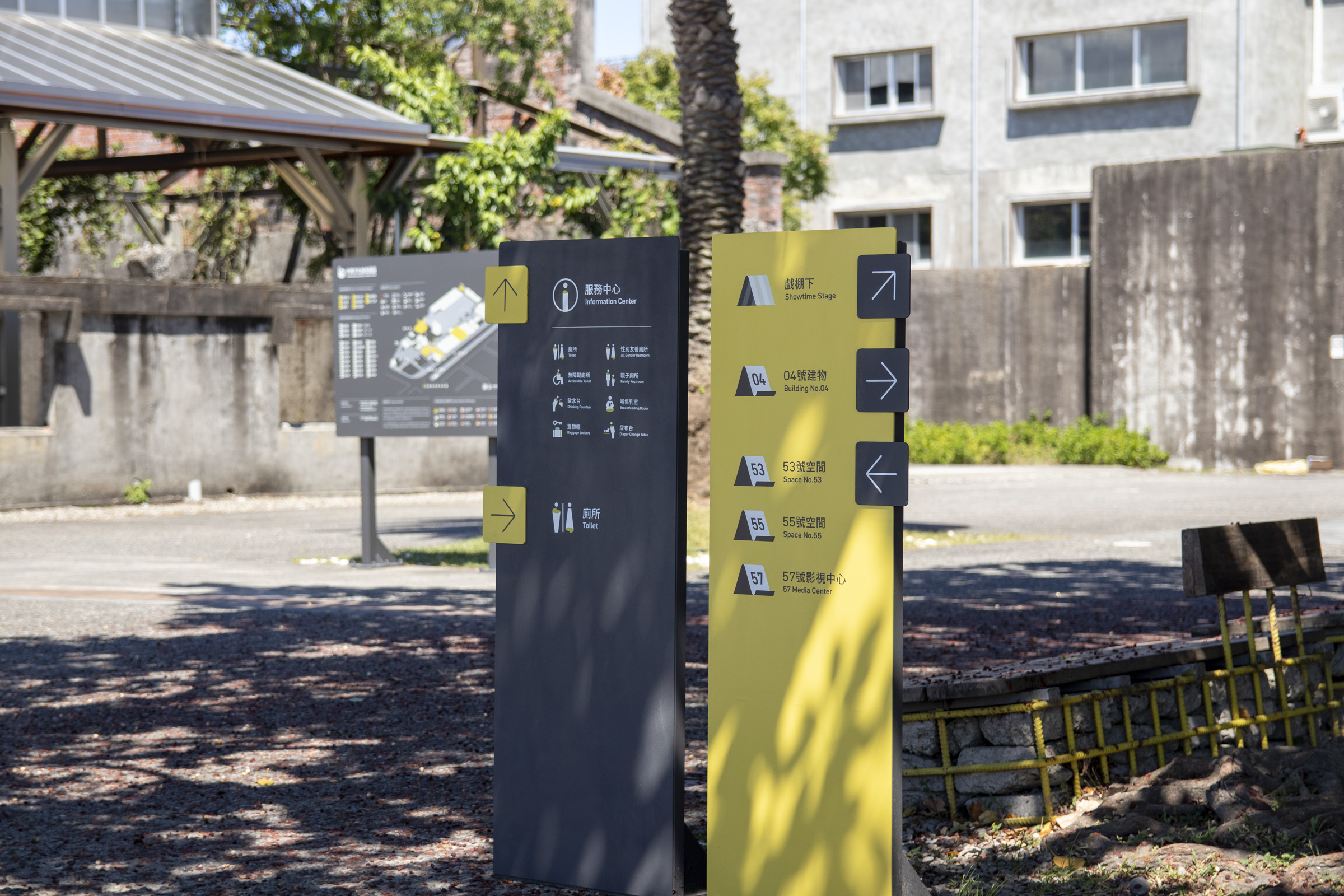
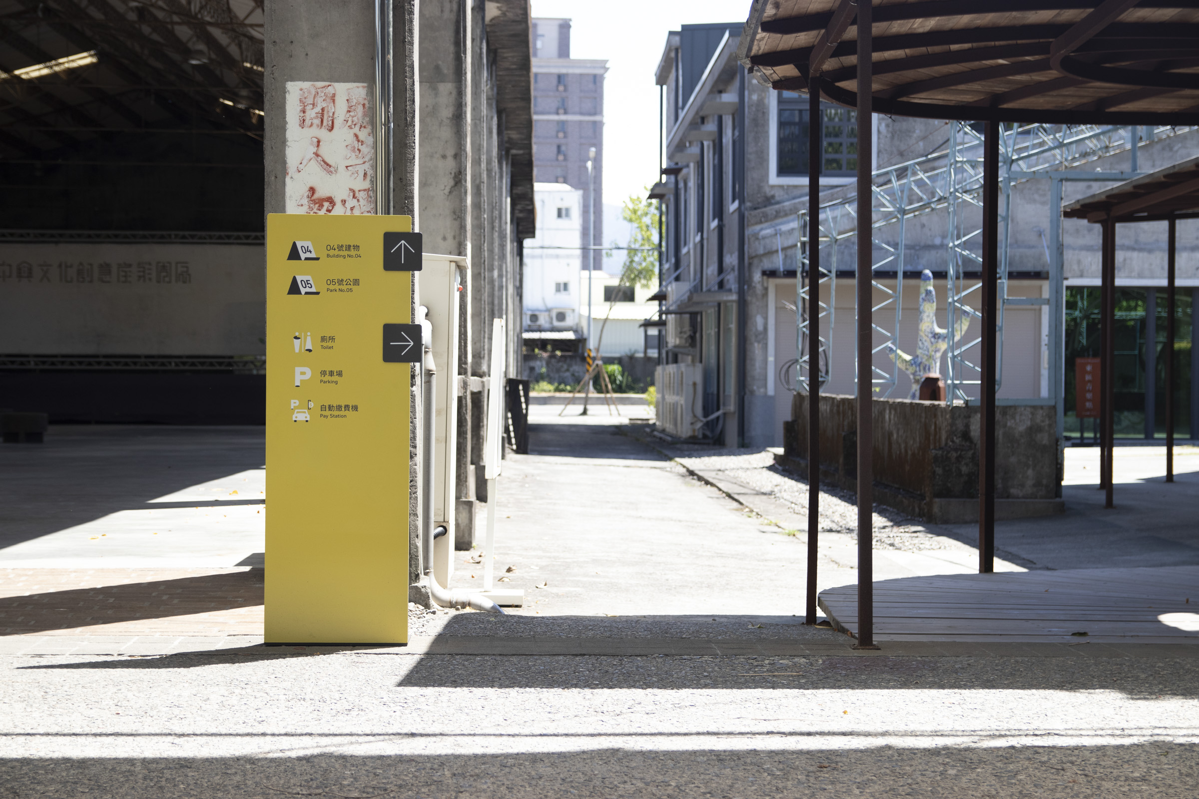
In terms of color sorting, open spaces and service facilities mostly use the primary color as the background. This maximizes recognizability while maintaining the visual harmony of the surroundings.
Furthermore, reading habits are formed through repeating appearance, and the overall character of the space is brought out.
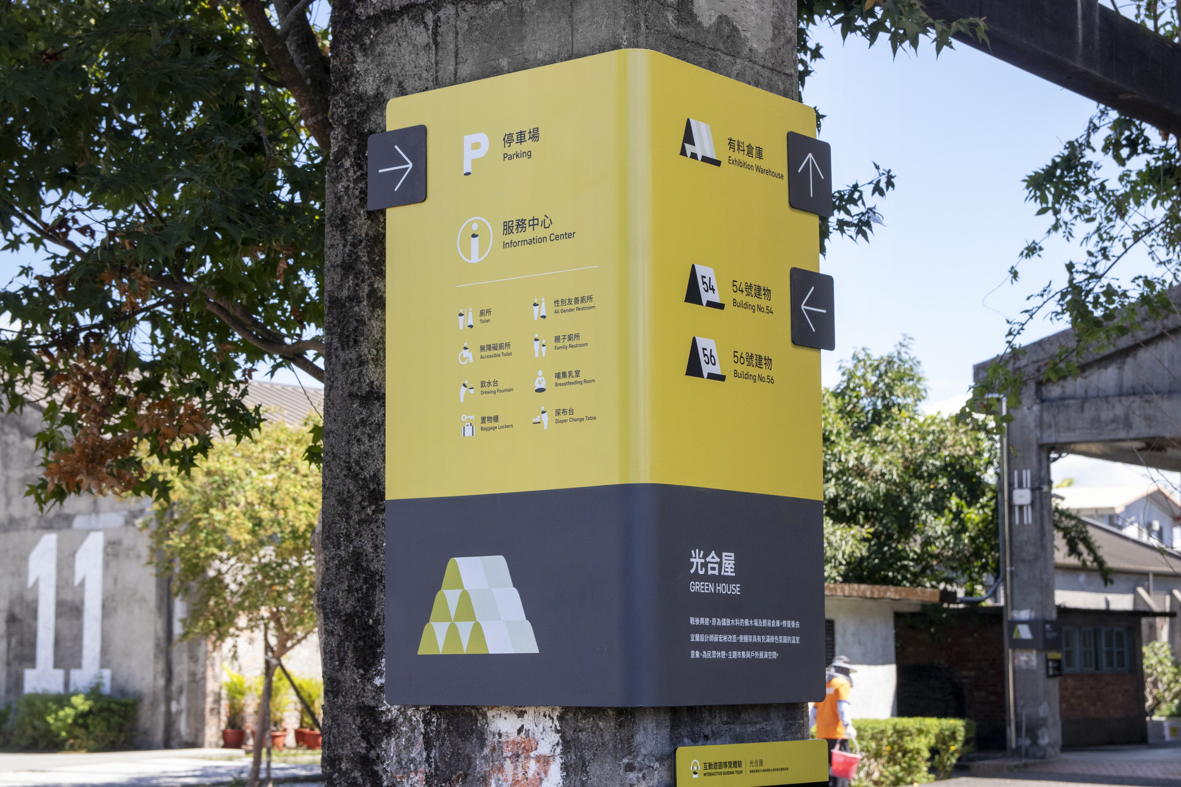
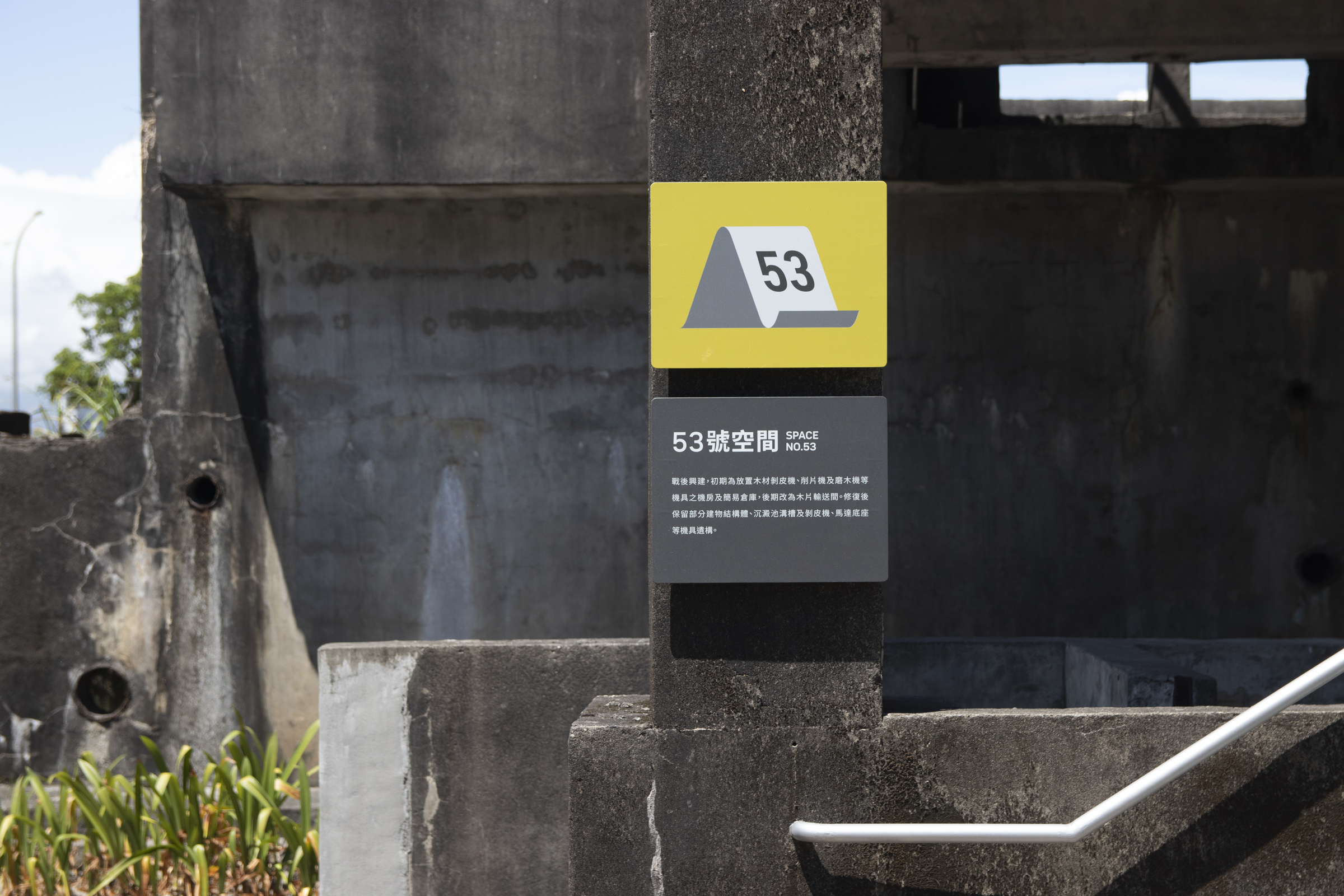
Public facilities and information mostly use dark backgrounds to improve clarity, responding to the appearance of industrial relics, while also distinguishing from the precious category.
With the preliminary plannings and system setup introduced, the following is some of the signage designs in the overall plan and their description.
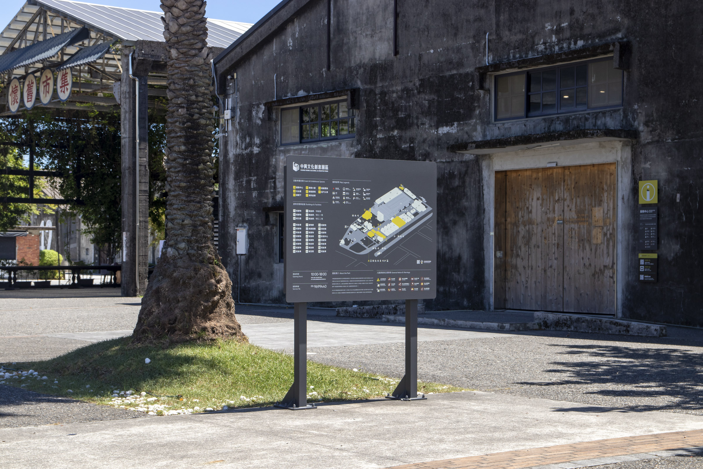
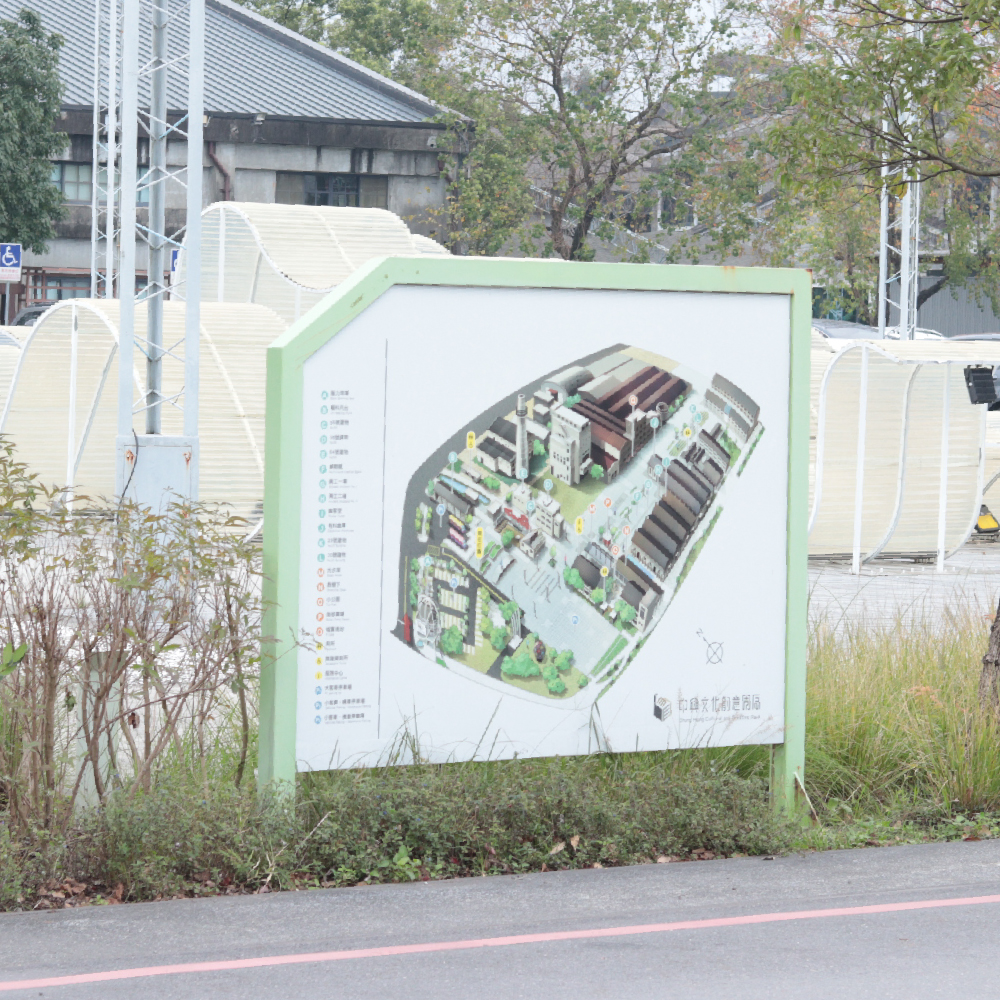
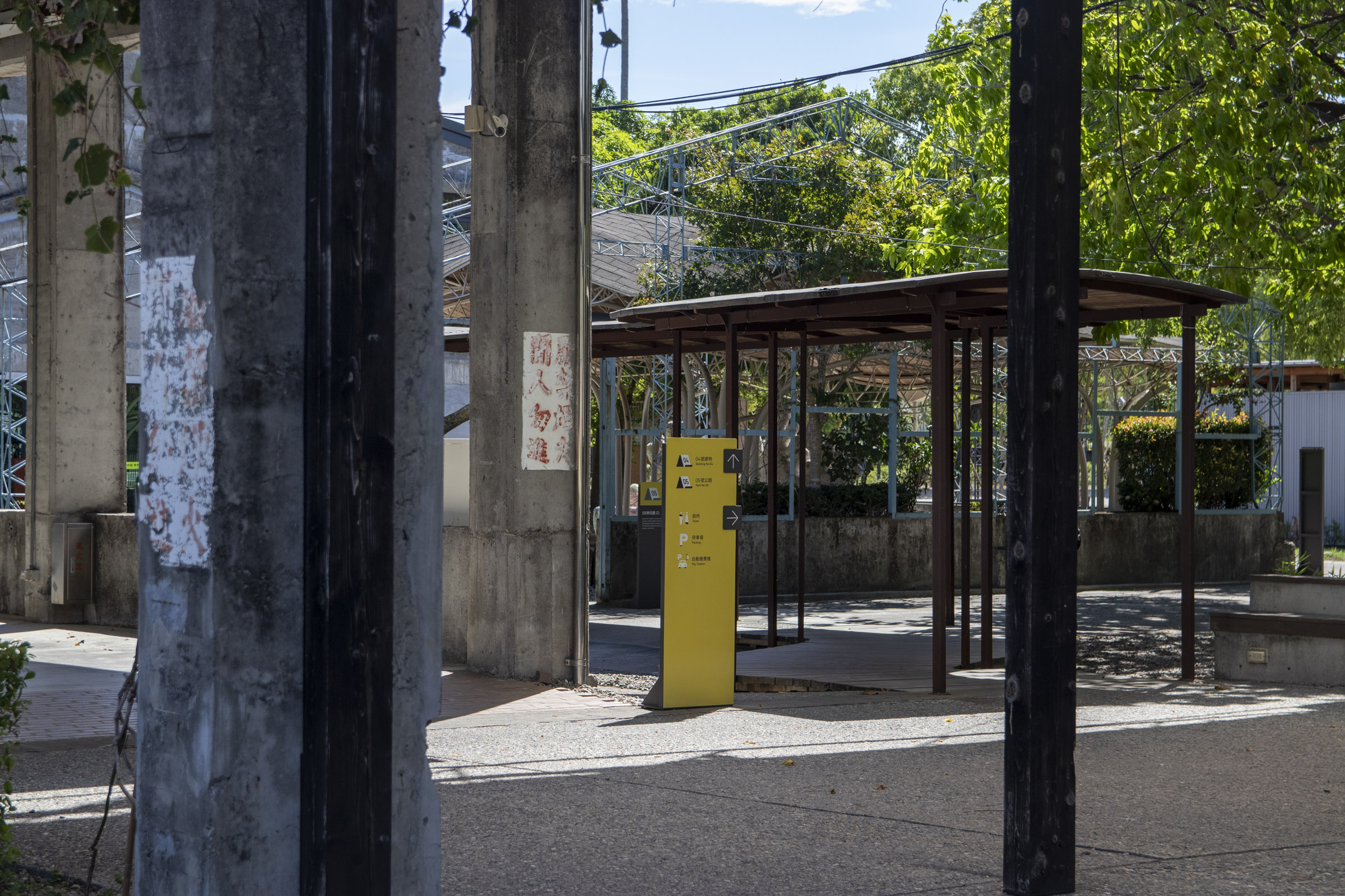
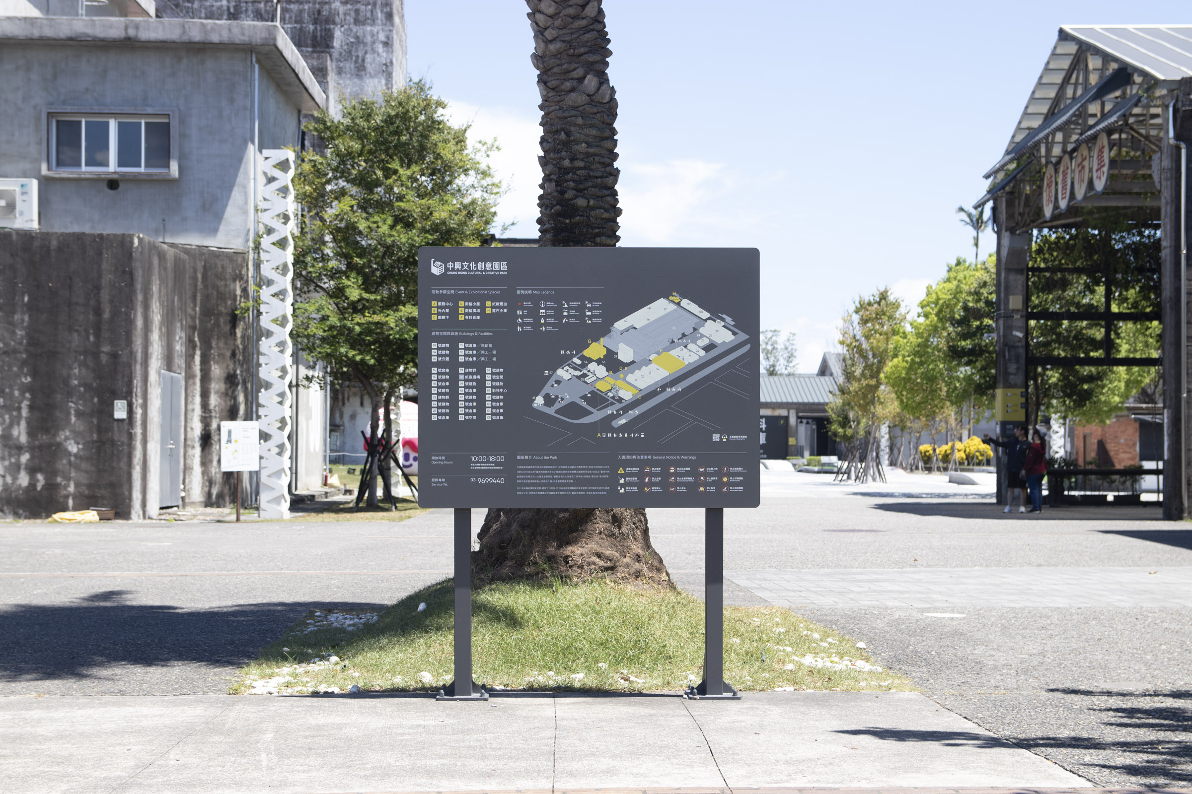
Entrance Map (Main Decision Point)
We noticed that the main entering route is from the passage in front of the service center, connecting the end of the parking lot.
Thus, we set up a map of the entire area with complete information, detailing various landmarks and service facilities, ensuring visitors could identify their location and plan their routes.


Central Map (Main Decision Point)
The front and back sections of the park have large plaza areas, both located along the main visiting routes.
Considering many facilities and landmarks surround the squares, we set up tilted map signages in both centers. Thus, visitors staying at the square for a short time can plan their next route.


Vertical Map (Main Decision Point)
During our survey, we noticed that visitors who arrived by car were accustomed to heading for the washroom behind the service center first, then entering the park through surrounding passages.
However, it is rather challenging to converge into the main visiting routes from here; therefore, a smaller vertical map is set up to prevent people from having a hard time finding directions when passing through.
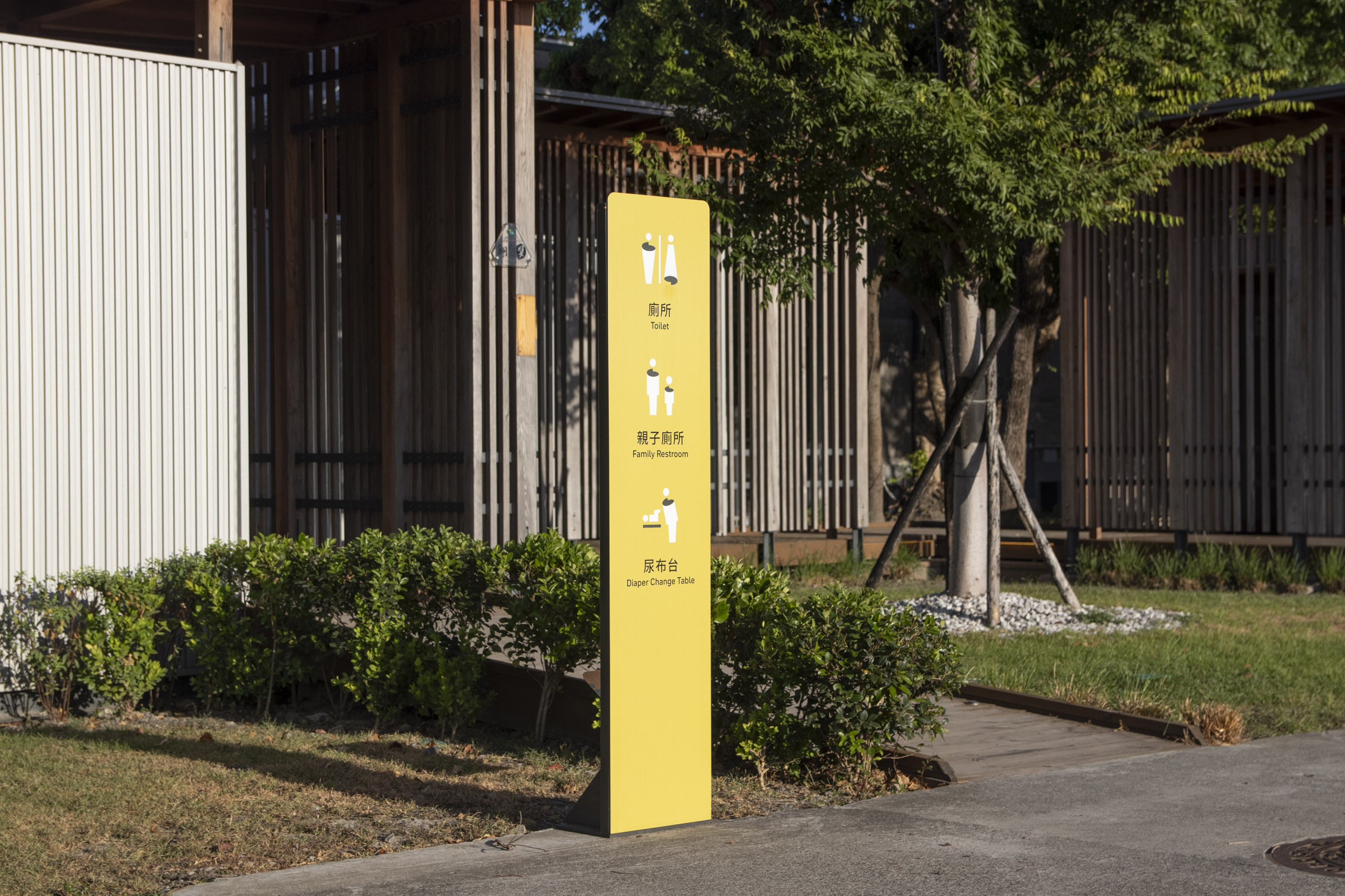
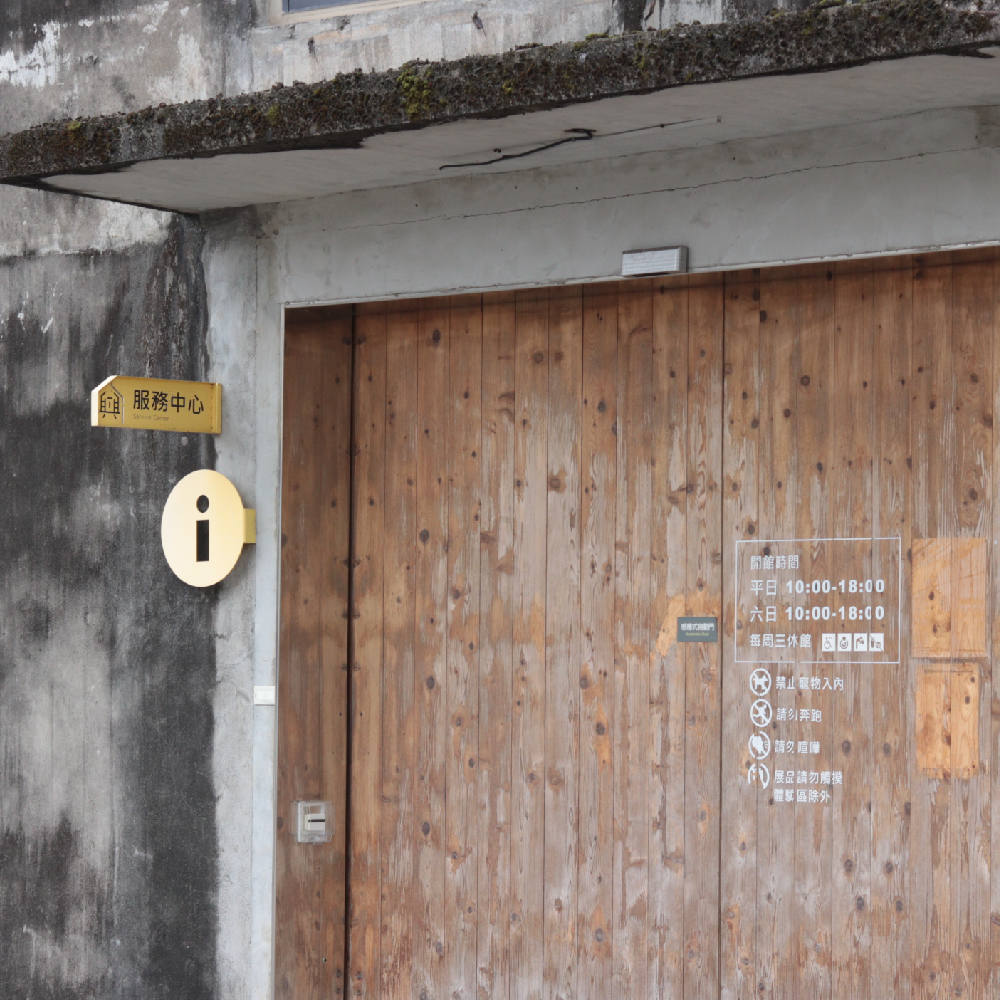
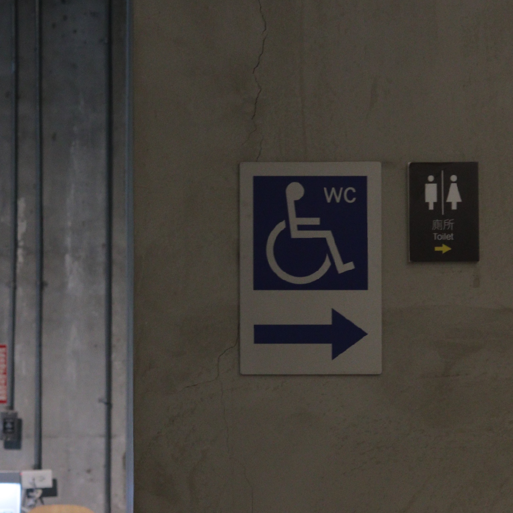
All Gender Restrooms
In addition, we noticed that the "All Gender Restrooms" at the end of the parking lot and the middle section of the park were frequently visited, yet the former signs were not recognizable enough.
In response, more prominent signages were set up at the entrance of both restrooms, and the primary color was used as an exception to increase recognizability in the surroundings.

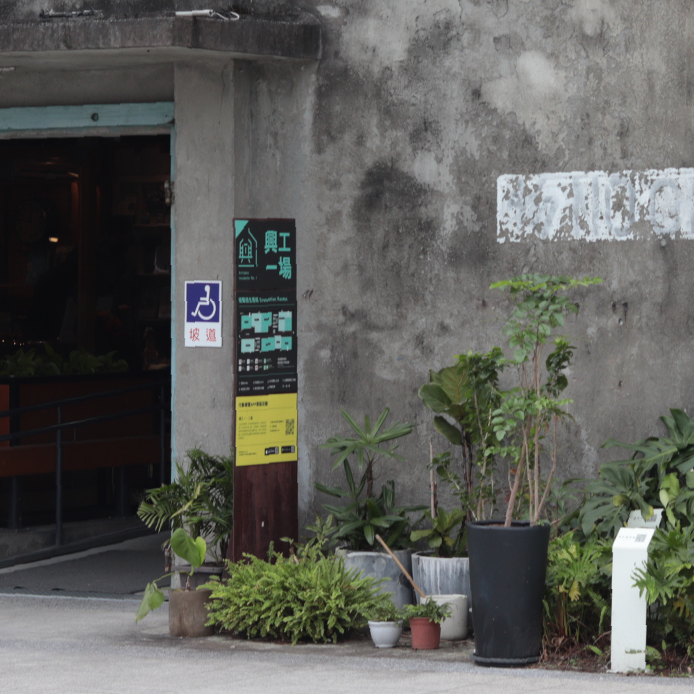
Wayfinding (Sub Decision Point)
The buildings in the park have undergone long history of changes at different stages. It is often difficult to directly observe important facility around corners or intersections of spaces.
Thus, we set up signs with different direction indicators which lead to common needs amid various areas, such as landmark or cultural space visits, and infrastructure wayfinding. This aims to avoid visitors from feeling frustrated while on their route.

Wayfinding (Sub Decision Point)
Most of the park's passages are long and narrow, which can easily lead to the problems above. Moreover, the park's outdoor areas are filled with open spaces, with entrance points varying from person to person.
Hence, we installed directional signs at many segments, leading people entering for the first time toward major landmarks. The guidance of other wayfinding designs can be carried on in such way.


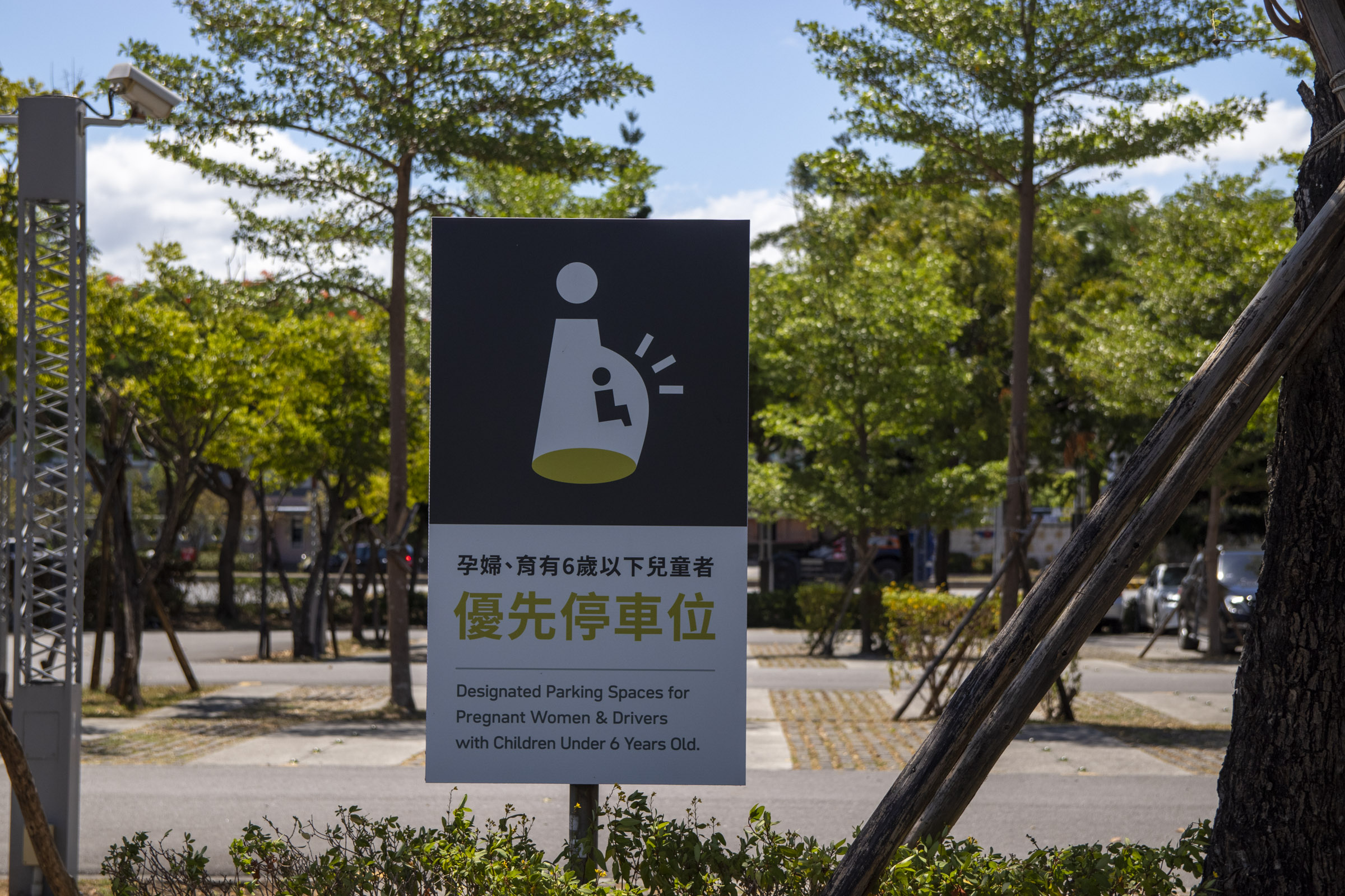

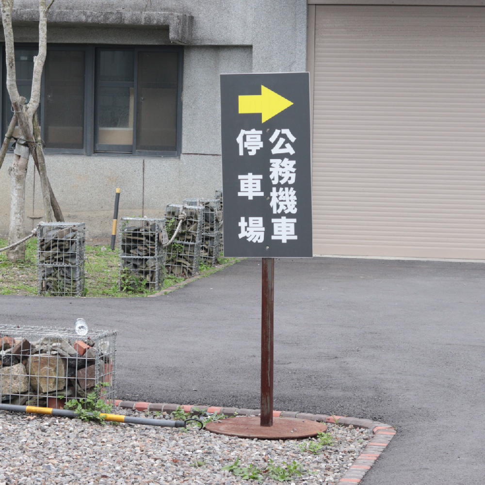
交通標示 Parking Signages
Driving is the main transportation for visitors. The parking lot in front of the park has a wide variety of regulations based on the types of vehicles and the needs of special groups, so the clarity among designs is critical.

CREDITS
CL Chung Hsing Cultural & Creative Park, Cultural Affairs Bureau Yilan County
AD 劉銘傑 Ming-Jie Liu 錢柏翰 Po-Han Chien
D 錢柏翰 Po-Han Chien 王祥宇 Xiang-Yu Wang 吳泓震 Hung-Jen Wu
Motion Design 伍聖耀 Sheng-Yao Wu
Pictograms in this work are partially adapted from the “Public Icon System” by the Taiwan Design Research Institute, licensed under CC BY 4.0. Original Source︎︎︎