(2018)
04. Remains on the Track
(2021)
(2021)
(2021)
(2021)
(2022)
(2022)
(2022)
(2022)
(2022)
(2023)
(2023)
(2024)
(2025)
(2025)
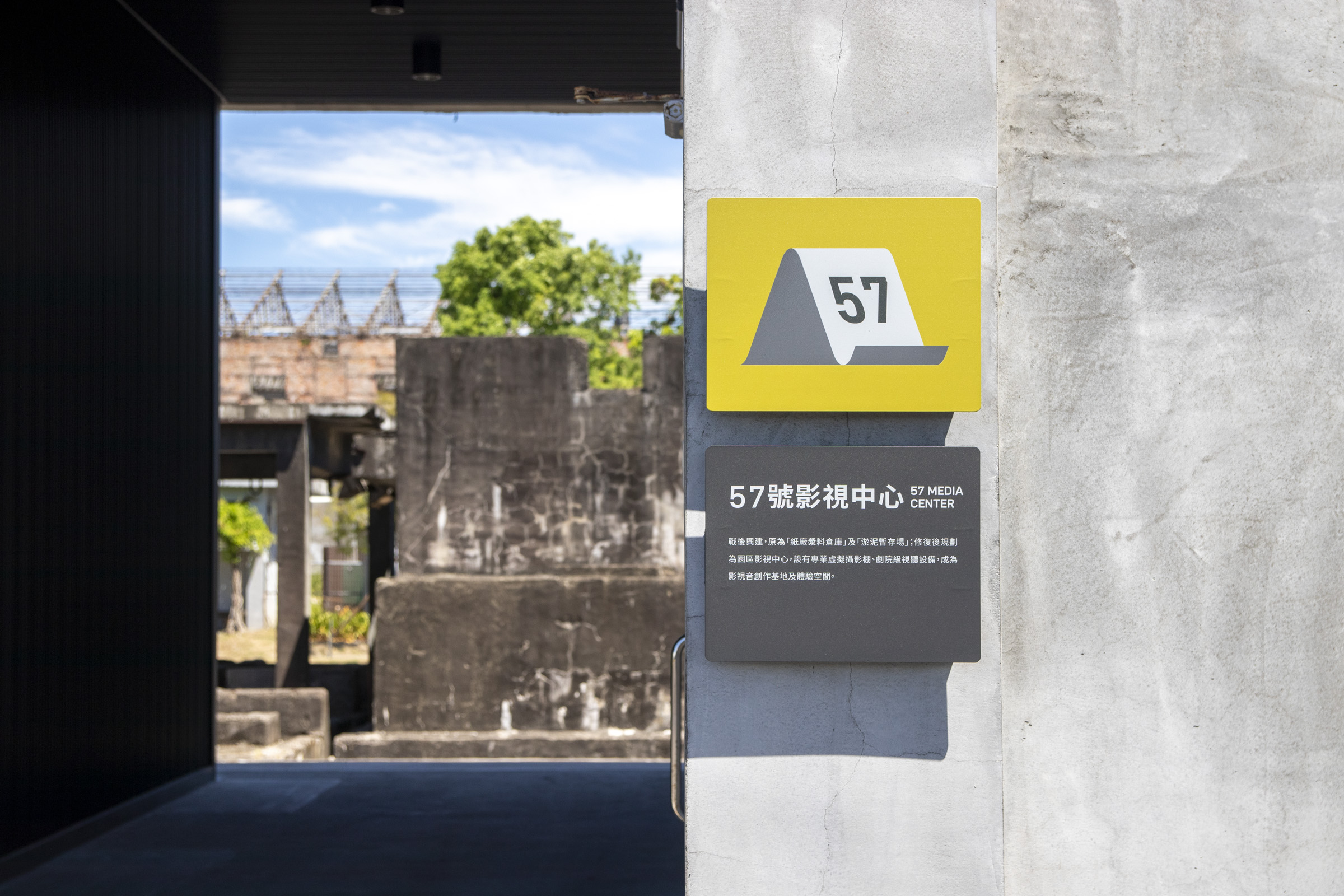
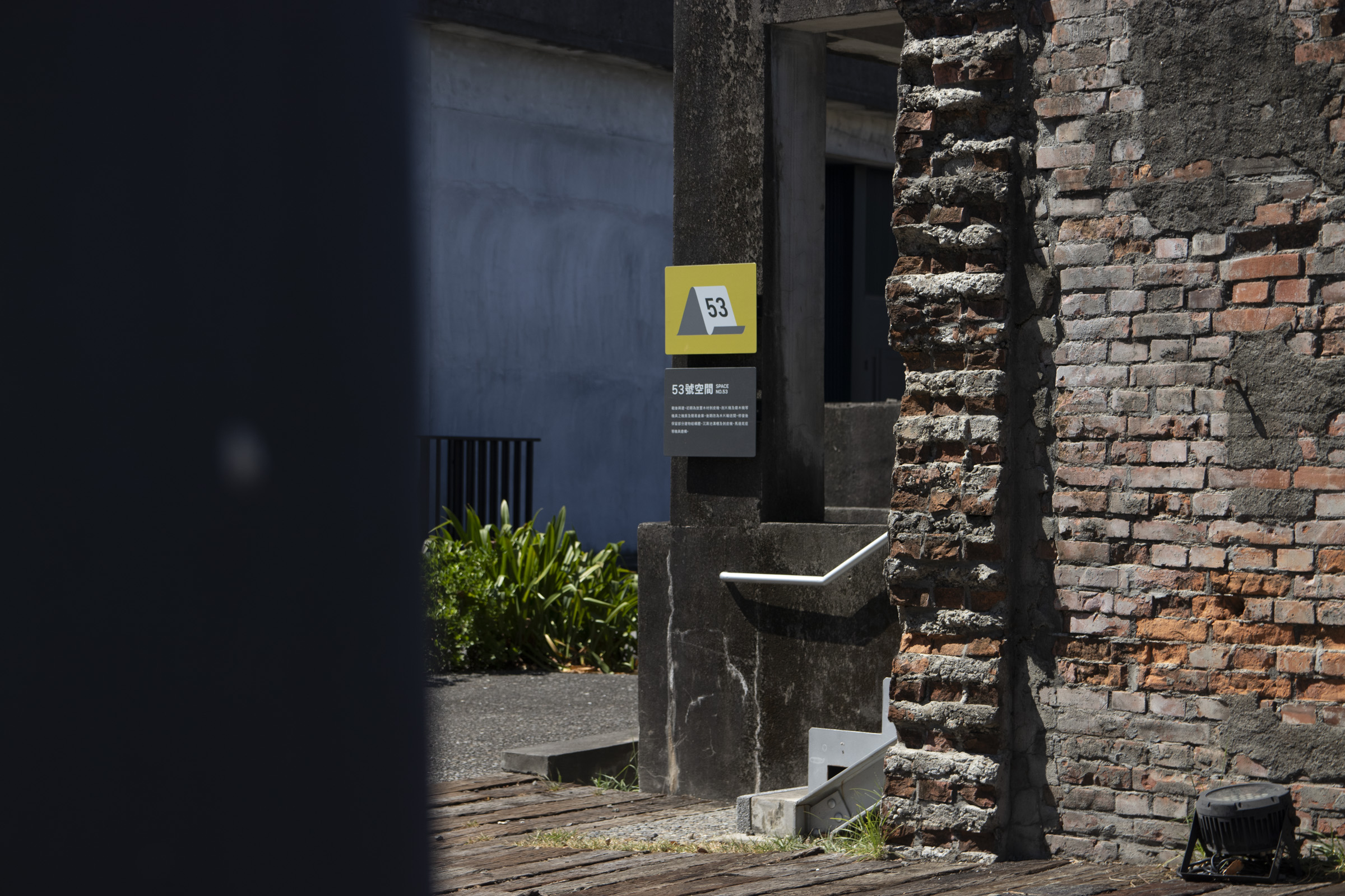
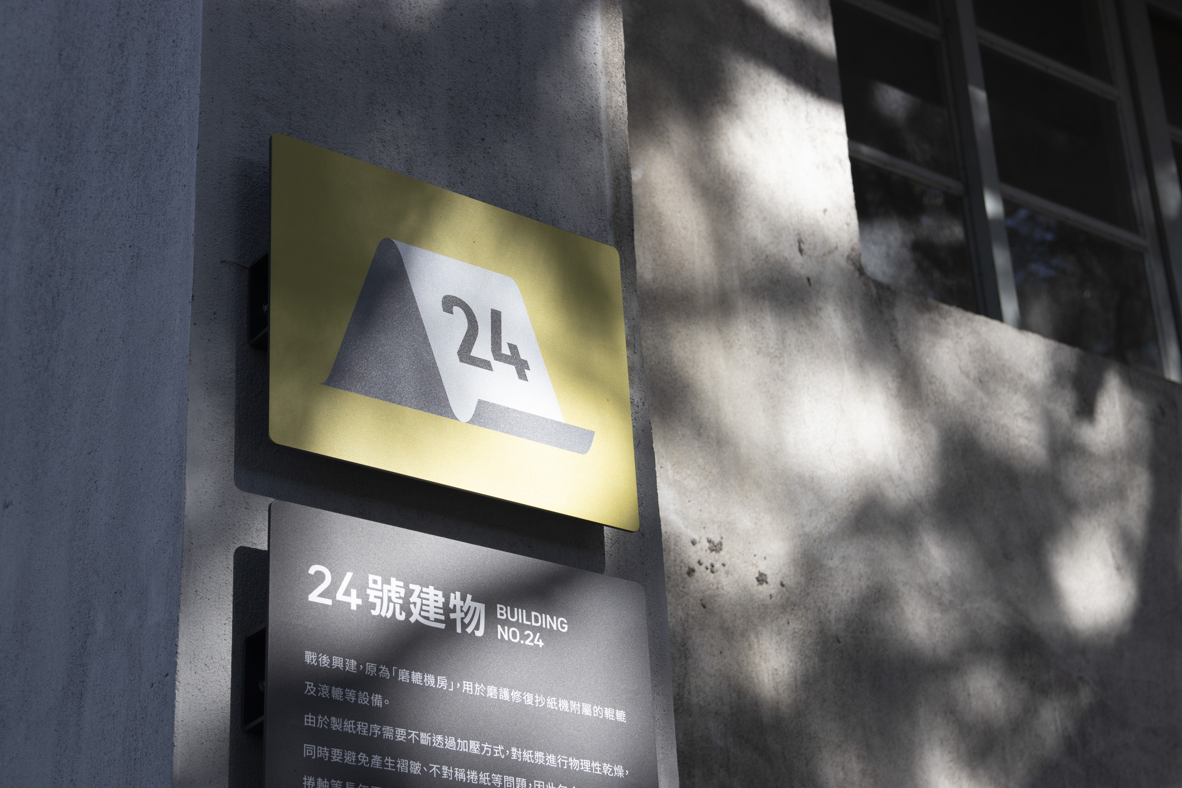
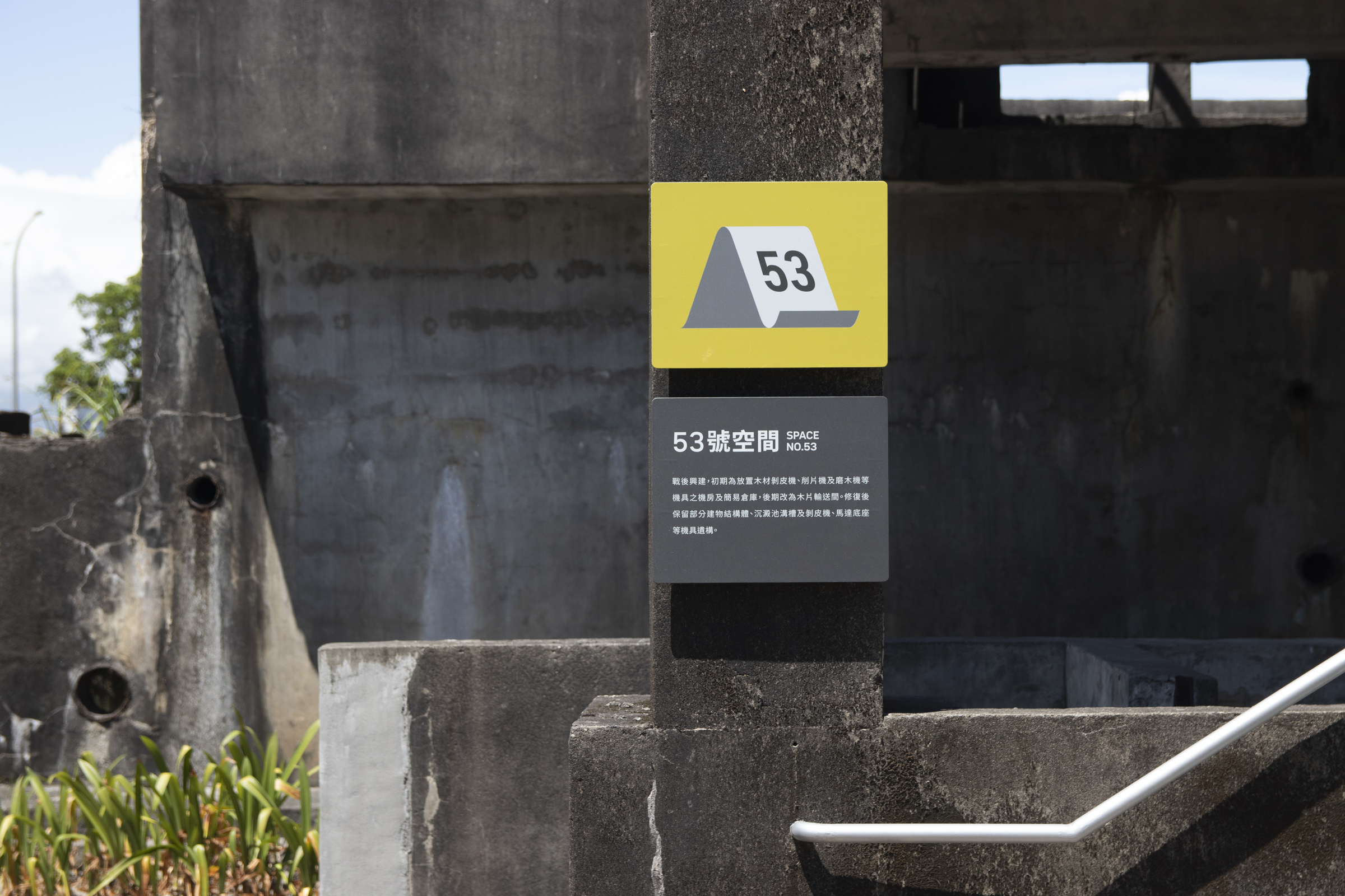
Pictogram is a key element in the update, returning the focus to the historical context of precedent "paper factory".
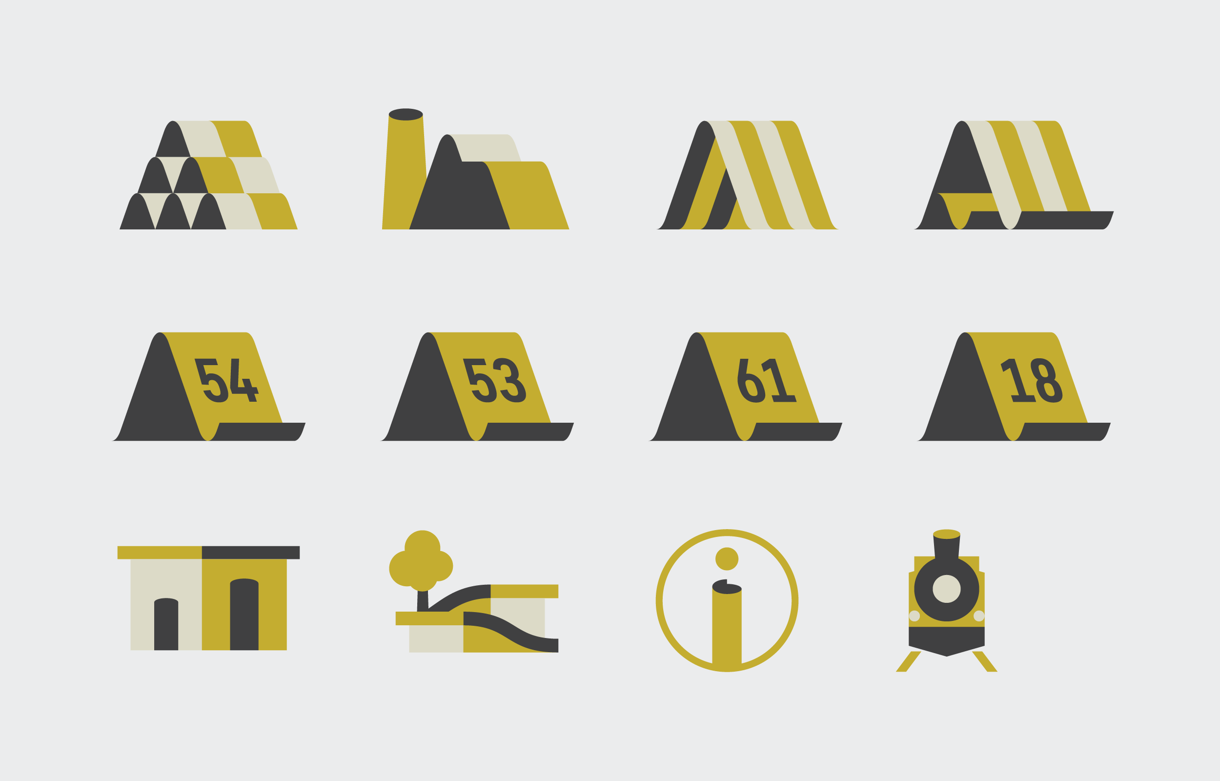
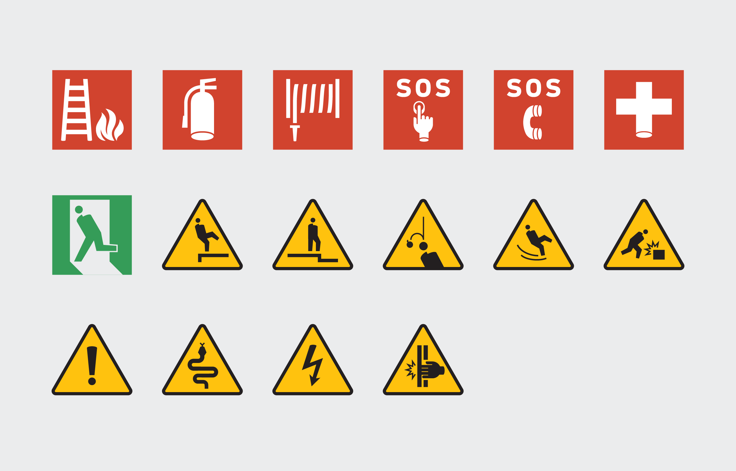
By transforming the image of paper bending and curling into the shape of the icon, it brings in a new visual vocabulary, and reestablishes a more recognizable identity.
As the park will gradually open up more space, keeping the scalability of pictograms is also a pivotal point.
Combined with our layout, a numbering system intergrated in the icons were brought up. This ensurse the consistency of the space icons that will be presented on subsequent signages.
Logomark Redesign
In line with the updated wayfinding system, the park's logomark was also redesigned. Over-detailed traces were simplified, and the logotype was adjusted to a much neutral style, matching with the typography inused of this update.
Color Planning

The color scheme responds to the park’s scenery of relics and plantings with a slightly distinctive green combined with grayscale backgrounds.
The former creates a recognizable order and a rhythmic scheme, while the latter accommodates the surrounding structures, ensuring sufficient clarity.
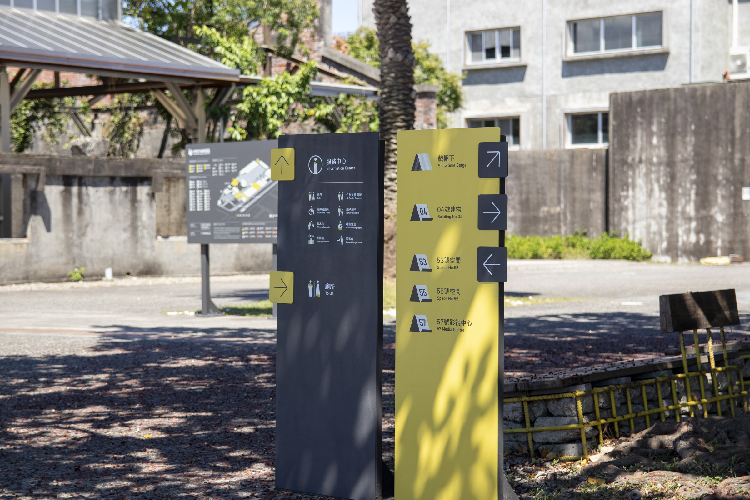
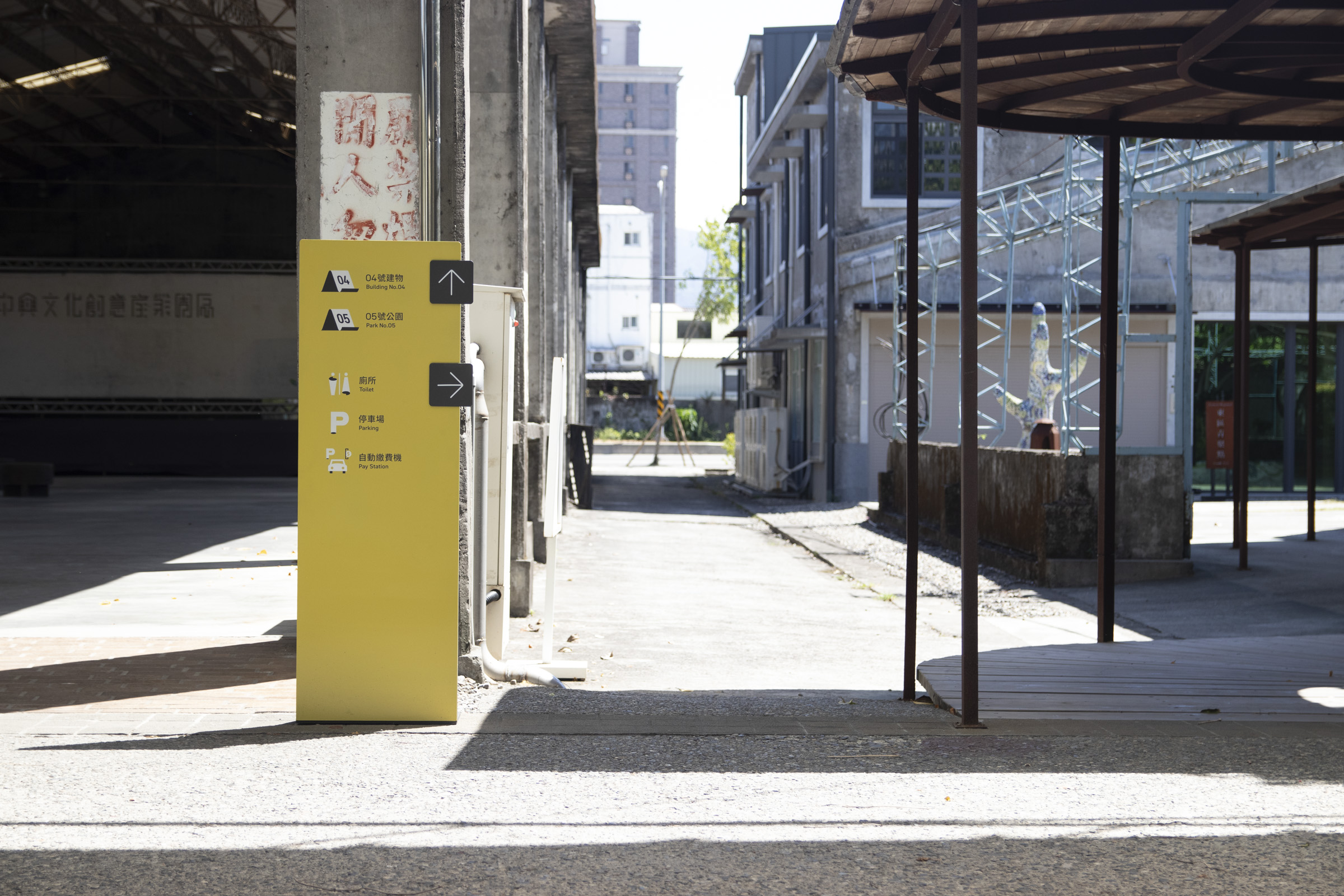
In terms of color sorting, open spaces and service facilities mostly use the primary color as the background. This maximizes recognizability while maintaining the visual harmony of the surroundings.
Furthermore, reading habits are formed through repeating appearance, and the overall character of the space is brought out.
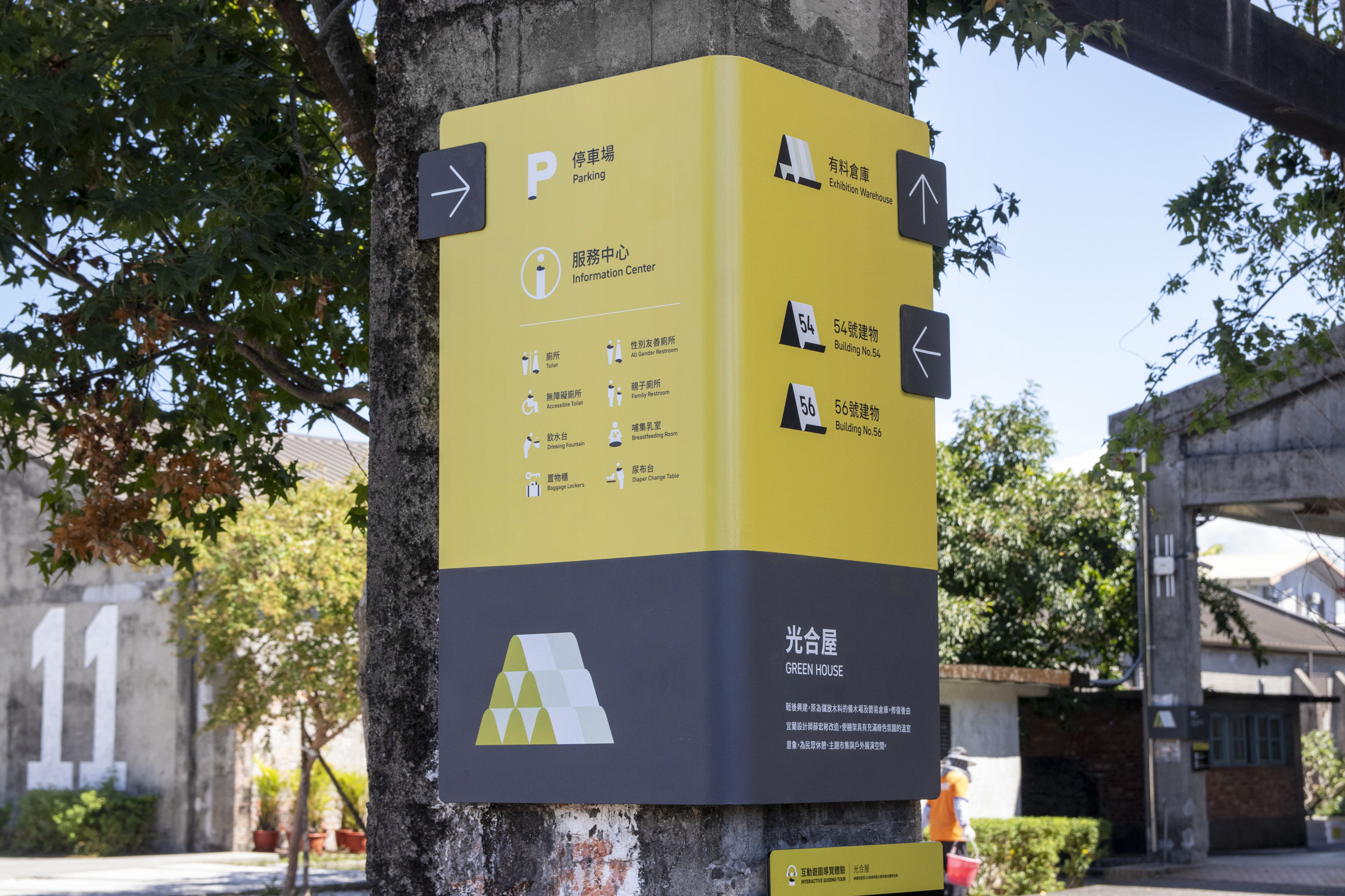
Public facilities and information mostly use dark backgrounds to improve clarity, responding to the appearance of industrial relics, while also distinguishing from the precious category.