

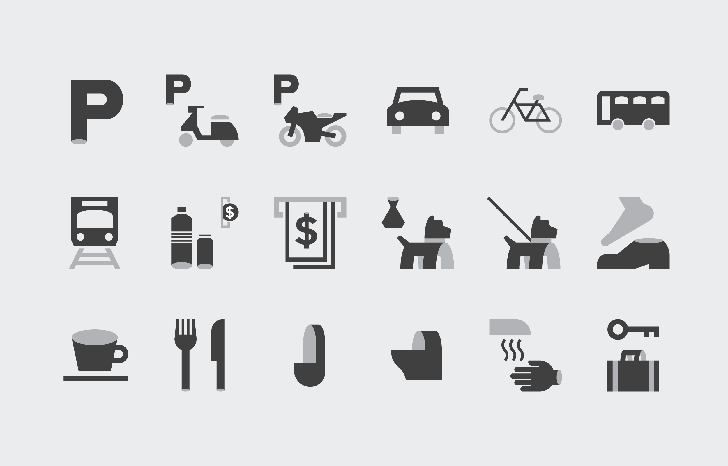


圖標設計 Pictogram Design
圖標設計是此次識導更新中,將焦點回歸園區「紙廠歷史」場域脈絡的關鍵元素。透過紙張彎折與捲曲的意象轉化為構成圖標的造形,一方面解決過往風格混雜的困境,也同時為園區帶來新的視覺語彙。
Pictogram is a key element in the update, returning the focus to the historical context of precedent "paper factory". By transforming the image of paper bending and curling into the shape of the icon, it brings in a new visual vocabulary, and reestablishes a more recognizable identity.


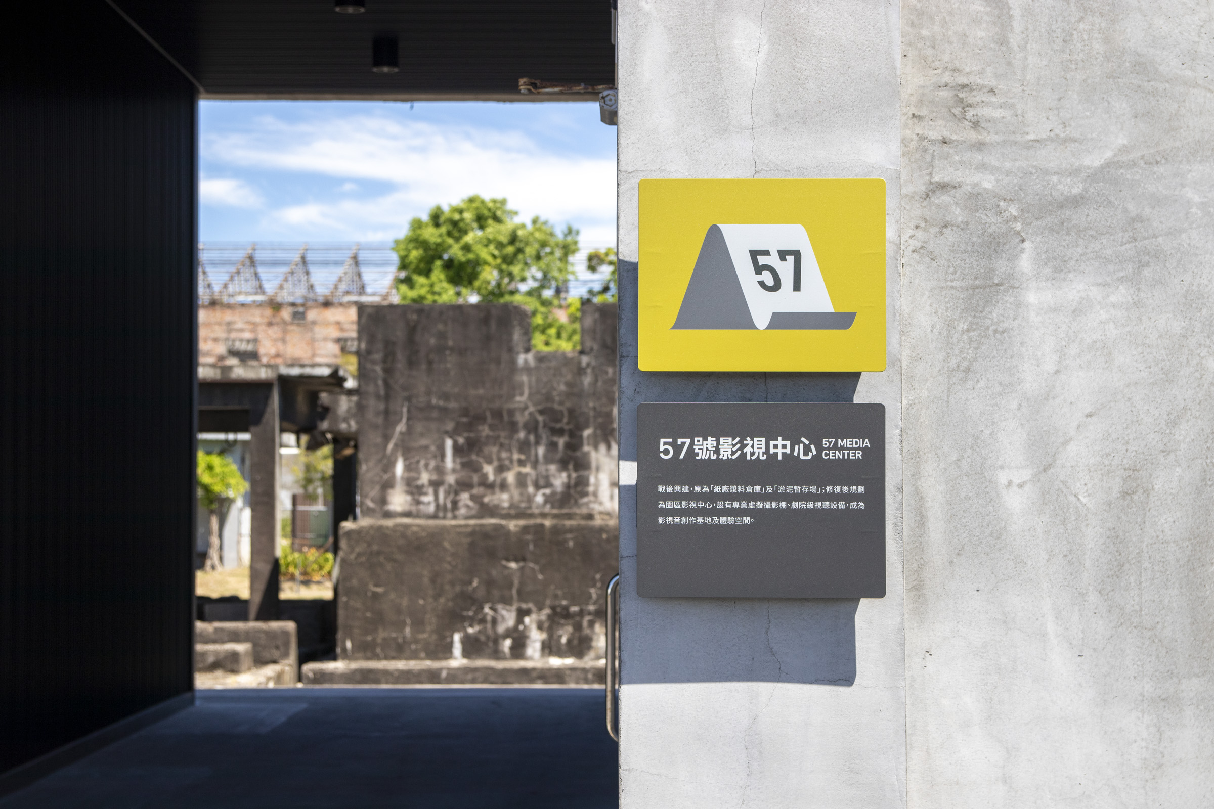
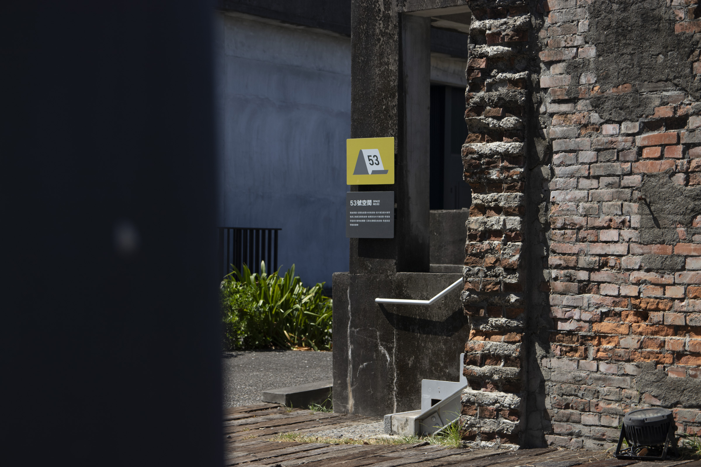
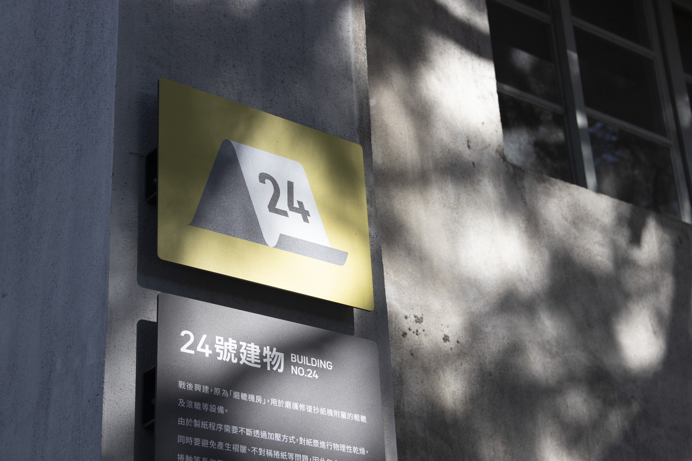


園區未來規劃將逐步開放更多空間,因此圖標設計如何保有擴展性也是一道課題。搭配前述排版中的文字層級,我們得以在圖標中設計編號加入的系統,確保後續指標上的空間圖標保有一致性。
As the park will gradually open up more space, keeping the scalability of pictograms is also a pivotal point. Combined with our layout, a numbering system intergrated in the icons were brought up. This ensurse the consistency of the space icons that will be presented on subsequent signages.


配合指標更新的視覺風格與系統規劃,園區識別標誌也同步進行了再設計。
調整後的圖像標誌簡化掉過往手感痕跡,標準字則趨近中性、呼應規範指定的歐文字體。
In line with the updated wayfinding system, the park's logomark was also redesigned. Over-detailed traces were simplified, and the logotype was adjusted to a much neutral style, matching with the typography inused of this update.

色彩計劃 Color Planning
此次更新中,色彩計劃是風格定奪的關鍵,也是指標功能分類的重要依據。因應戶外工業遺構與景觀植栽錯落的環境,指標設計多採用深灰色背景搭配黃綠主色來呈現。深灰色既呼應周圍偏淺灰的工業遺構與地景色彩,又能確保足夠的訊息承載辨識度;而作為主色的黃綠具備清晰識別性,同時維持整體色彩計畫的節奏與秩序。
The color scheme responds to the park’s scenery of relics and plantings with a slightly distinctive green combined with grayscale backgrounds. The former creates a recognizable order and a rhythmic scheme, while the latter accommodates the surrounding structures, ensuring sufficient clarity.
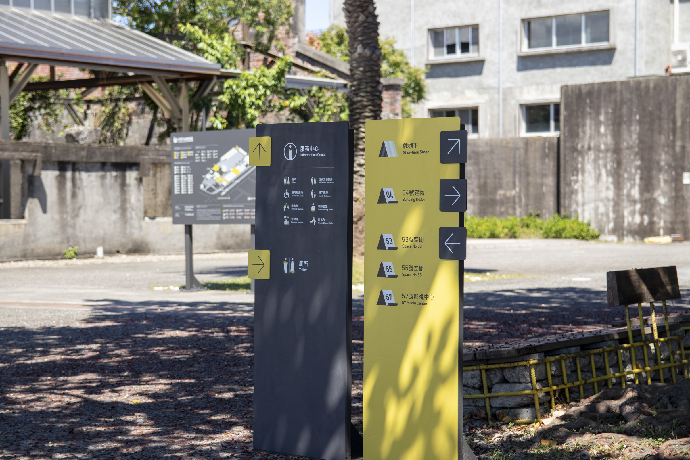
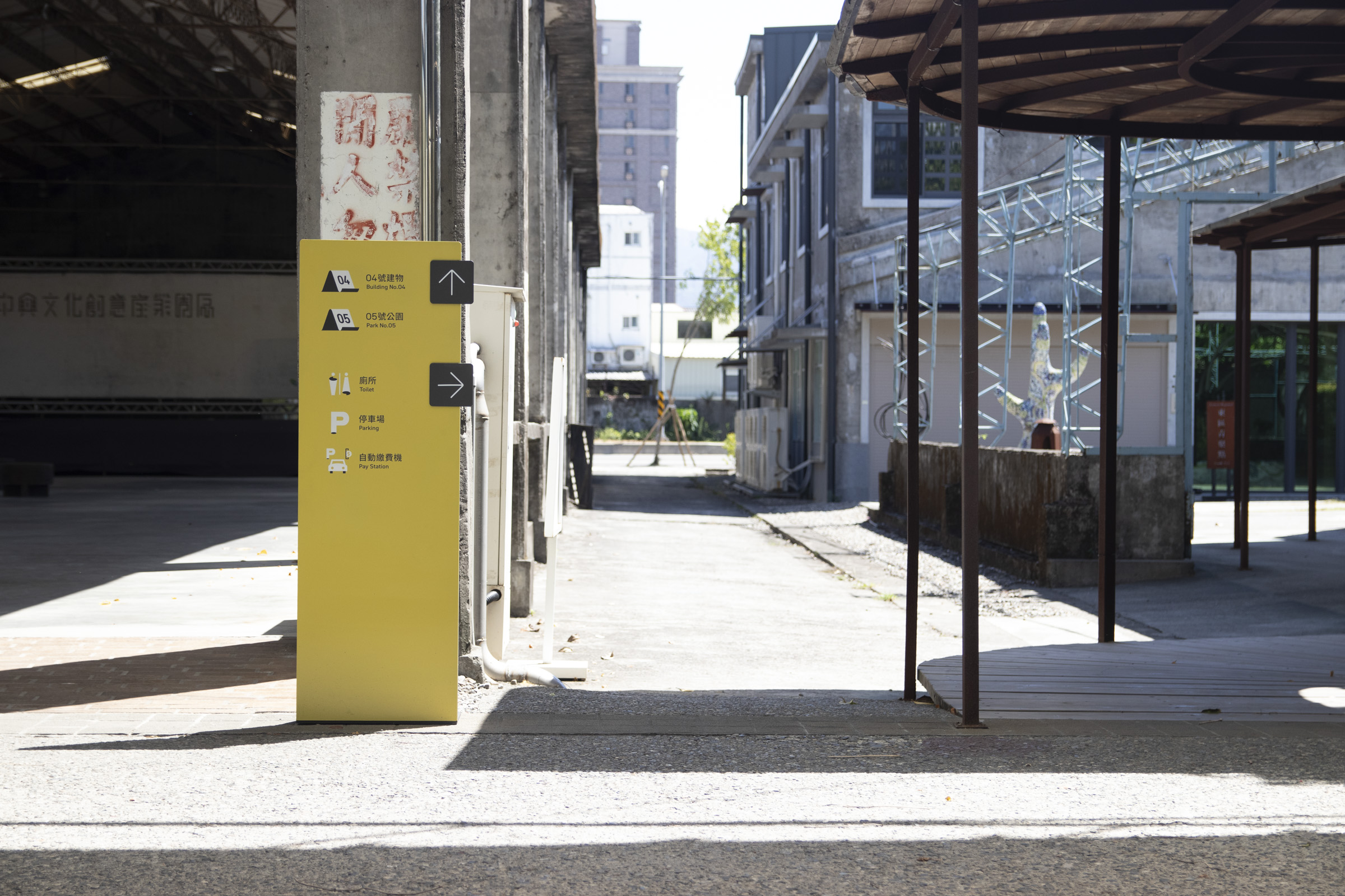
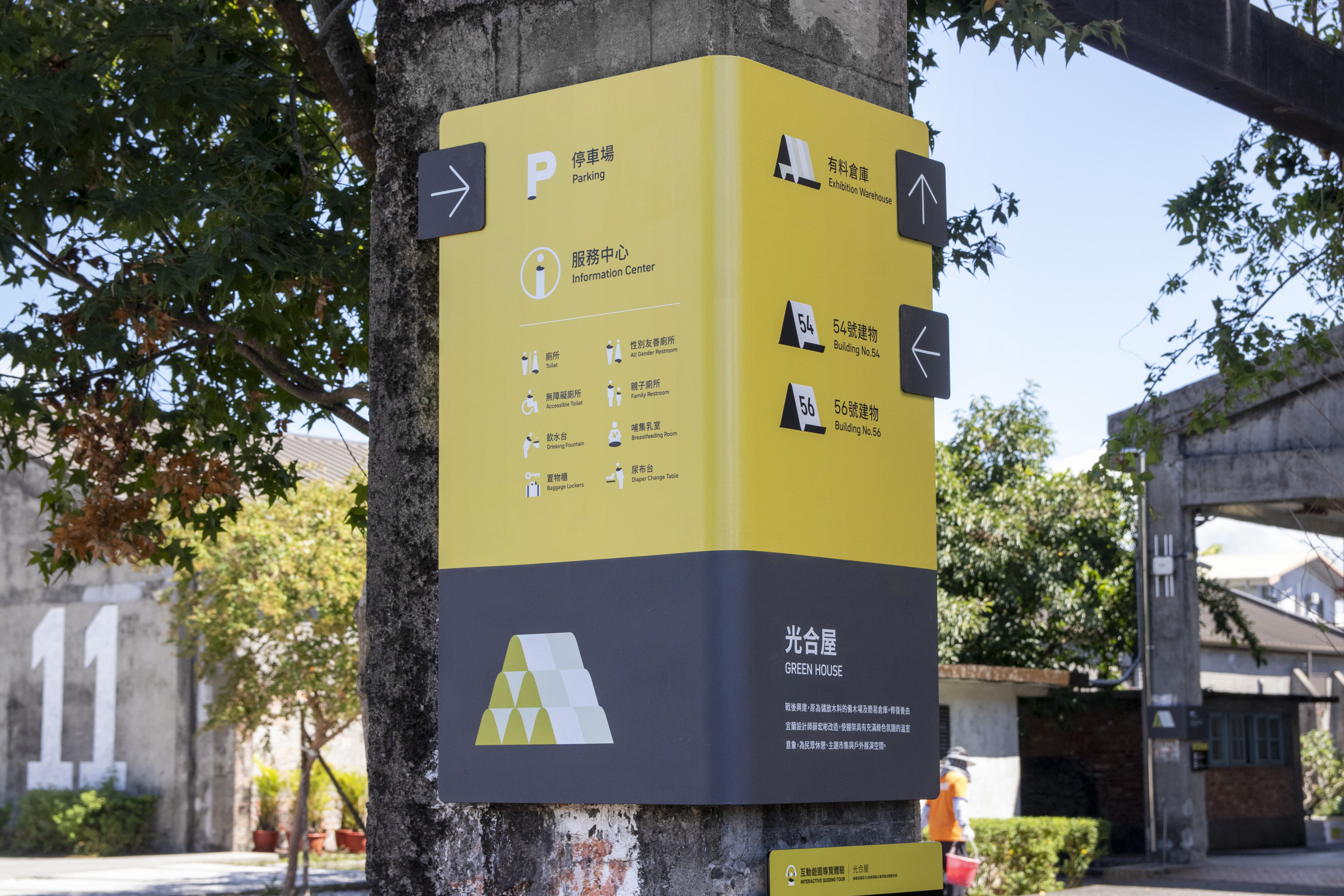
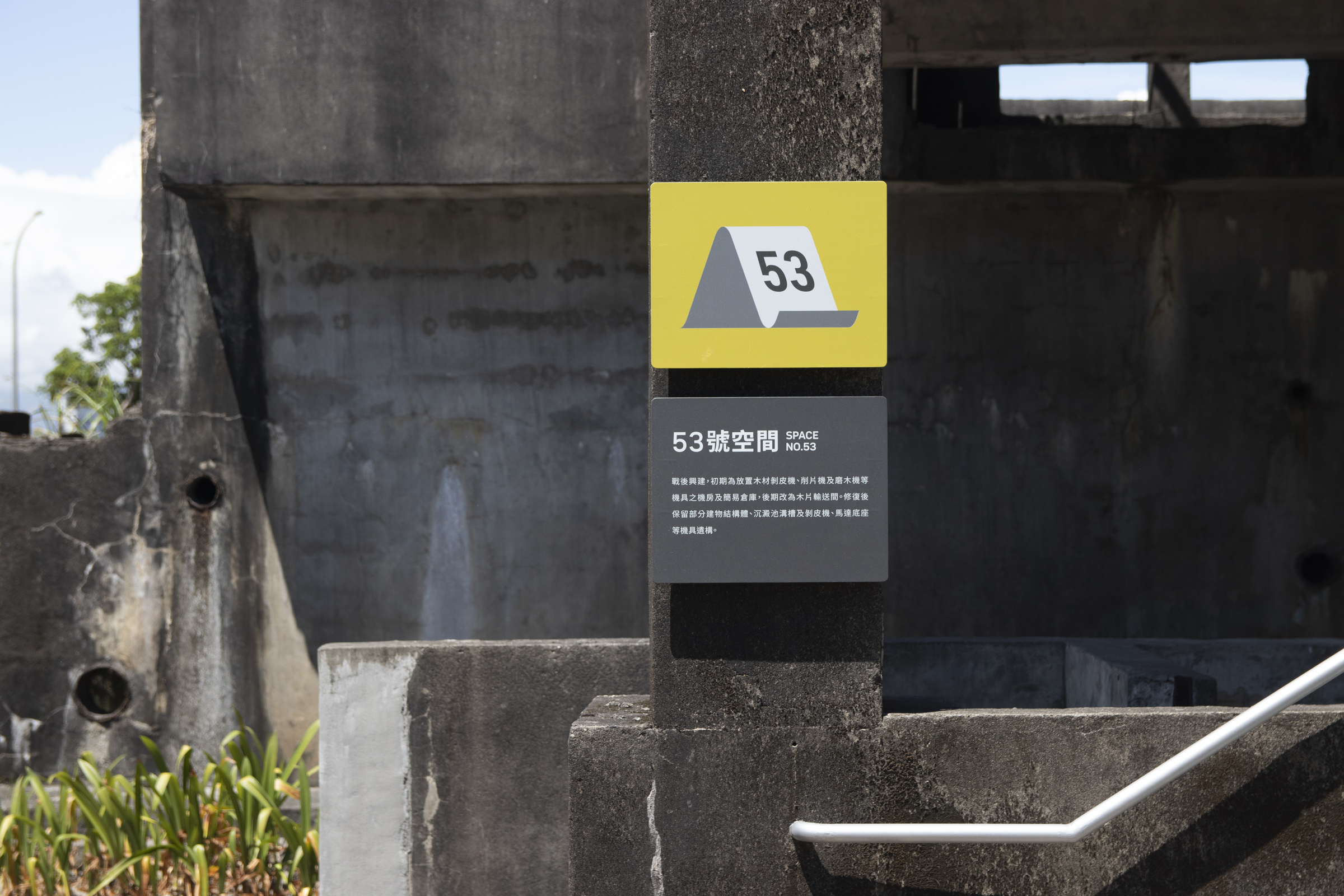
色彩分類上,開放空間與服務設施多使用主色綠作為背景呈現,在維持環境視覺協調的情況下最大化辨識度;透過一致的色彩重複出現,進而形成閱讀上的習慣,也營造出空間整體的個性。
而公共設施與相關資訊等,多使用暗色背景來提高易讀性,呼應工業遺構外觀的同時,也與空間類別做出區隔。
In terms of color sorting, open spaces and service facilities mostly use the primary color as the background. This maximizes recognizability while maintaining the visual harmony of the surroundings. Furthermore, reading habits are formed through repeating appearance, and the overall character of the space is brought out.
Public facilities and information mostly use dark backgrounds to improve clarity, responding to the appearance of industrial relics, while also distinguishing from the precious category.
Public facilities and information mostly use dark backgrounds to improve clarity, responding to the appearance of industrial relics, while also distinguishing from the precious category.
